Goal: Learn to create basic plots like scatter plots, line plots, histograms, and box plots using R’s built-in functions.
Prerequisites: Basic understanding of R syntax and data structures (vectors, data frames).
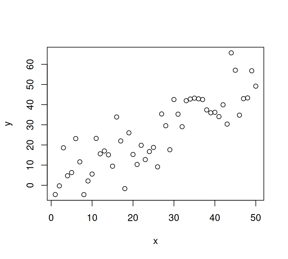
Getting Started: The plot() Function (Scatter Plots)
The most versatile base R plotting function is plot(). By default, when given two numeric vectors, it creates a scatter plot.
Let’s generate some sample data:
Code
# Generate some sample dataset.seed(123) # for reproducibilityx <-1:50y <- x +rnorm(50, mean =0, sd =10) # y is x plus some noisez <- x^2-2*x +rnorm(50, mean =0, sd =50) # another relationshipcategories <-sample(c("A", "B", "C"), 50, replace =TRUE)
Scatter plot
Now, let’s create our first scatter plot:
Code
# Basic Scatter Plotplot(x, y)
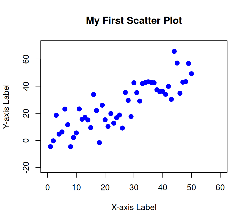
Adding Customization to plot():
Code
plot(x, y,main ="My First Scatter Plot", # Main titlexlab ="X-axis Label", # X-axis labelylab ="Y-axis Label", # Y-axis labelcol ="blue", # Color of pointspch =19, # Plotting character (point type, 19 is a solid circle)cex =1.2, # Character expansion (size of points)xlim =c(0, 60), # X-axis limitsylim =c(-20, 70) # Y-axis limits )
main: Sets the main title of the plot.
xlab, ylab: Set the labels for the x and y axes.
col: Controls the color of the plotting elements. You can use names (“red”, “blue”, “green”), hexadecimal codes (“#FF0000”), or numbers.
pch: Determines the plotting character (the symbol used for points). There are 25 standard symbols (0-25). ?pch to see them all.
cex: Controls the size of the plotting characters.
xlim, ylim: Set the minimum and maximum values for the x and y axes.
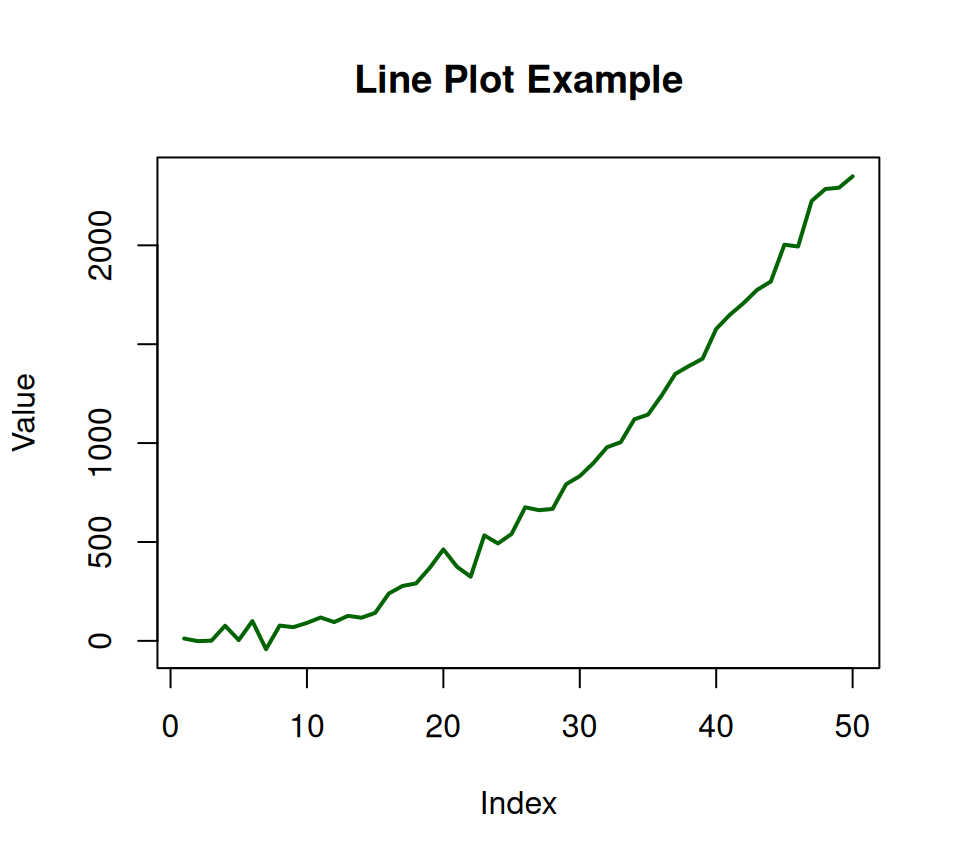
Line Plots
To create a line plot, you use the same plot() function, but specify the type argument.
Code
# Line Plotplot(x, z,type ="l", # "l" for linemain ="Line Plot Example",xlab ="Index",ylab ="Value",col ="darkgreen",lwd =2# Line width )
type:
"p": points (default)
"l": lines
"b": both points and lines
"o": both points and lines, overplotted
"h": histogram-like vertical lines
"s": stair steps
"n": no plotting (useful for setting up axes without drawing anything yet)
lwd: Line width.
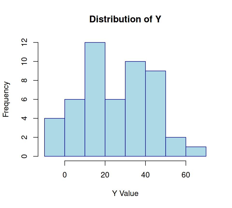
Histograms (hist())
Histograms are used to visualize the distribution of a single numeric variable.
Code
# Histogram of yhist(y,main ="Distribution of Y",xlab ="Y Value",col ="lightblue",border ="darkblue"# Border color of bars )
breaks: Controls the number of bins or the bin boundaries. Can be a number, a vector, or a character string (“Sturges”, “FD”, “Scott”).
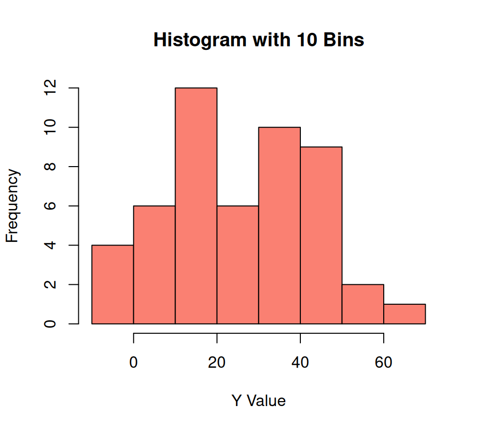
Code
hist(y, breaks =10, main ="Histogram with 10 Bins", xlab ="Y Value", col ="salmon")
Box Plots (boxplot())
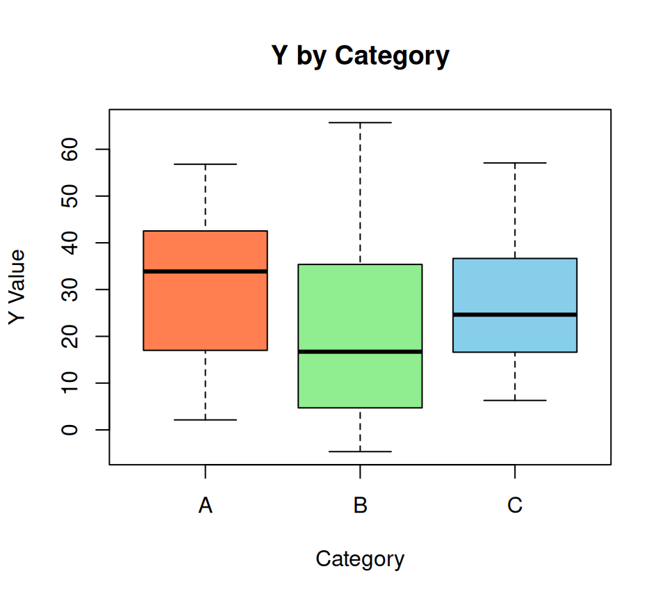
Box plots are excellent for visualizing the distribution of a numeric variable across different categories, showing median, quartiles, and outliers.
Code
# Box plot of y grouped by categoriesboxplot(y ~ categories, # Formula: numeric_var ~ categorical_varmain ="Y by Category",xlab ="Category",ylab ="Y Value",col =c("coral", "lightgreen", "skyblue") # Colors for each box )
The formula numeric_var ~ categorical_var is a common pattern in R for specifying relationships between variables, particularly for group-wise operations.
Bar Plots (barplot())
Bar plots are used to display the count or some other aggregated statistic for categorical variables. First, you usually need to count the occurrences of each category.
table(): Creates a frequency table (counts) for a categorical variable.
Adding Elements to an Existing Plot
One of the key features of base R graphics is the ability to add elements to an existing plot.
Code
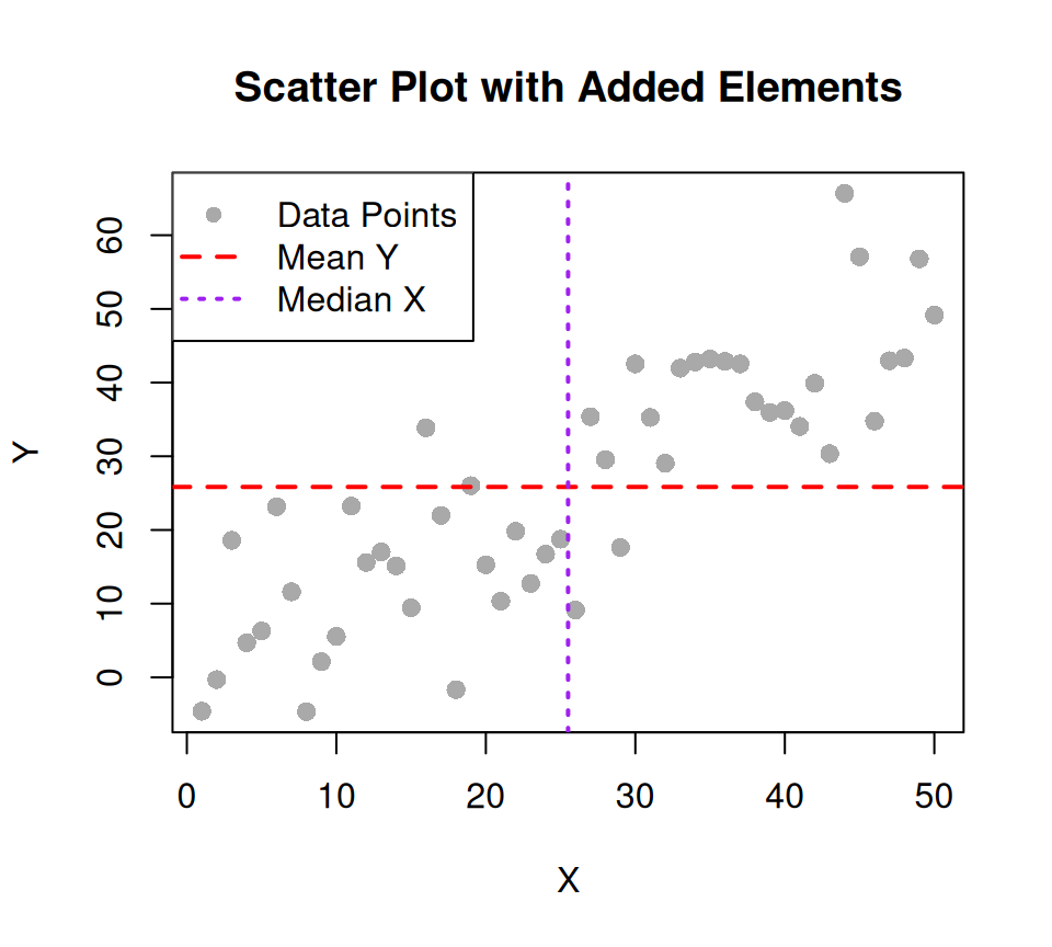
# Recreate the scatter plotplot(x, y,main ="Scatter Plot with Added Elements",xlab ="X", ylab ="Y",pch =16, col ="darkgray",cex =1.2 )# Add a horizontal lineabline(h =mean(y), col ="red", lty =2, lwd =2) # Horizontal line at mean of y# Add a vertical lineabline(v =median(x), col ="purple", lty =3, lwd =2) # Vertical line at median of x# Add text to the plottext(x =10, y =60, labels ="Mean Y", col ="red")text(x =40, y =-10, labels ="Median X", col ="purple")# Add a legend (useful if you have multiple series or colors)# For this plot, let's pretend we have two groups, even though we only plotted one 'y'# This is just to demonstrate the legend functionlegend("topleft", # Position of the legendlegend =c("Data Points", "Mean Y", "Median X"), # Labels for legend itemscol =c("darkgray", "red", "purple"),pch =c(16, NA, NA), # NA for lines, number for pointslty =c(NA, 2, 3), # NA for points, number for line typelwd =c(NA, 2, 2) )
abline(h=...): Adds a horizontal line.
abline(v=...): Adds a vertical line.
abline(a, b): Adds a line with intercept a and slope b.
text(x, y, labels): Adds text at specific coordinates.
legend(): Adds a legend to the plot. Takes arguments for position, text labels, colors, point types (pch), and line types (lty), and line widths (lwd).
Multiple Plots in One Window (par())
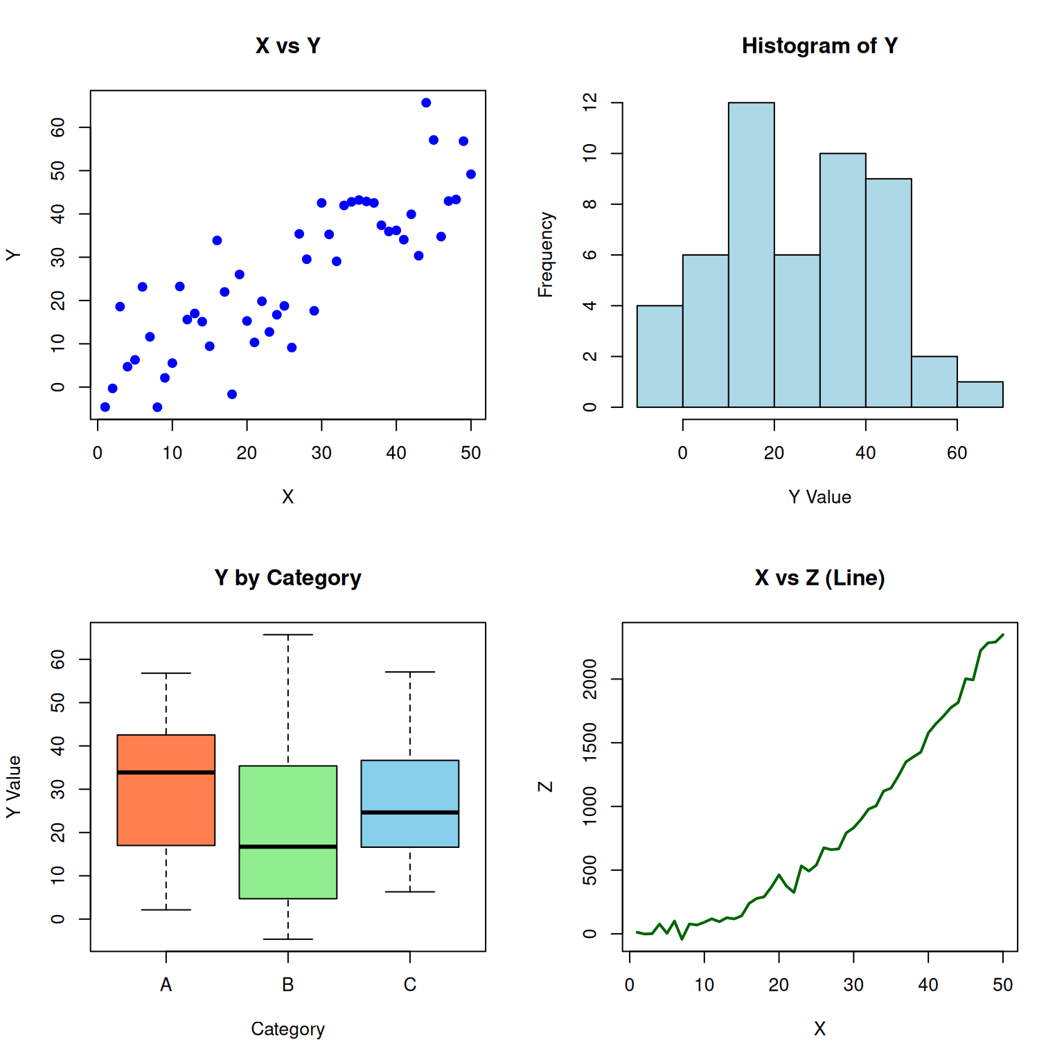
The par() function allows you to control many graphical parameters, including arranging multiple plots on a single display.
Code
# Set up a 2x2 grid for plotspar(mfrow =c(2, 2)) # mfrow = c(rows, columns)# Plot 1: Scatter plotplot(x, y, main ="X vs Y", xlab ="X", ylab ="Y", col ="blue", pch =19)# Plot 2: Histogramhist(y, main ="Histogram of Y", xlab ="Y Value", col ="lightblue")# Plot 3: Box plotboxplot(y ~ categories, main ="Y by Category", xlab ="Category", ylab ="Y Value", col =c("coral", "lightgreen", "skyblue"))# Plot 4: Line plotplot(x, z, type ="l", main ="X vs Z (Line)", xlab ="X", ylab ="Z", col ="darkgreen", lwd =2)
Code
# Reset graphical parameters to default (IMPORTANT!)par(mfrow =c(1, 1))
par(mfrow = c(rows, columns)): Arranges plots in a grid. mfcol arranges them by column first.
par(mfrow = c(1, 1)): Always reset this after you’re done! Otherwise, subsequent single plots will still try to fit into the grid.
Saving Plots
You can save your R plots to various file formats.
Code
# Save as a PNG filepng("my_scatter_plot.png", width =800, height =600) # Open PNG deviceplot(x, y, main ="Scatter Plot Saved as PNG", xlab ="X", ylab ="Y", col ="steelblue", pch =16)dev.off() # Close the device, saving the file
png
  2
Code
# Save as a PDF filepdf("my_box_plot.pdf", width =7, height =5) # Open PDF device (dimensions in inches)boxplot(y ~ categories, main ="Box Plot Saved as PDF", xlab ="Category", ylab ="Y Value", col ="lightcoral")dev.off() # Close the device, saving the file
png
  2
Functions like png(), jpeg(), pdf(), tiff(), svg() open a graphics device.
All plotting commands executed after opening a device and before closing it with dev.off() will be drawn to that file.
dev.off() is crucial to actually save the file.
Summary and Conclusion
R’s base graphics system is powerful for quick, exploratory visualizations and offers extensive control over plot elements. While packages like ggplot2 provide a more consistent and often more aesthetically pleasing approach for complex, publication-ready graphics, understanding base R plotting is a fundamental skill that will enhance your overall R proficiency. Experiment with these functions and their arguments to get comfortable creating your own visualizations!