Code
library(ggplot2)![]()

ggplot2 is a powerful and elegant data visualization package for R, part of the tidyverse. It’s based on the “Grammar of Graphics,” a systematic way of building plots layer by layer. This approach makes ggplot2 incredibly flexible and consistent.
![]()
First, if you haven’t already, you’ll need to install ggplot2.
install.packages("ggplot2")Then, load the library every time you start a new R session where you want to use it.
library(ggplot2)We’ll also often use the dplyr package for data manipulation, so let’s load that too.
library(dplyr)
Attaching package: 'dplyr'The following objects are masked from 'package:stats':
filter, lagThe following objects are masked from 'package:base':
intersect, setdiff, setequal, unionEvery ggplot2 plot is built using these core components:
Let’s start with a simple scatter plot using the built-in mtcars dataset, which contains information about various car models.
# Load the dataset (it's already available in R)
data(mtcars)

# Basic scatter plot: mpg vs. hp
ggplot(data = mtcars, aes(x = hp, y = mpg)) +
  geom_point()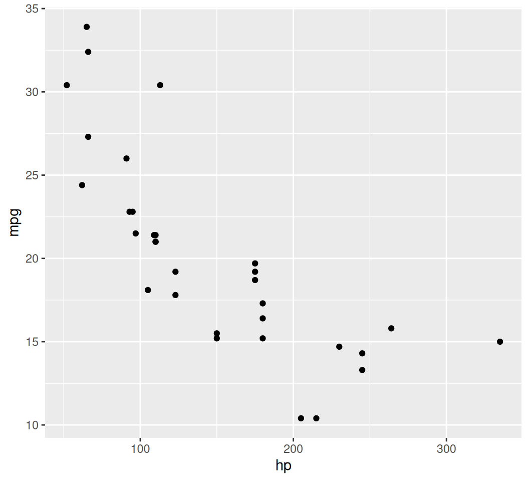
ggplot() initializes the plot and specifies the data and global aes mappings.aes(x = disp, y = mpg) tells ggplot to map the disp column to the x-axis and mpg to the y-axis.geom_point() adds a layer of points, creating a scatter plot. The + operator is used to add layers.We can map other variables to visual aesthetics like color, size, or shape. Let’s map cyl (number of cylinders) to color.
ggplot(data = mtcars, aes(x = disp, y = mpg, color = factor(cyl))) +
  geom_point()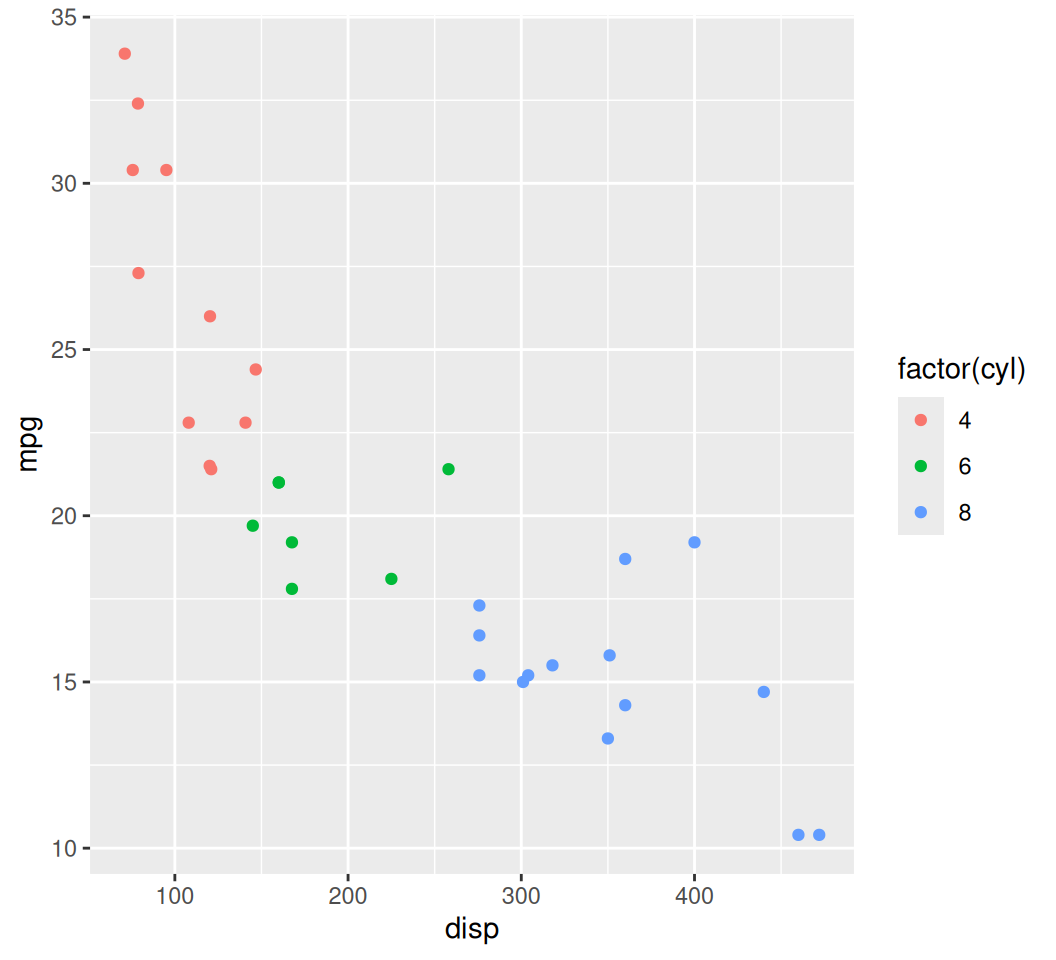
Note: We use factor(cyl) because cyl is a discrete variable that ggplot2 should treat as categories for coloring.
Let’s also vary the size by qsec (1/4 mile time) and shape by am (transmission type: 0 = automatic, 1 = manual).
ggplot(data = mtcars, aes(x = hp, y = mpg,
                          color = factor(cyl),
                          size = qsec,
                          shape = factor(am))) +
  geom_point()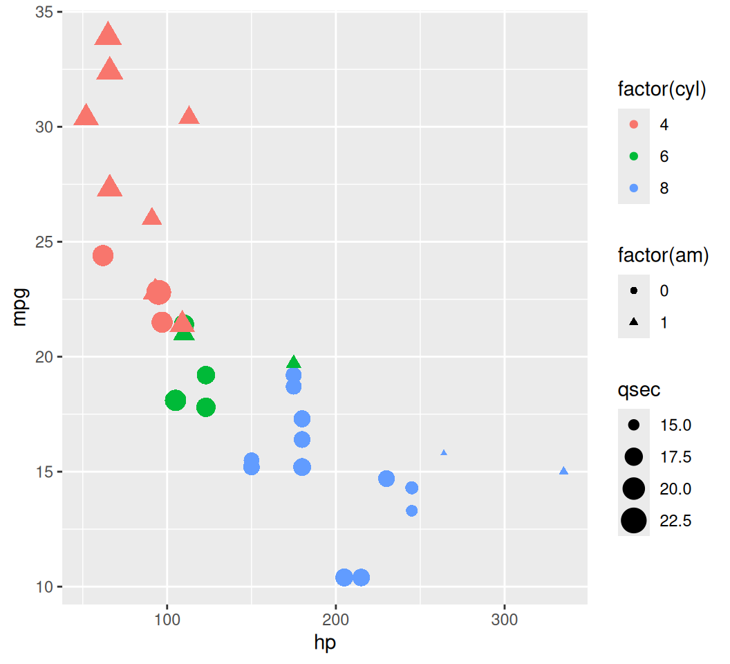
geom_bar, geom_col)Bar charts are used to display the distribution of a categorical variable or to compare values across categories.
geom_bar(): Counts the number of observations for each category (default stat = “count”).
geom_col(): Requires x and y aesthetics, where y represents the height of the bars. Use this when you’ve already pre-computed the counts or sums.
ggplot(data = mtcars, aes(x = factor(cyl))) +
  geom_bar()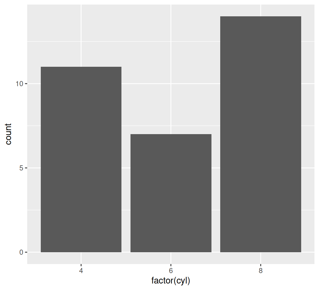
x aesthetic is provided to geom_bar(), it defaults to counting the occurrences of each unique value in x.You can also color the bars by vs (engine type: 0 = V-shaped, 1 = straight) to see their distribution within each cylinder group:
ggplot(data = mtcars, aes(x = factor(cyl), fill = factor(vs))) +
  geom_bar() # Stacked bar chart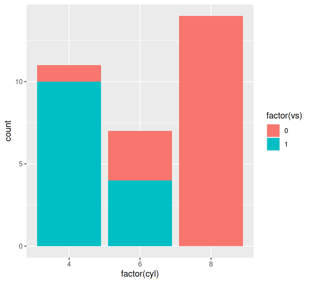
ggplot2 defaults to a stacked bar chart when fill is used. You can change this behavior with position argument:
# Dodged bar chart
ggplot(data = mtcars, aes(x = factor(cyl), fill = factor(vs))) +
  geom_bar(position = "dodge")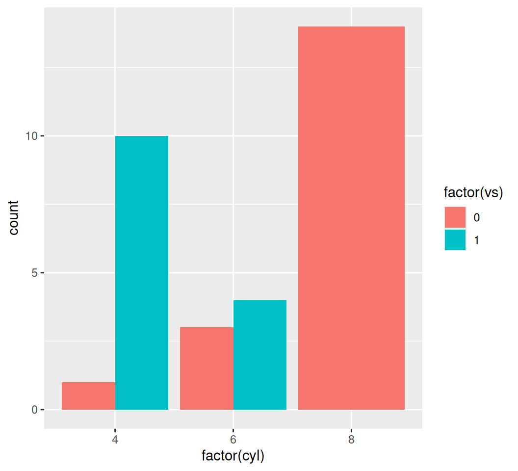
# Filled bar chart (shows proportions)
ggplot(data = mtcars, aes(x = factor(cyl), fill = factor(vs))) +
  geom_bar(position = "fill")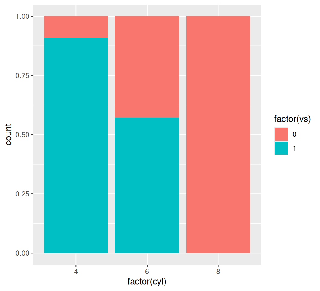
bar_plot <- ggplot(data = mtcars, aes(x = factor(cyl), y = mpg)) +
  stat_summary(fun = mean, geom = "bar", fill = "skyblue") +
  stat_summary(fun.data = mean_se, geom = "errorbar", width = 0.4) +
  labs(title = "Bar Plot of Average MPG by Cylinder Count",
       x = "Cylinders",
       y = "Average MPG") +
  theme_minimal()
print(bar_plot)
To visualize the distribution of a single continuous variable, we use a histogram.
ggplot(data = mtcars, aes(x = mpg)) +
  geom_histogram(binwidth = 2) # binwidth controls the width of the bins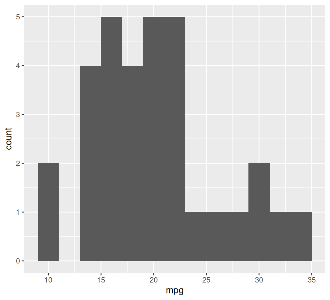
Box plots are excellent for showing the distribution of a continuous variable across different categories.
ggplot(data = mtcars, aes(x = factor(cyl), y = mpg)) +
  geom_boxplot()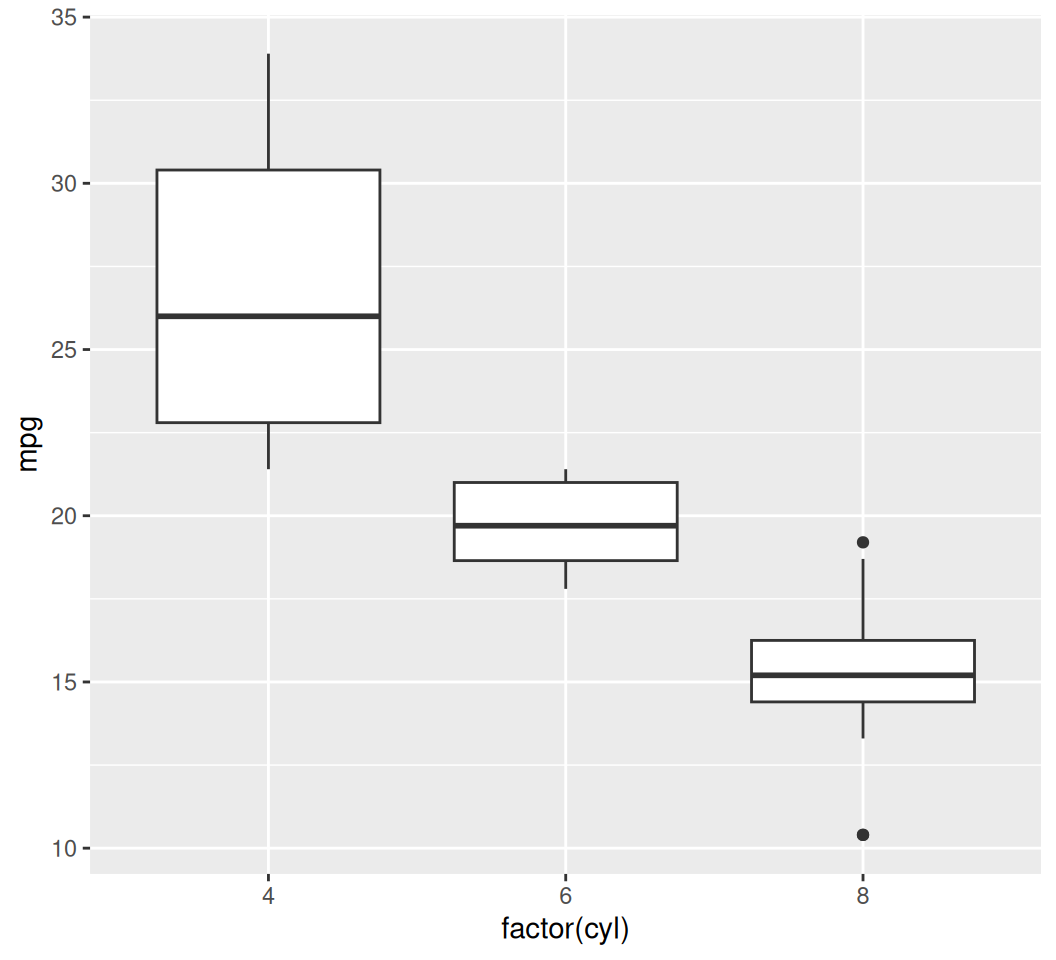
We can also add individual data points on top of the box plots for more detail, using geom_jitter to avoid overplotting:
ggplot(data = mtcars, aes(x = factor(cyl), y = mpg, color = factor(cyl))) +
  geom_boxplot(outlier.shape = NA) + # Hide default outliers
  geom_jitter(width = 0.2, alpha = 0.7) + # Add jittered points
  labs(title = "MPG Distribution by Cylinders",
       x = "Number of Cylinders",
       y = "Miles Per Gallon") +
  theme_minimal() +
  guides(color = "none") # Remove the redundant color legend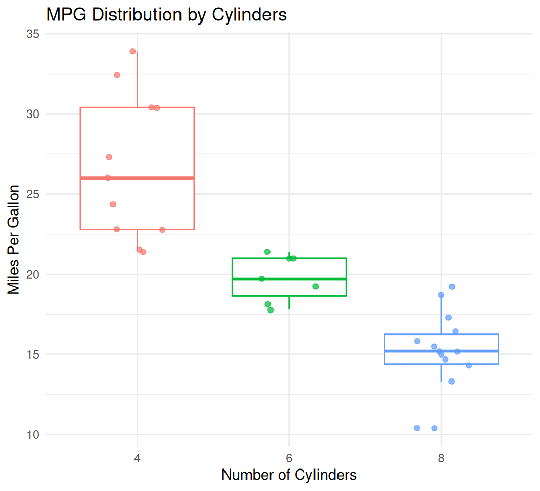
Line plots are typically used to show trends over time or ordered categories. Let’s use the economics dataset for this.
data(economics)

ggplot(data = economics, aes(x = date, y = unemploy)) +
  geom_line(color = "darkgreen", size = 1) +
  labs(title = "US Unemplyoment Rate Over Time",
       x = "Date",
       y = "Unemployment (Thousands)")
Warning: Using `size` aesthetic for lines was deprecated in ggplot2 3.4.0.
ℹ Please use `linewidth` instead.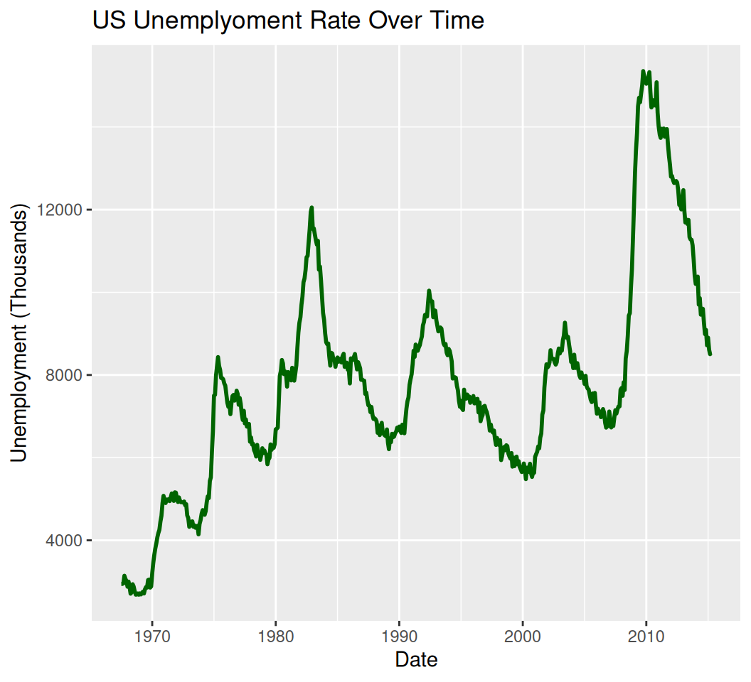
smooth_plot <- ggplot(data = mtcars, aes(x = wt, y = mpg)) +
  geom_point() +
  geom_smooth(method = "lm", color = "red") +
  labs(title = "Scatter Plot with Linear Trend Line",
       x = "Weight (1000 lbs)",
       y = "Miles Per Gallon") +
  theme_classic()
print(smooth_plot)
`geom_smooth()` using formula = 'y ~ x'
# Example with multiple smoothers (no points/lines for clarity)
multi_smooth_plot <- ggplot(data = economics[1:100, ], aes(x = date, y = psavert)) +  # Subset for clarity
  geom_smooth(method = "lm", aes(color = "Linear"), se = FALSE) +
  geom_smooth(method = "loess", aes(color = "Loess"), se = FALSE) +
  geom_smooth(method = "lm", formula = y ~ poly(x, 2), aes(color = "Quadratic"), se = FALSE) +
  labs(title = "Multiple Smooth Lines: Savings Rate Trends",
       x = "Date",
       y = "Personal Savings Rate (%)",
       color = "Smoother Type") +
  theme_minimal()
print(multi_smooth_plot)
`geom_smooth()` using formula = 'y ~ x'
`geom_smooth()` using formula = 'y ~ x'
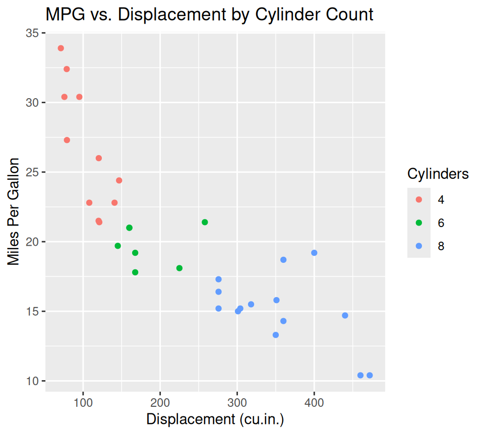
Good plots need clear labels and titles.
ggplot(data = mtcars, aes(x = disp, y = mpg, color = factor(cyl))) +
  geom_point() +
  labs(
    title = "MPG vs. Displacement by Cylinder Count",
    x = "Displacement (cu.in.)",
    y = "Miles Per Gallon",
    color = "Cylinders" # Legend title
  )
ggplot2 comes with several built-in themes to quickly change the overall look of your plot.
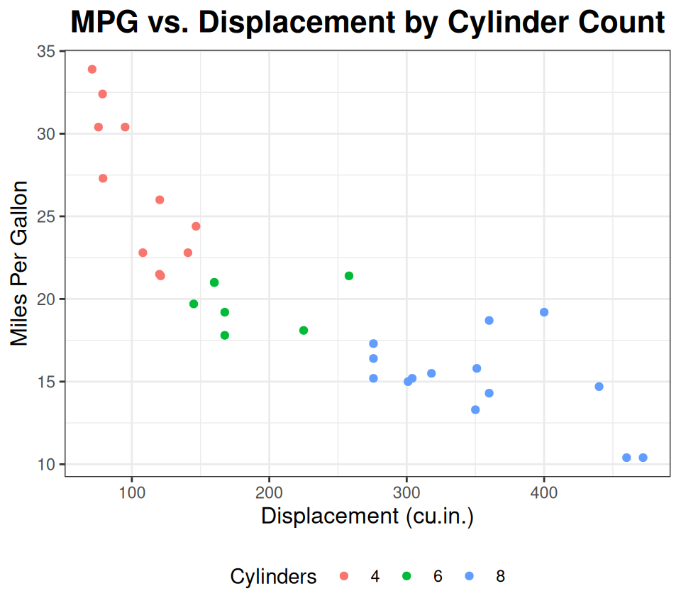
ggplot(data = mtcars, aes(x = disp, y = mpg, color = factor(cyl))) +
  geom_point() +
  labs(
    title = "MPG vs. Displacement by Cylinder Count",
    x = "Displacement (cu.in.)",
    y = "Miles Per Gallon",
    color = "Cylinders"
  ) +
  theme_minimal() # Or theme_classic(), theme_bw(), theme_dark(), etc.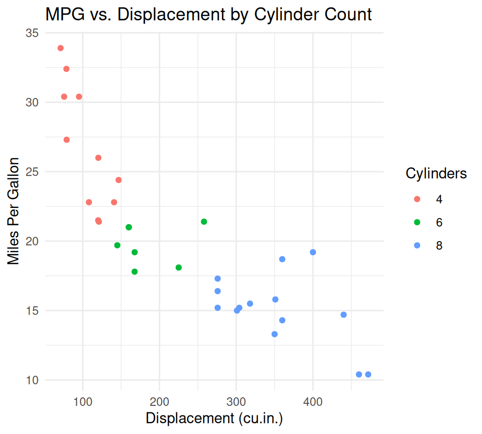
You can also customize individual elements of a theme using theme().
ggplot(data = mtcars, aes(x = disp, y = mpg, color = factor(cyl))) +
  geom_point() +
  labs(
    title = "MPG vs. Displacement by Cylinder Count",
    x = "Displacement (cu.in.)",
    y = "Miles Per Gallon",
    color = "Cylinders"
  ) +
  theme_bw() +
  theme(
    plot.title = element_text(hjust = 0.5, face = "bold", size = 16), # Center title, bold, larger
    axis.title.x = element_text(size = 12),
    axis.title.y = element_text(size = 12),
    legend.position = "bottom" # Move legend to bottom
  )
You can manually set colors or use predefined color scales.
#
# Manual colors
ggplot(data = mtcars, aes(x = factor(cyl), y = mpg, fill = factor(cyl))) +
  geom_boxplot() +
  scale_fill_manual(values = c("4" = "darkgreen", "6" = "orange", "8" = "darkred")) +
  labs(title = "MPG by Cylinders", x = "Number of Cylinders", y = "Miles Per Gallon")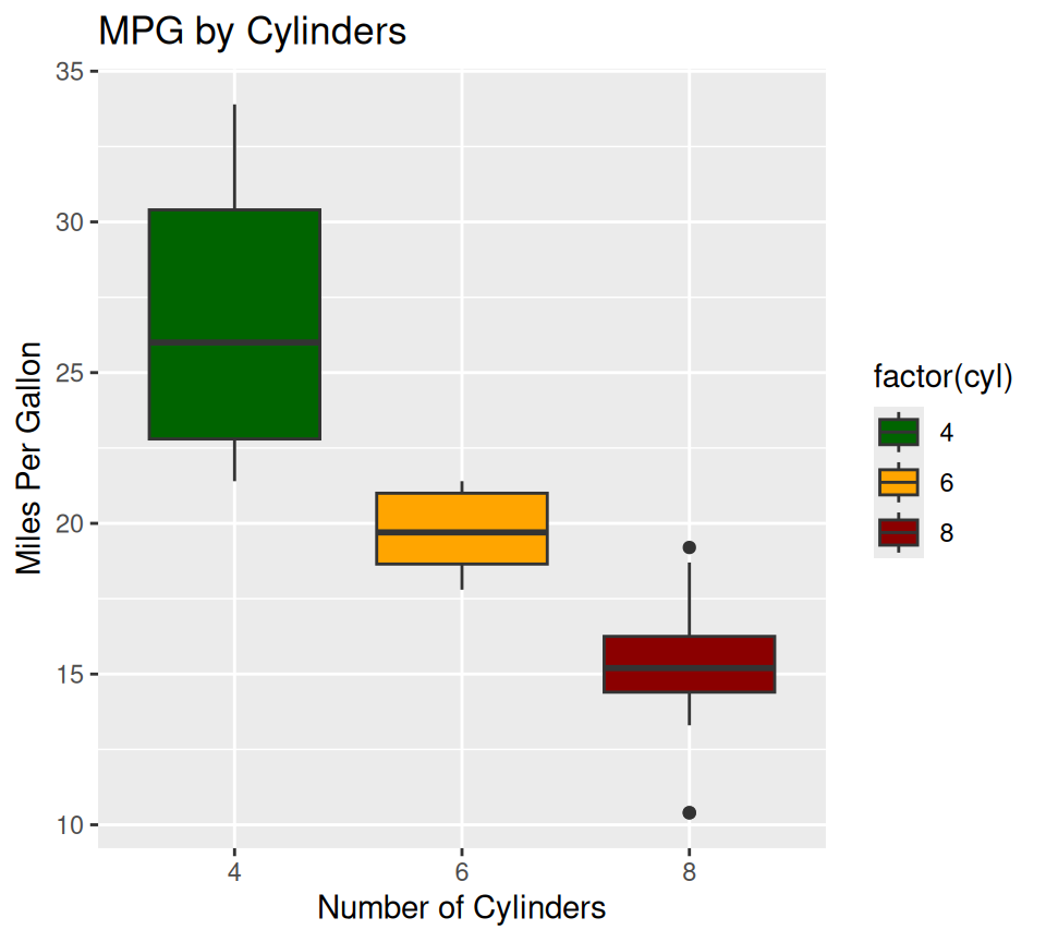
# Using a palette from RColorBrewer
#install.packages("RColorBrewer")
library(RColorBrewer)

ggplot(data = mtcars, aes(x = factor(cyl), y = mpg, fill = factor(cyl))) +
  geom_boxplot() +
  scale_fill_brewer(palette = "Set1") + # Choose a palette name
  labs(title = "MPG by Cylinders", x = "Number of Cylinders", y = "Miles Per Gallon")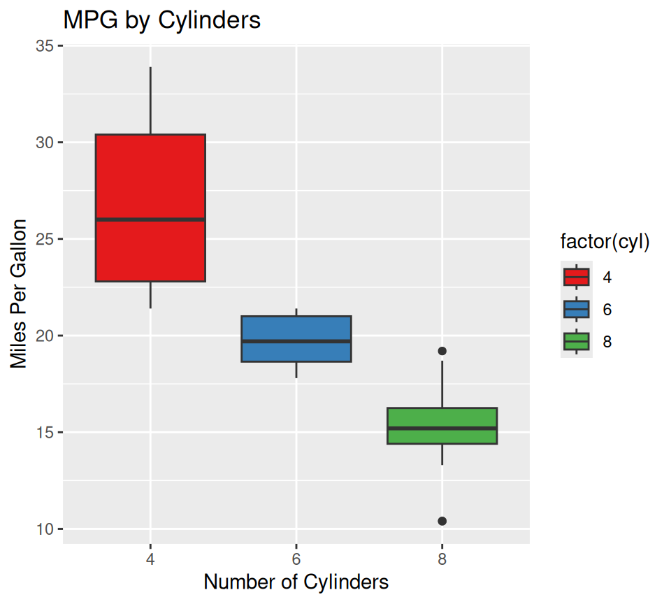
You can set axis limits, breaks, and labels.
ggplot(data = mtcars, aes(x = disp, y = mpg)) +
  geom_point() +
  xlim(50, 500) + # Set x-axis limits
  ylim(5, 35) +   # Set y-axis limits
  scale_x_continuous(breaks = seq(100, 400, by = 100)) # Custom breaks for x-axis
Scale for x is already present.
Adding another scale for x, which will replace the existing scale.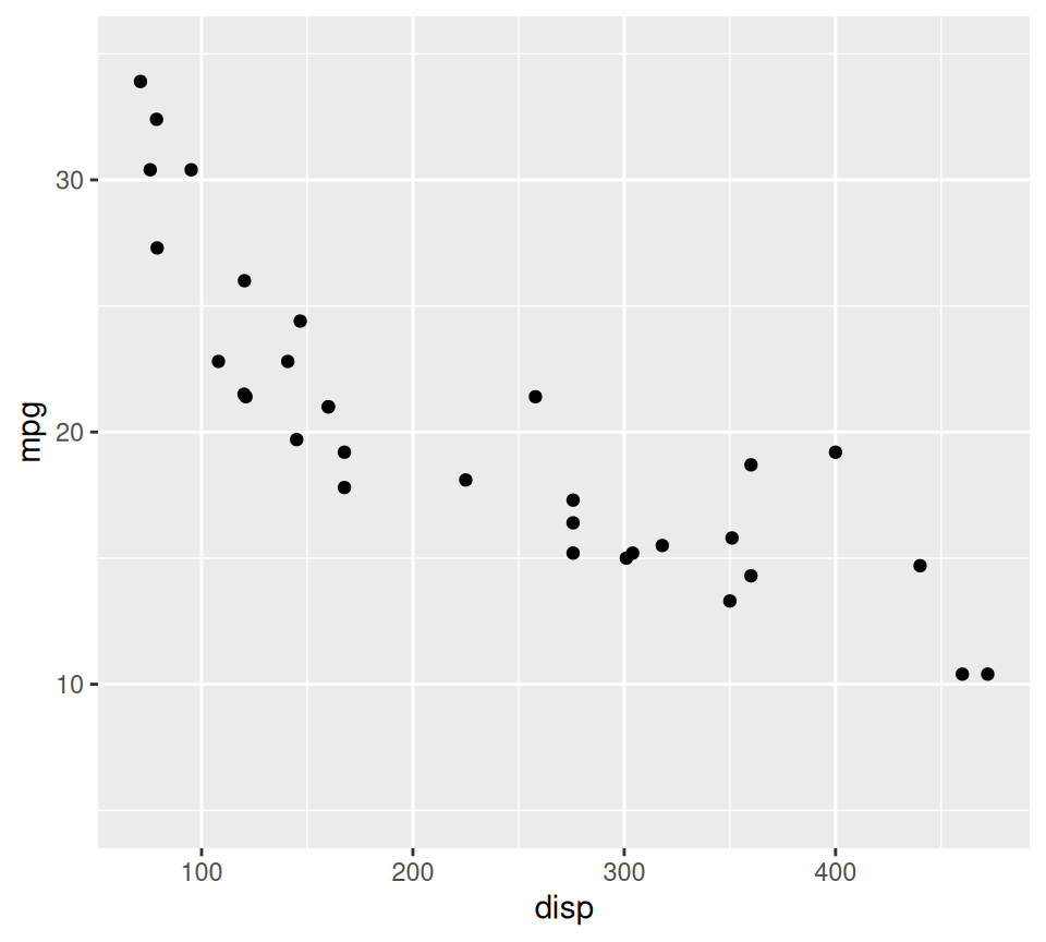
Faceting allows you to split your plot into multiple sub-plots based on the levels of one or more categorical variables. This is excellent for comparing distributions across groups.
# Facet by a single variable (cyl)
ggplot(data = mtcars, aes(x = mpg, fill = factor(am))) +
  geom_histogram(binwidth = 2) +
  facet_wrap(~ cyl, ncol = 2) + # Create a grid, 2 columns
  labs(title = "MPG Distribution by Cylinders and Transmission", fill = "Transmission (0=Auto, 1=Manual)")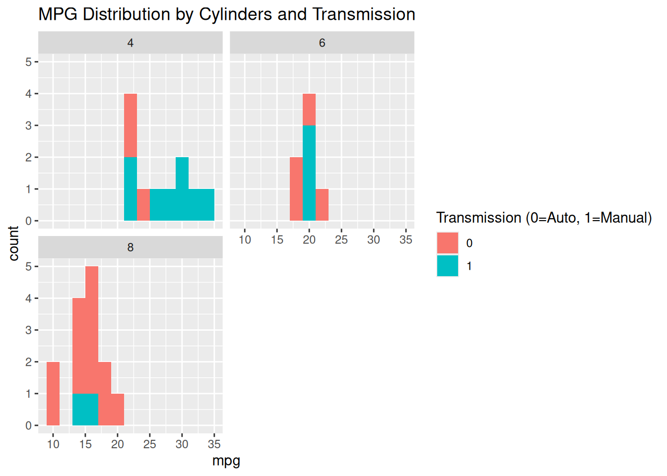
# Facet by two variables (cyl and am)
ggplot(data = mtcars, aes(x = hp, y = qsec)) +
  geom_point() +
  facet_grid(am ~ cyl) + # Rows by 'am', columns by 'cyl'
  labs(title = "HP vs. QSEC by Cylinders and Transmission")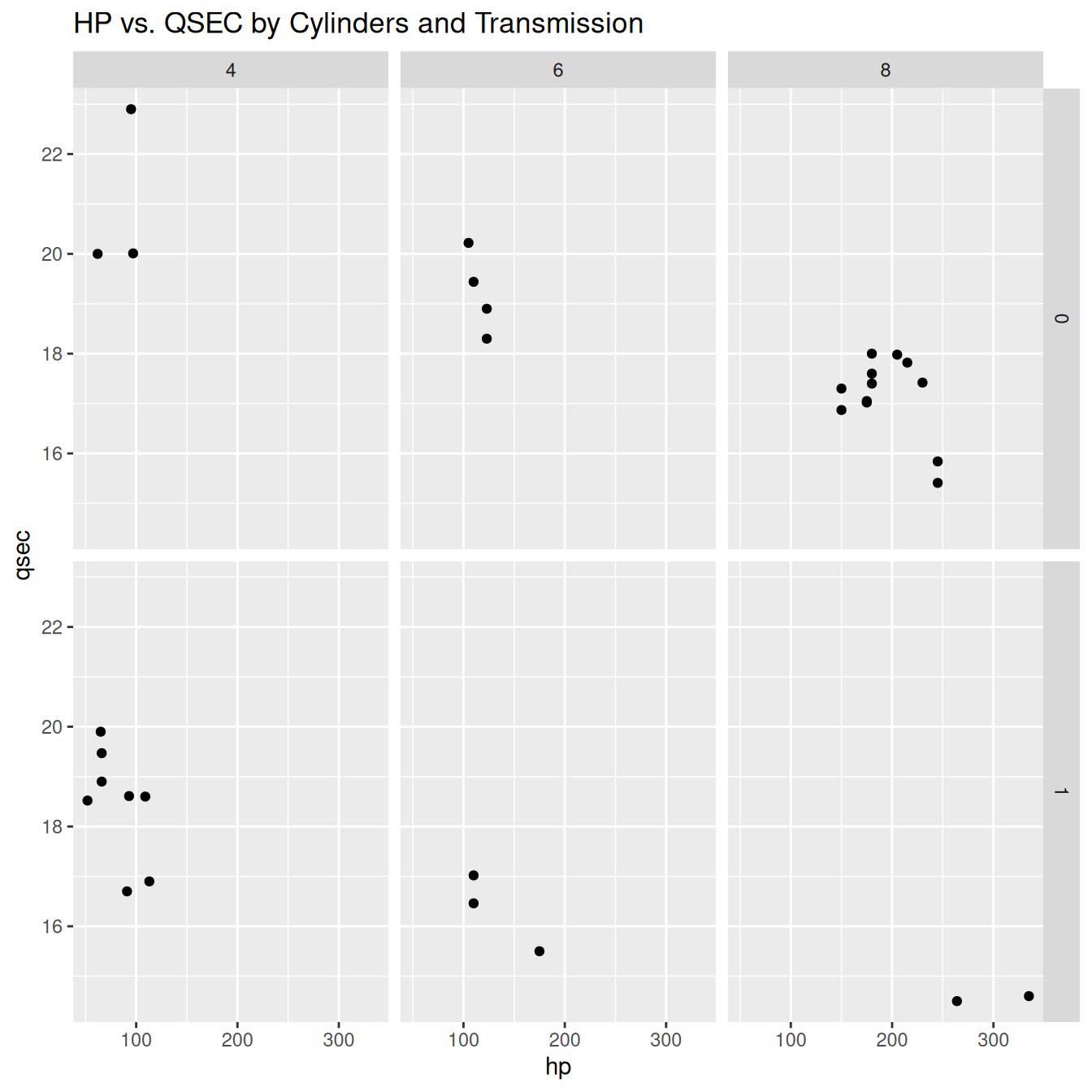
ggplot(mtcars, aes(x = wt, y = mpg)) +
  geom_point(aes(color = factor(am))) +
  facet_wrap(~ cyl, ncol = 2) +
  labs(title = "MPG vs Weight by Cylinder Count", color = "Transmission") +
  theme_minimal()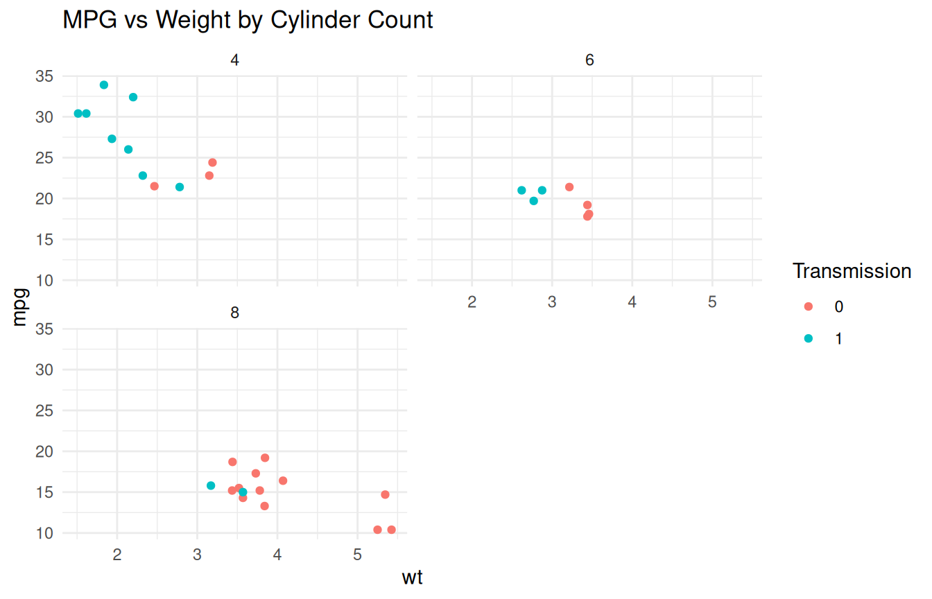
stat_ functions)Many geom_ functions have a default statistical transformation. For instance, geom_bar() defaults to stat_count(). You can explicitly use stat_ functions.
Let’s plot mean MPG for each cylinder group, with error bars (standard error).
bar_plot <- ggplot(data = mtcars, aes(x = factor(cyl), y = mpg)) +
  stat_summary(fun = mean, geom = "bar", fill = "skyblue") +
  stat_summary(fun.data = mean_se, geom = "errorbar", width = 0.4) +
  labs(title = "Bar Plot of Average MPG by Cylinder Count",
       x = "Cylinders",
       y = "Average MPG") +
  theme_minimal()
print(bar_plot)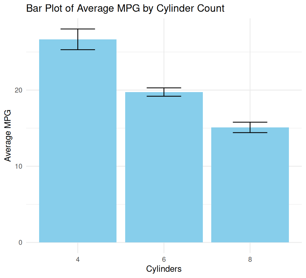
geom_col() is used when the y-values are already calculated in your data (unlike geom_bar() which calculates counts by default).geom_errorbar() adds vertical lines representing the range.smooth_plot <- ggplot(data = mtcars, aes(x = wt, y = mpg)) +
geom_point() +
geom_smooth(method = "lm", color = "red") +
labs(title = "Scatter Plot with Linear Trend Line",
x = "Weight (1000 lbs)",
y = "Miles Per Gallon") +
theme_classic()
print(smooth_plot)`geom_smooth()` using formula = 'y ~ x'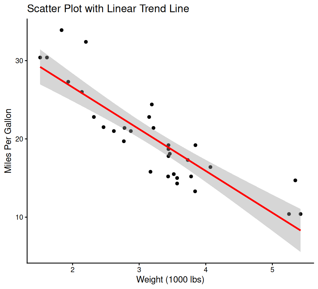
You can layer multiple geometries on top of each other.
ggplot(data = mtcars, aes(x = wt, y = mpg)) +
  geom_point(aes(color = factor(cyl))) + # Points colored by cylinders
  geom_smooth(method = "lm", se = FALSE) + # Add a linear regression line, no confidence interval
  labs(title = "MPG vs. Weight by Cylinders with Regression Line", x = "Weight (1000 lbs)", y = "Miles Per Gallon")
`geom_smooth()` using formula = 'y ~ x'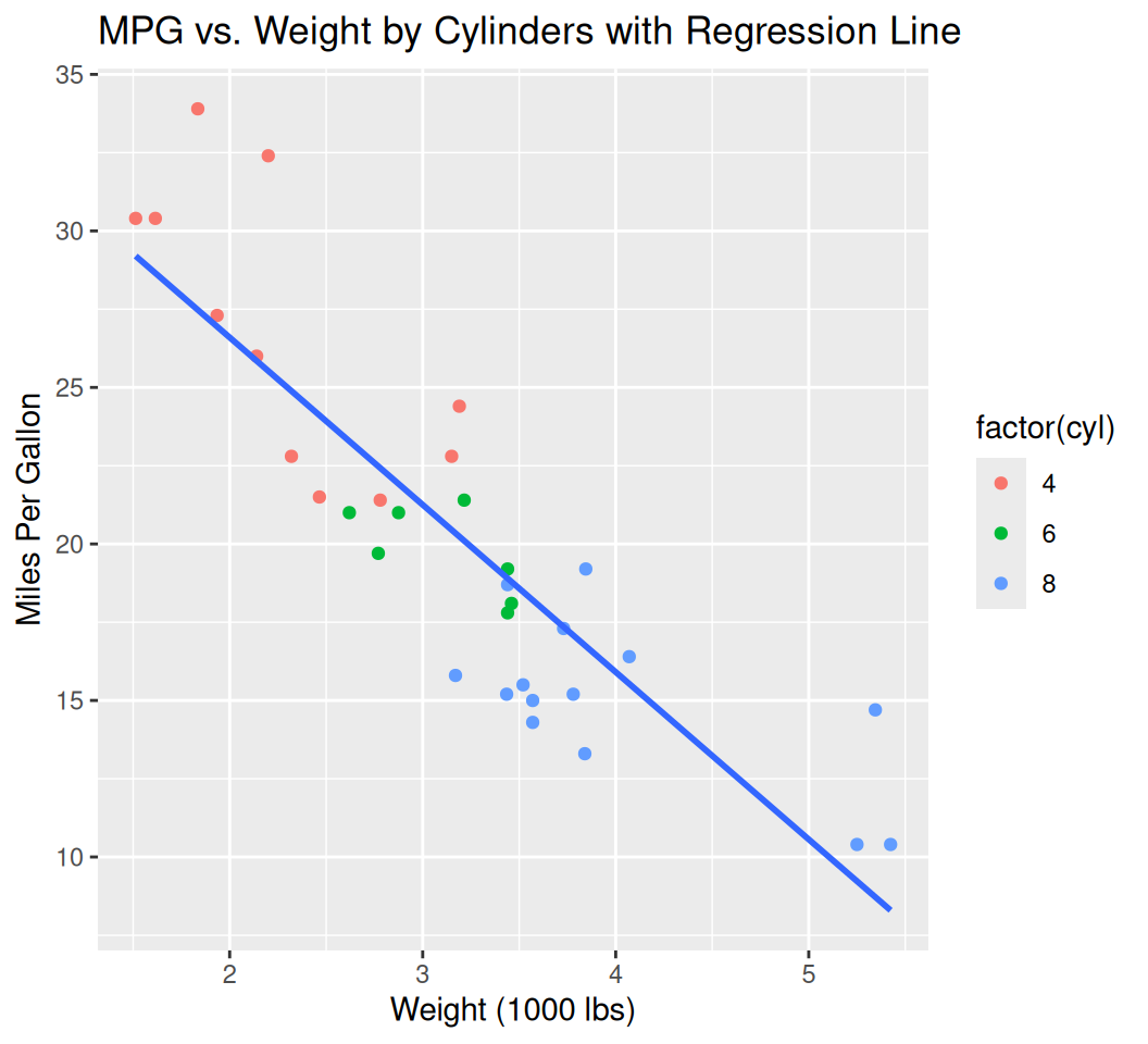
# Use mtcars dataset
data(mtcars)

# Perform linear regression to get equation and R-squared
lm_model <- lm(mpg ~ wt, data = mtcars)
slope <- round(coef(lm_model)[2], 2)
intercept <- round(coef(lm_model)[1], 2)
r_squared <- round(summary(lm_model)$r.squared, 3)

# Create equation and R-squared text for annotation
eq_text <- paste0("y = ", slope, "x + ", intercept)
r2_text <- paste0("R² = ", r_squared)
annotation_text <- paste(eq_text, r2_text, sep = "\n")

# Create the plot
linear_trend_plot <- ggplot(data = mtcars, aes(x = wt, y = mpg)) +
  geom_point(color = "blue", size = 3) +  # Scatter points
  geom_smooth(method = "lm", color = "red", se = TRUE) +  # Linear trend with confidence interval
  annotate("text", x = max(mtcars$wt) * 0.8, y = max(mtcars$mpg) * 0.9,
           label = annotation_text, hjust = 0, vjust = 1, size = 5) +  # Add equation and R²
  labs(title = "Linear Regression: MPG vs Weight",
       x = "Weight (1000 lbs)",
       y = "Miles Per Gallon") +
  theme_minimal()
print(linear_trend_plot)
`geom_smooth()` using formula = 'y ~ x'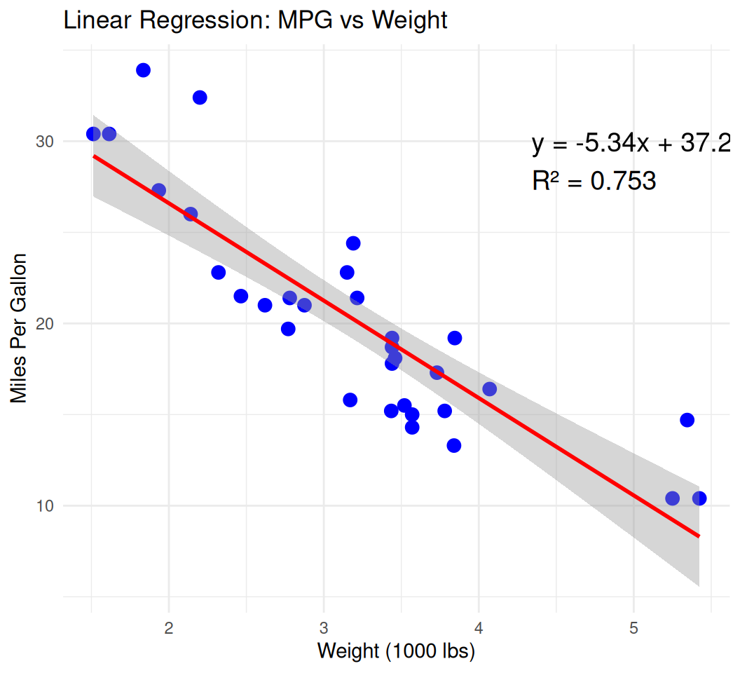
data(economics)

basic_line_smooth <- ggplot(data = economics, aes(x = date, y = unemploy)) +
  geom_line(color = "gray", alpha = 0.7) +  # Raw line for reference
  geom_smooth(method = "loess", color = "blue", se = TRUE) +  # Smooth line with confidence interval
  labs(title = "US Unemployment Rate Over Time",
       x = "Date",
       y = "Unemployment Rate (thousands)") +
  theme_minimal()
print(basic_line_smooth)
`geom_smooth()` using formula = 'y ~ x'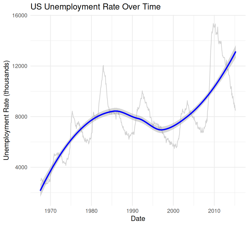
# Example with multiple smoothers (no points/lines for clarity)
multi_smooth_plot <- ggplot(data = economics[1:100, ], aes(x = date, y = psavert)) +  # Subset for clarity
  geom_smooth(method = "lm", aes(color = "Linear"), se = FALSE) +
  geom_smooth(method = "loess", aes(color = "Loess"), se = FALSE) +
  geom_smooth(method = "lm", formula = y ~ poly(x, 2), aes(color = "Quadratic"), se = FALSE) +
  labs(title = "Multiple Smooth Lines: Savings Rate Trends",
       x = "Date",
       y = "Personal Savings Rate (%)",
       color = "Smoother Type") +
  theme_minimal()
print(multi_smooth_plot)
`geom_smooth()` using formula = 'y ~ x'
`geom_smooth()` using formula = 'y ~ x'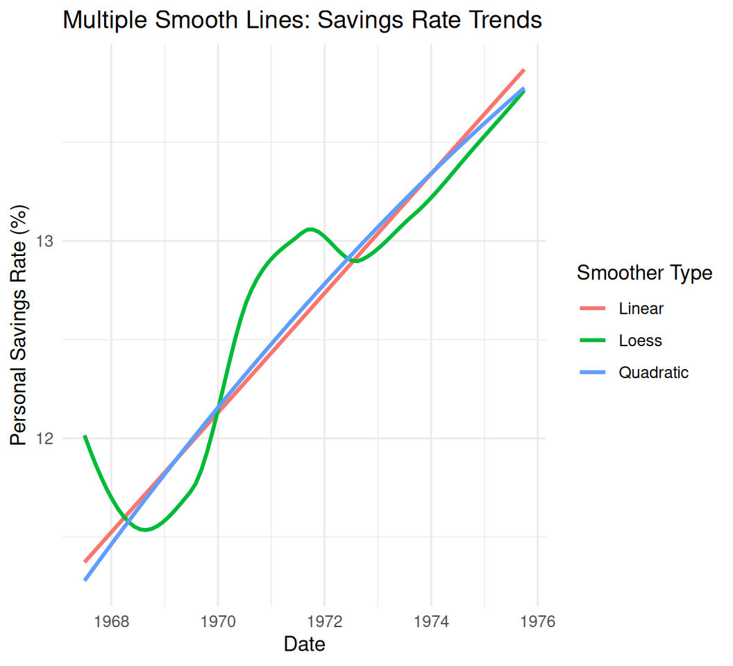
You can add text labels, arrows, or lines to highlight specific points or regions.
#
ggplot(data = mtcars, aes(x = wt, y = mpg)) +
  geom_point() +
  annotate("text", x = 4, y = 15, label = "Lower MPG for heavier cars", color = "red", size = 4) +
  annotate("segment", x = 3.5, y = 18, xend = 4.5, yend = 13, arrow = arrow(length = unit(0.2, "cm"))) +
  labs(title = "MPG vs. Weight with Annotation", x = "Weight (1000 lbs)", y = "Miles Per Gallon")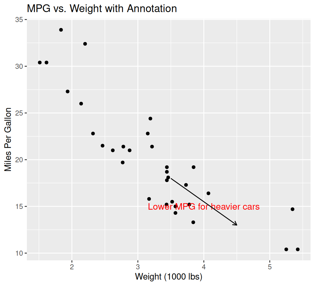
library(lubridate)
Attaching package: 'lubridate'The following objects are masked from 'package:base':
date, intersect, setdiff, union# Use economics data
ggplot(ggplot2::economics, aes(x = date, y = psavert)) +
geom_line(color = "blue") +
scale_x_date(date_breaks = "2 years", date_labels = "%Y") +
labs(title = "Personal Savings Rate Over Time", x = "Year", y = "Savings Rate (%)") +
theme_minimal()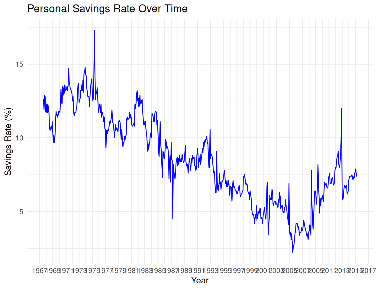
library(ggplot2)

# Normalize two variables to [0,1] for dual axis
econ <- ggplot2::economics %>%
  mutate(
    unemploy_scaled = (unemploy - min(unemploy)) / diff(range(unemploy)),
    psavert_scaled = (psavert - min(psavert)) / diff(range(psavert))
  )

ggplot(econ, aes(x = date)) +
  geom_line(aes(y = unemploy_scaled, color = "Unemployment")) +
  geom_line(aes(y = psavert_scaled, color = "Savings Rate")) +
  scale_color_manual(values = c("Unemployment" = "red", "Savings Rate" = "blue")) +
  scale_y_continuous(
    name = "Unemployment (scaled)",
    sec.axis = sec_axis(~., name = "Personal Savings Rate (scaled)")
  ) +
  labs(title = "Unemployment vs Personal Savings Rate (Scaled)", color = "Variable") +
  theme_minimal()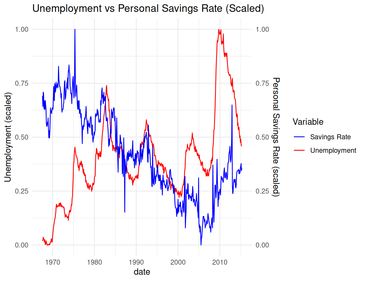
⚠️ Note: Dual axes can mislead — use only when variables are meaningfully related or normalized.
Combine different plot types in one.
ggplot(mtcars, aes(x = factor(cyl), y = mpg)) +
  geom_boxplot(fill = "lightblue", alpha = 0.6) +
  geom_jitter(width = 0.2, aes(color = factor(am)), size = 3) +
  labs(title = "MPG by Cylinder with Individual Points", color = "Transmission") +
  theme_minimal()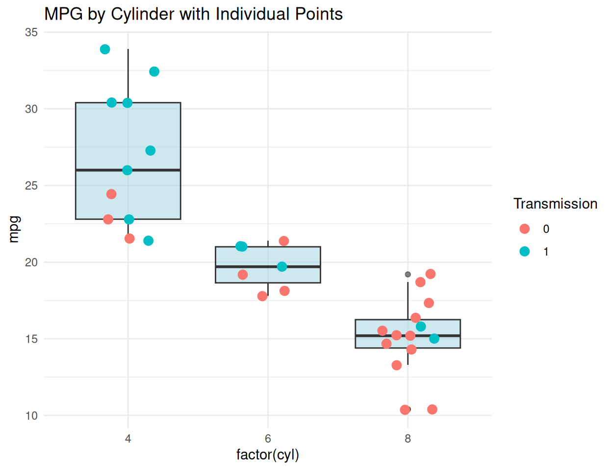
patchworkInstall patchwork for easy subplot layouts.
library(patchwork)

p1 <- ggplot(mtcars, aes(x = wt, y = mpg)) + geom_point() + ggtitle("Weight vs MPG")
p2 <- ggplot(mtcars, aes(x = hp, y = mpg)) + geom_point() + ggtitle("HP vs MPG")
p3 <- ggplot(mtcars, aes(x = factor(cyl))) + geom_bar() + ggtitle("Cars by Cylinders")

# Arrange plots
(p1 + p2) / p3  # top row: p1 and p2; bottom: p3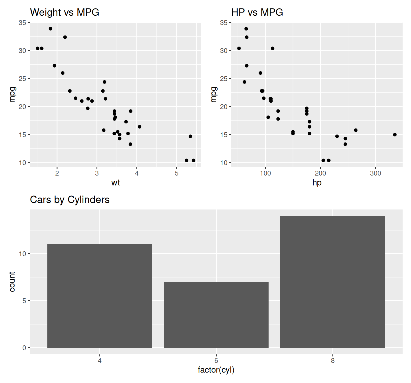
# Or use plot_layout
p1 + p2 + p3 + plot_layout(ncol = 2)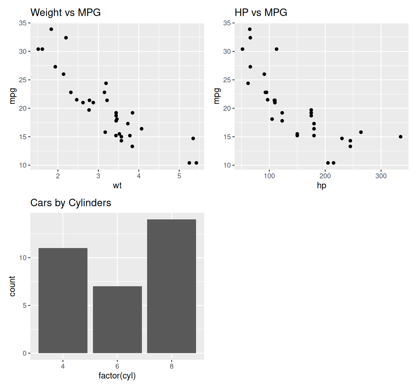
Flip axes or use polar coordinates.
# Flip axes
ggplot(mtcars, aes(x = factor(cyl), y = mpg)) +
  geom_boxplot() +
  coord_flip() +
  labs(title = "MPG by Cylinder (Flipped Coordinates)") +
  theme_minimal()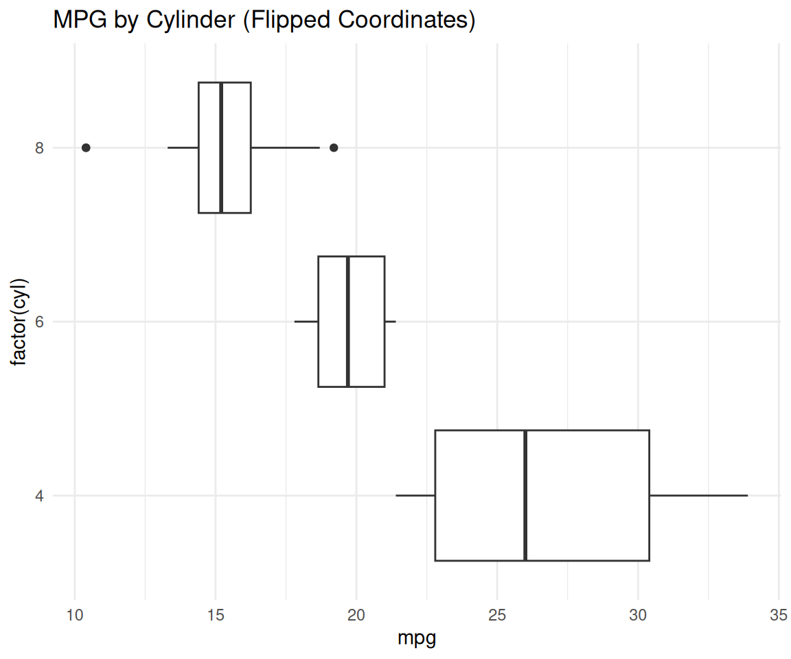
# Polar plot (example: bar plot in polar)
ggplot(mtcars, aes(x = factor(cyl))) +
  geom_bar() +
  coord_polar() +
  labs(title = "Cars by Cylinder (Polar Coordinates)") +
  theme_void()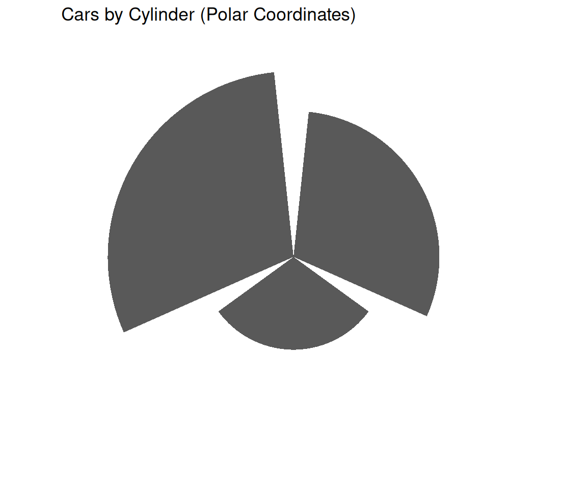
ggrepel, gganimate, ggthemesggrepel#install.packages("ggrepel")
library(ggrepel)
ggplot(mtcars, aes(x = wt, y = mpg, label = rownames(mtcars))) +
geom_point() +
geom_text_repel() +
labs(title = "Cars Labeled Without Overlap") +
theme_minimal()Warning: ggrepel: 1 unlabeled data points (too many overlaps). Consider
increasing max.overlaps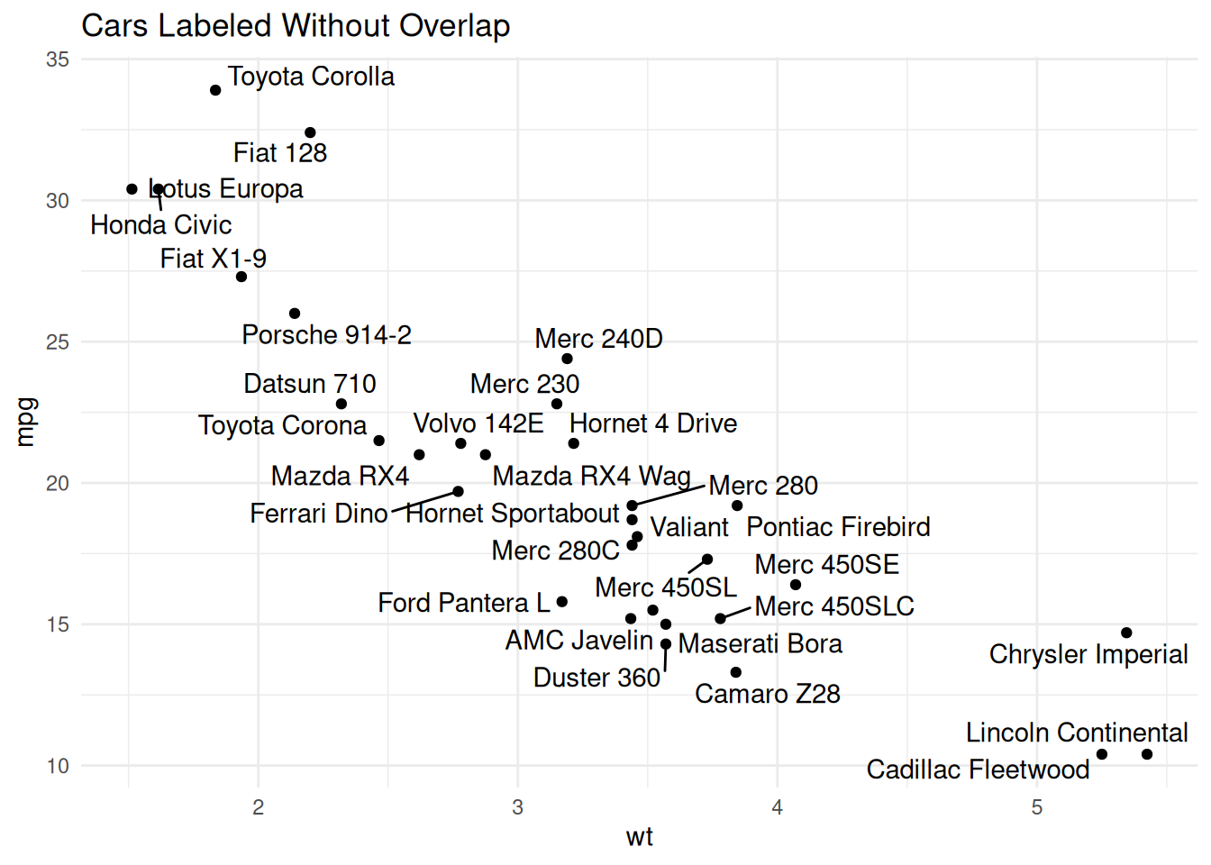
You can save your plots to various file formats using ggsave().
my_plot <- ggplot(data = mtcars, aes(x = disp, y = mpg, color = factor(cyl))) +
  geom_point() +
  labs(title = "MPG vs. Displacement", x = "Displacement", y = "MPG")

ggsave("my_scatter_plot.png", plot = my_plot, width = 7, height = 5, dpi = 300)
# You can specify .pdf, .jpeg, .tiff, etc.ggplot(data, aes(...))aes() for mappings that vary with data (color, size, shape)aes() (e.g., color = "red")labs() for clear titles and axis labelstheme_minimal(), theme_bw()ggsave():This tutorial covers ggplot2 in R, from basic to advanced plotting using the mtcars and economics datasets. It starts with simple scatter plots, introducing ggplot(), aes(), and geom_point(). Aesthetics like color and size encode variables, while faceting splits plots by categories. Trend lines (geom_smooth()) show linear and loess fits. Bar plots and boxplots summarize distributions, and advanced techniques include custom themes, multiple geoms, polar coordinates, and saving plots with ggsave(). A final example adds a linear regression line with its equation and R-squared displayed.
ggplot2 is a versatile tool for creating insightful visualizations in R. This tutorial demonstrates its flexibility, from basic scatter and line plots to complex, customized graphics. Users can leverage aesthetics, faceting, and statistical overlays for professional plots. Explore scale_*, coord_*, or packages like ggthemes and plotly for further customization and interactivity, enabling effective data exploration and presentation.
“R for Data Science” by Hadley Wickham — Chapter 3 on Data Visualization
3 ggplot2 extensions gallery: https://exts.ggplot2.tidyverse.org/gallery/