Code
packages <- c('tidyverse',
'DataExplorer',
'janitor'
)![]()

This section of the tutorial will cover the data exploration and visualization using {DataExplorer} package in R. The package is designed to simplify the exploratory data analysis (EDA) process, making it accessible to both novice and experienced data analysts. With its user-friendly interface and extensive functionality, {DataExplorer} is an invaluable resource for anyone looking to gain insights from their data efficiently.
{DataExplorer} simplifies simplifies exploring and visualizing data, particularly for initial exploratory data analysis (EDA) tasks. The package is designed to automate the data exploration process for analytical tasks and predictive modeling, enabling users to focus on understanding data and extracting insights. It meticulously scans and analyzes each variable and presents them visually using typical graphical techniques, such as histograms, scatter plots, and box plots. The package can help with various tasks throughout the data exploration, including Exploratory Data Analysis (EDA), Feature Engineering, and Data Reporting. With its user-friendly interface, DataExplorer enables users to interact with their data quickly and efficiently, facilitating the identification of patterns and outliers that are critical to understanding the data.

install.packages("xfun", lib='drive/My Drive/R/')
devtools::install_github("boxuancui/DataExplorer", lib='drive/My Drive/R/')packages <- c('tidyverse',
'DataExplorer',
'janitor'
)#| warning: false
#| error: false
# Install missing packages
new_packages <- packages[!(packages %in% installed.packages()[,"Package"])]
if(length(new_packages)) install.packages(new_packages)# Verify installation
cat("Installed packages:\n")Installed packages:print(sapply(packages, requireNamespace, quietly = TRUE)) tidyverse DataExplorer janitor
TRUE TRUE TRUE # Load packages with suppressed messages
invisible(lapply(packages, function(pkg) {
suppressPackageStartupMessages(library(pkg, character.only = TRUE))
}))# Check loaded packages
cat("Successfully loaded packages:\n")Successfully loaded packages:print(search()[grepl("package:", search())]) [1] "package:janitor" "package:DataExplorer" "package:lubridate"
[4] "package:forcats" "package:stringr" "package:dplyr"
[7] "package:purrr" "package:readr" "package:tidyr"
[10] "package:tibble" "package:ggplot2" "package:tidyverse"
[13] "package:stats" "package:graphics" "package:grDevices"
[16] "package:utils" "package:datasets" "package:methods"
[19] "package:base" All data set use in this exercise can be downloaded from here We will use read_csv() function of {readr} package to import data as a tidy data.
mf<-read_csv("https://raw.githubusercontent.com/zia207/Data/main/CSV_files/gp_soil_data_na.csv")With the create_report() function of the DataExplorer package, you can effortlessly generate a visually appealing and informative HTML document that summarizes your data. This report can be saved and conveniently opened in your web browser. You can also customize the report to display data in the context of a single most important variable in your dataset. By running the create_report() function on two different datasets, you can easily observe how the report presents the data in a distinct manner for each input. This feature makes it a powerful tool for data analysis, as it helps you to identify patterns and trends in your data swiftly and efficiently.
df  |>  dplyr::select(NLCD, SOC, DEM, MAP, MAT, NDVI)  |>
create_report(y = "SOC")Instead of running create_report, you may also run each function individually for your analysis, e.g.,
introduce() function describe basic information for input data.
mf  |>
  dplyr::select(NLCD, SOC, DEM, MAP, MAT, NDVI)  |>
  introduce()
# A tibble: 1 × 9
rows columns discrete_columns continuous_columns all_missing_columns
<int> <int> <int> <int> <int>
1 471 6 1 5 0
# ℹ 4 more variables: total_missing_values <int>, complete_rows <int>,
# total_observations <int>, memory_usage <dbl>plot_intro() Plot basic information (from introduce) for input data.
mf  |>
  dplyr::select(NLCD, SOC, DEM, MAP, MAT, NDVI)  |>
  plot_intro()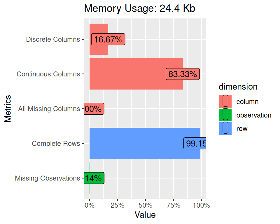
plot_missing() function returns and plots frequency of missing values for each feature.
mf  |>
  dplyr::select(NLCD, SOC, DEM, MAP, MAT, NDVI)  |>
  plot_missing()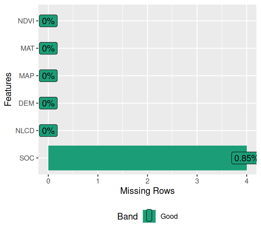
plot_bar() create chart of discrete feature, based on either frequency or another continuous feature.
mf  |>
  dplyr::select(NLCD, SOC, NDVI)  |>
  plot_bar()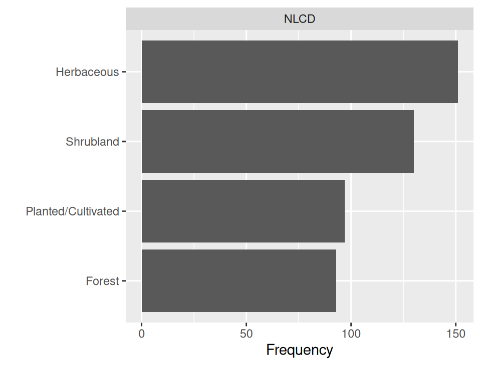
# View frequency distribution with a continuous variable
mf  |>
  dplyr::select(NLCD, SOC)  |>
  plot_bar(with = 'SOC')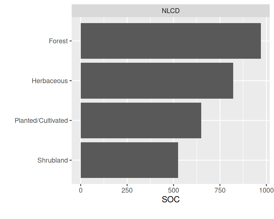
# View frequency distribution by a discrete variable
mf  |>
  dplyr::select(NLCD, FRG)  |>
  plot_bar(by = 'FRG', by_position = "dodge")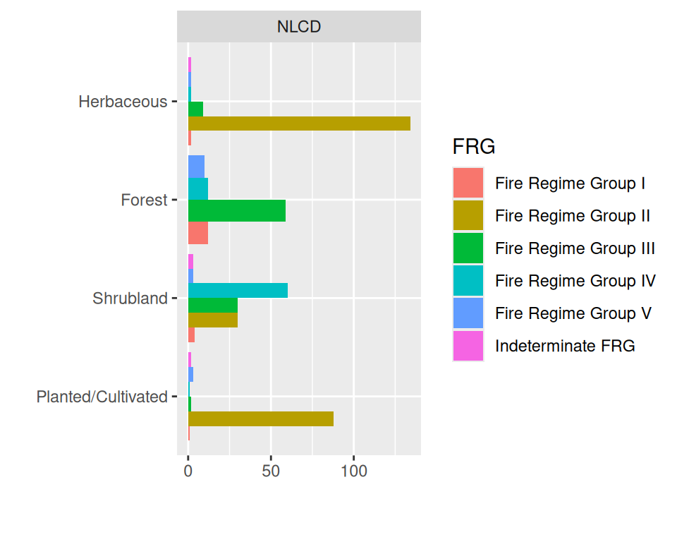
plot_histogram() create histogram for each continuous feature
mf  |>
  dplyr::select(SOC, DEM, MAP, MAT, NDVI, KFactor, Slope, TPI)  |>
  plot_histogram()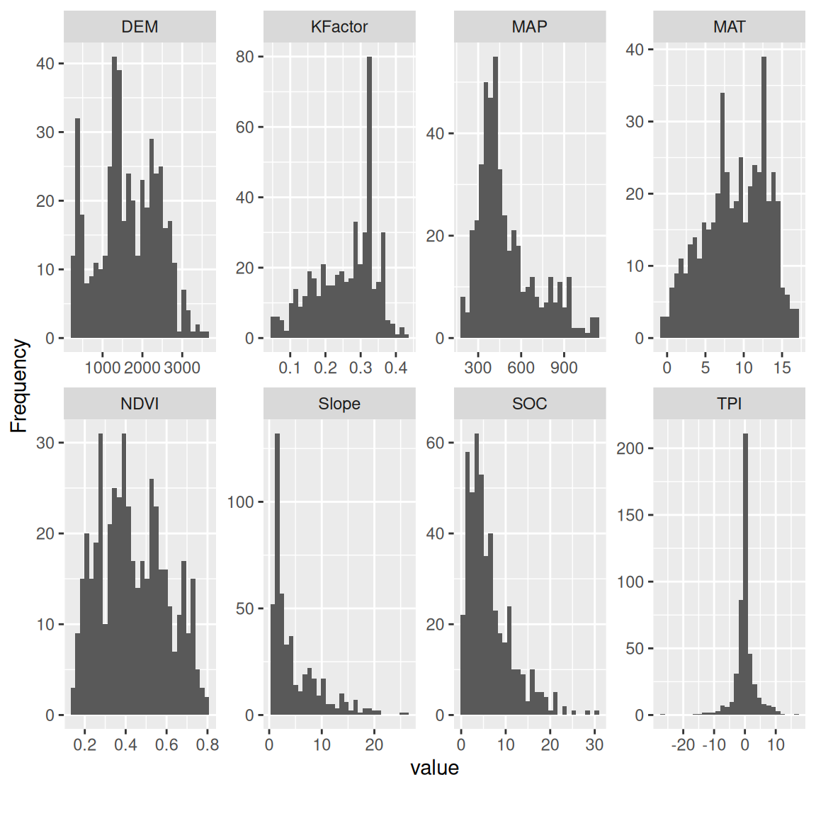
plot_density() plot estimated density distribution of all continuous variables
mf  |>
  dplyr::select(SOC, DEM, MAP, MAT, NDVI, KFactor, Slope, TPI)  |>
  plot_density()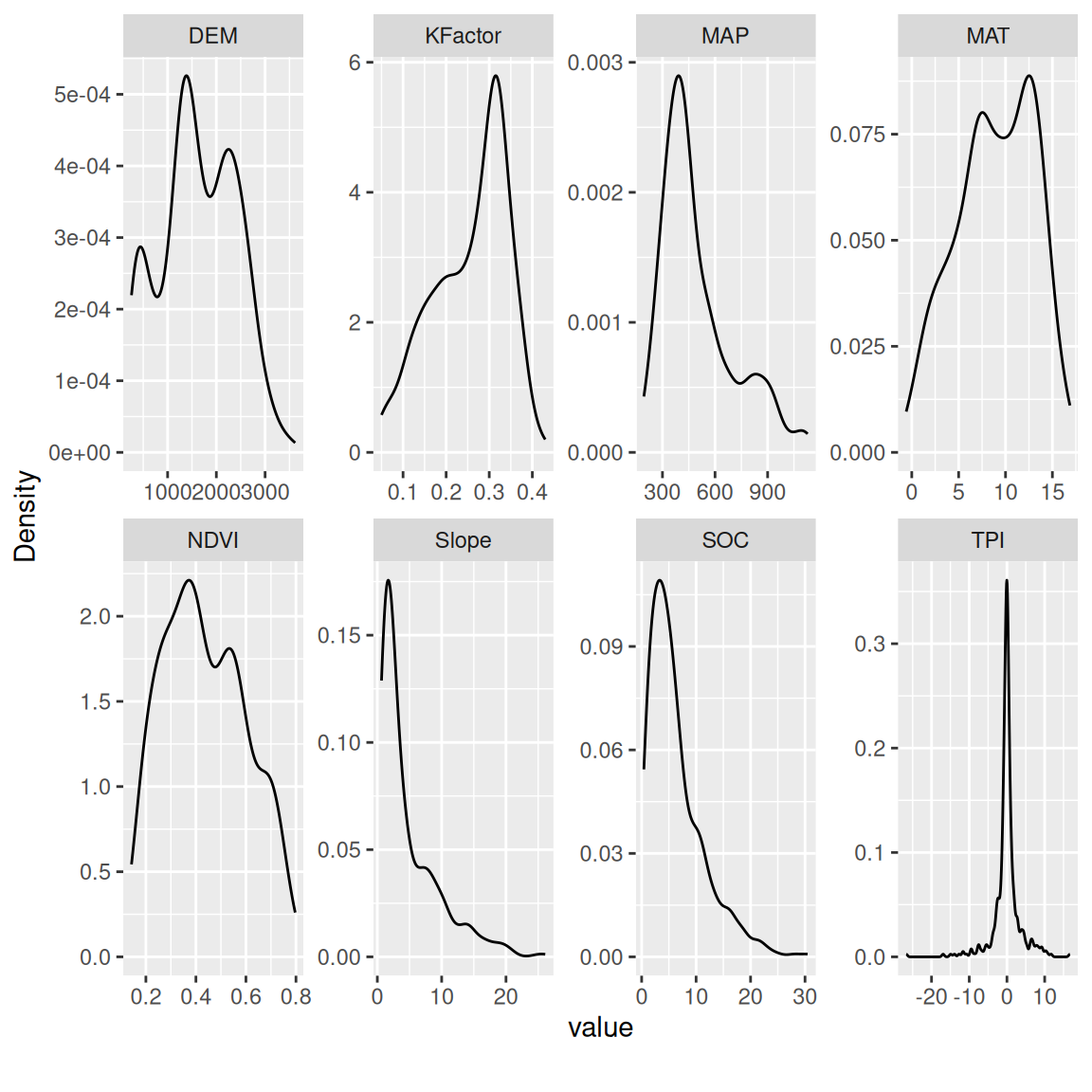
plot_qq() create quantile-quantile plot of all continuous variables
mf  |>
  dplyr::select(SOC, DEM, MAP, MAT, NDVI, KFactor, Slope, TPI)  |>
  plot_qq()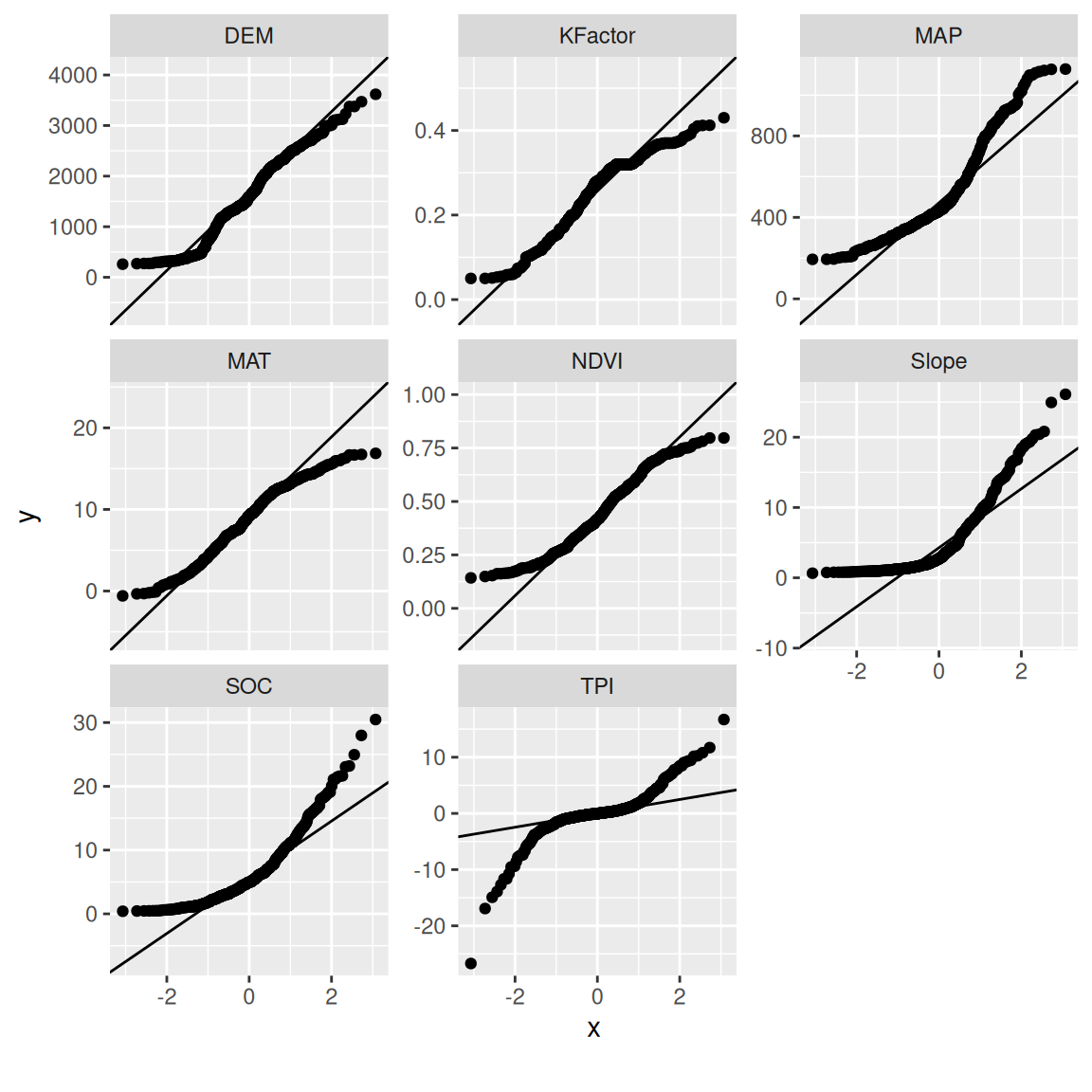
We can view quantile-quantile plot of all continuous variables by feature NLCD
mf  |>
  dplyr::select(SOC, DEM, MAP, MAT, NDVI, KFactor, Slope, TPI, NLCD)  |>
  plot_qq(by = 'NLCD')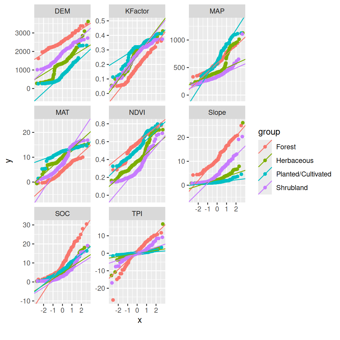
plot_correlation function creates a correlation heatmap for all discrete categories.
mf  |>
  dplyr::select(SOC, DEM, MAP, MAT, NDVI, KFactor, Slope, TPI)  |>
  plot_correlation()
plot_boxplot() function creates boxplot for each continuous feature based on a selected feature.
mf  |>
  dplyr::select(SOC, DEM, MAP, MAT, NDVI, KFactor, Slope, TPI, NLCD)  |>
  plot_boxplot(by = 'NLCD')
`plot_scatterplot() function creates scatterplot for all features fixing on a selected feature.
mf  |>
  dplyr::select(SOC, DEM, MAP, MAT, NDVI, KFactor, Slope, TPI)  |>
  plot_scatterplot( by = "SOC")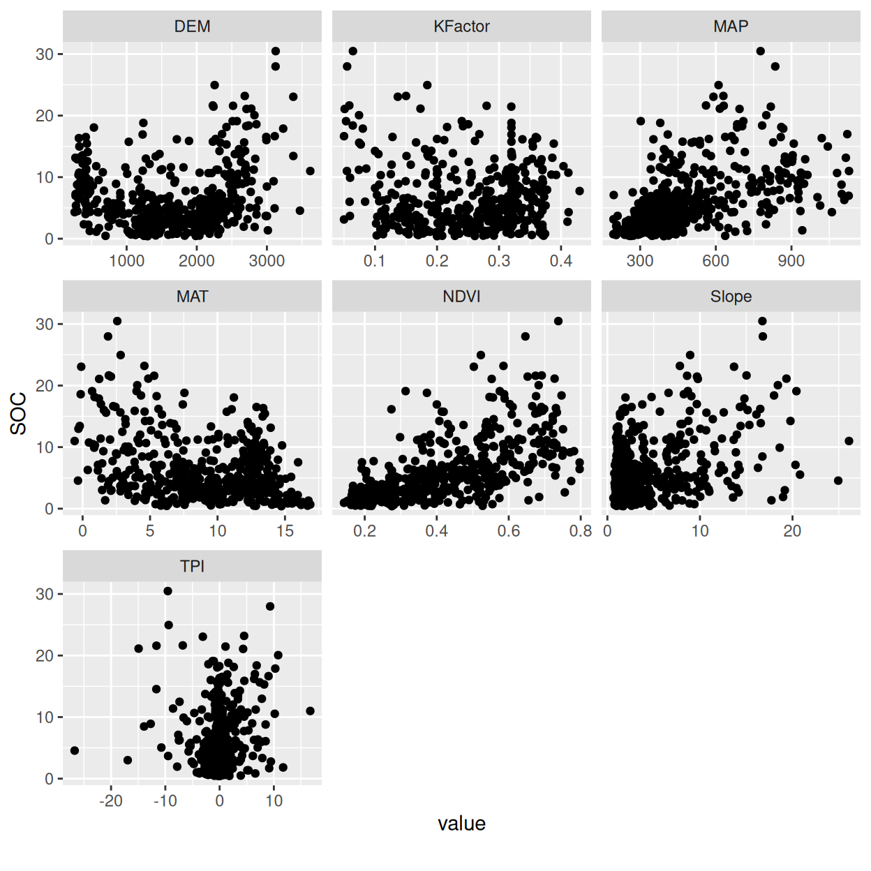
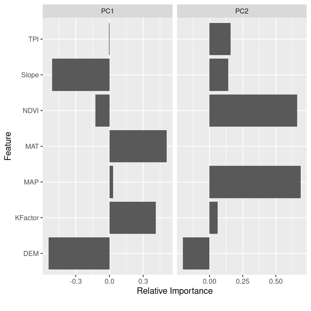
Principal Component Analysis (PCA) is a widely used data analysis technique that helps identify the underlying patterns and relationships between variables in a dataset. The primary goal of PCA is to simplify complex datasets by reducing the number of variables while preserving as much of the original data as possible. This technique is advantageous when dealing with datasets with many variables, some of which may be highly correlated.
PCA transforms the original dataset into a new set of variables called principal components. These principal components are uncorrelated with each other and are ordered in terms of the amount of variance they explain in the original dataset. The first principal component accounts for the most variance, followed by the second, and so on. By selecting only the principal components that explain the majority of the variance, we can reduce the dimensionality of the dataset while retaining most of the information.
Overall, PCA is a powerful tool for data analysts and scientists who need to explore complex datasets with many variables. Reducing the dimensionality of the data can help identify underlying patterns and relationships that might otherwise be difficult to detect.
plot_prcomp() visualize output of principal component analysis
mf  |>
  dplyr::select(DEM, MAP, MAT, NDVI, KFactor, Slope, TPI)  |>
  plot_prcomp ()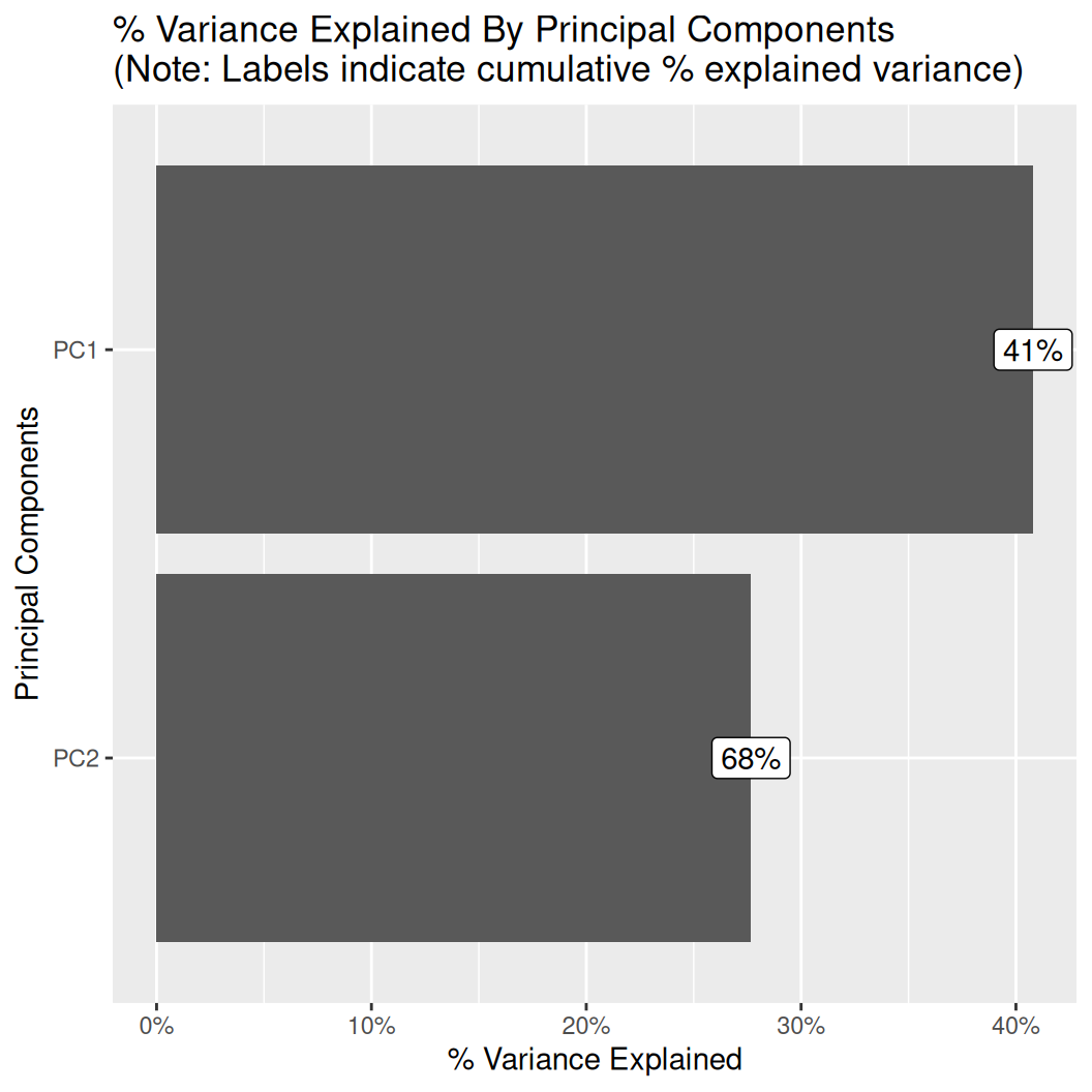
Feature engineering is an essential process in preparing data for machine learning models. It involves creating or modifying new features to improve the model’s performance. The process requires a deep understanding of the data and the problem.
Practical feature engineering can significantly improve the accuracy and generalization of the model. It helps the machine learning model to identify and extract relevant information from the data. Feature engineering can also help to reduce overfitting, which occurs when the model is too closely matched to the training data and, as a result, performs poorly on the test data.
Some standard techniques used in feature engineering include feature scaling, feature extraction, and feature selection. Feature scaling helps to normalize the data by transforming it to a standard scale. Feature extraction involves transforming raw data into features that can be used for modeling. Feature selection involves identifying and selecting the most relevant features that contribute the most to the model’s performance while discarding the redundant ones.
Some of the commonly used techniques in feature engineering are:
Feature scaling: This involves scaling the features to a specific range to ensure they are on the same scale and have equal weightage during model training.
One-hot encoding: This technique converts categorical variables into dummy variables that can be used in mathematical equations.
Feature extraction: Extracting important features from raw data using techniques like PCA, LDA, or t-SNE.
4.Imputation: This technique is used to fill in missing values in the dataset, which can be done using mean, median, or mode.
These techniques can help improve the performance and accuracy of machine learning models by creating better features that accurately represent the underlying data.
When dealing with data containing a large number of small categories in a variable, it can be challenging to analyze and make sense of the information. However, one helpful technique is to aggregate these small categories into a single category named “OTHER.” This process involves selecting the specific variable you want to modify and setting a threshold to determine what percentage of the data should be included in the “OTHER” category. By doing this, you can reduce the number of categories you have to deal with, simplify your data analysis, and make it easier to draw meaningful conclusions from your data.
The variable FRG has 3 categories, all of which have less then 5% of observations. Cumulatively (together) they add up to 9%. Thus, we can use 9% as a threshold and end up with only 4 groups.
janitor::tabyl(mf$FRG)  |>
  mutate(percent = round(percent*100)) |>
  arrange(-percent)
mf$FRG n percent
Fire Regime Group II 252 54
Fire Regime Group III 100 21
Fire Regime Group IV 75 16
Fire Regime Group I 19 4
Fire Regime Group V 18 4
Indeterminate FRG 7 1group_category() function will group the sparse categories for a discrete feature based on a given threshold.
mf_bla <- group_category(
  mf,
  feature = "FRG",
  threshold = 0.09,
update = T)janitor::tabyl(mf_bla$FRG) %>%
mutate(percent = round(percent*100)) %>%
arrange(-percent) mf_bla$FRG n percent
Fire Regime Group II 252 54
Fire Regime Group III 100 21
Fire Regime Group IV 75 16
OTHER 44 9Dummification, also referred to as one-hot encoding, is a popular technique used in feature engineering to convert categorical variables into binary vectors. When working with machine learning models that require numerical input, categorical data cannot be directly processed. Therefore, dummification is used to create binary columns, also known as dummy variables, for each category present in the categorical variable. This technique creates a separate column for each category, where the presence of a binary digit represents the presence or absence of the category. This process is particularly useful in creating a more meaningful representation of categorical data, which can be further used in machine learning models for better predictions.
dummify() turns each category to a distinct column with binary (numeric) values.
mf  |>
  dplyr::select(SOC, DEM, NLCD)  |>
  dummify(select = "NLCD") |>
  glimpse()
Rows: 471
Columns: 6
$ SOC <dbl> 15.763, 15.883, 18.142, 10.745, 10.479, 16.987…
$ DEM <dbl> 2229.079, 1889.400, 2423.048, 2484.283, 2396.1…
$ NLCD_Forest <int> 0, 0, 1, 1, 1, 1, 1, 0, 1, 1, 1, 0, 1, 1, 0, 0…
$ NLCD_Herbaceous <int> 0, 0, 0, 0, 0, 0, 0, 0, 0, 0, 0, 0, 0, 0, 0, 0…
$ NLCD_Planted.Cultivated <int> 0, 0, 0, 0, 0, 0, 0, 0, 0, 0, 0, 0, 0, 0, 0, 0…
$ NLCD_Shrubland <int> 1, 1, 0, 0, 0, 0, 0, 1, 0, 0, 0, 1, 0, 0, 1, 1…This tutorial guides you through exploring datasets using DataExplorer. It simplifies the EDA process with its one-stop solution for data profiling, summary statistics, and visualizations. The package generates insightful reports and visualizations with minimal code, making it accessible to users with varying skill levels. ‘DataExplorer’ handles missing data, detects outliers, and visualizes variable distribution. The interactive and intuitive nature of the generated reports allows for a dynamic exploration of data characteristics. As you integrate ‘DataExplorer’ into your data exploration workflow, explore its advanced features, such as the plot_multi() function for multivariate visualizations and the plot_str() function for visualizing variable structures. Remember, ‘DataExplorer’ simplifies and enhances the EDA process, making it an excellent choice for users seeking a straightforward yet powerful tool. With the skills acquired in this tutorial, you will be well-equipped to conduct thorough and efficient data explorations.