Code
# Load tidyverse
library(tidyverse)
# define data folder
dataFolder<-"E:/Dropbox/GitHub/Data/USA/"
# Load data
mf<-read.csv(paste0(dataFolder, "gp_soil_data_na.csv"), header=TRUE)In this exercise you will learn some important steps of data exploration and visualization with R.
In this exercise we will use following data set. The data set has missing values.
# Load tidyverse
library(tidyverse)
# define data folder
dataFolder<-"E:/Dropbox/GitHub/Data/USA/"
# Load data
mf<-read.csv(paste0(dataFolder, "gp_soil_data_na.csv"), header=TRUE)In R, the str() function is a useful tool for examining the structure of an object. It provides a compact and informative description of the object’s internal structure, including its type, length, dimensions, and contents.
str(mf)'data.frame': 471 obs. of 19 variables:
$ ID : int 1 2 3 4 5 6 7 8 9 10 ...
$ FIPS : int 56041 56023 56039 56039 56029 56039 56039 56039 56039 56035 ...
$ STATE_ID : int 56 56 56 56 56 56 56 56 56 56 ...
$ STATE : chr "Wyoming" "Wyoming" "Wyoming" "Wyoming" ...
$ COUNTY : chr "Uinta County" "Lincoln County" "Teton County" "Teton County" ...
$ Longitude: num -111 -111 -111 -111 -111 ...
$ Latitude : num 41.1 42.9 44.5 44.4 44.8 ...
$ SOC : num 15.8 15.9 18.1 10.7 10.5 ...
$ DEM : num 2229 1889 2423 2484 2396 ...
$ Aspect : num 159 157 169 198 201 ...
$ Slope : num 5.67 8.91 4.77 7.12 7.95 ...
$ TPI : num -0.0857 4.5591 2.6059 5.1469 3.7557 ...
$ KFactor : num 0.32 0.261 0.216 0.182 0.126 ...
$ MAP : num 468 536 860 869 803 ...
$ MAT : num 4.595 3.86 0.886 0.471 0.759 ...
$ NDVI : num 0.414 0.694 0.547 0.619 0.584 ...
$ SiltClay : num 64.8 72 57.2 55 51.2 ...
$ NLCD : chr "Shrubland" "Shrubland" "Forest" "Forest" ...
$ FRG : chr "Fire Regime Group IV" "Fire Regime Group IV" "Fire Regime Group V" "Fire Regime Group V" ...In R, the is.na() function is used to test for missing values (NA) in an object. It returns a logical vector indicating which elements of the object are missing.
sum(is.na(mf))[1] 4Dealing with missing values is an important task in data analysis. There are way we can deal with missing values in data. The choice of method depends on the specific dataset and the analysis goals. It’s important to carefully consider each approach’s implications and select the most appropriate method for the data at hand
Here are some common strategies for handling missing data:
Delete the rows or columns with missing data: This is the simplest approach, but it can result in the loss of valuable information if there are many missing values.
Imputation: Imputation involves filling in the missing values with estimated values based on other data points. Standard imputation techniques include mean imputation, median imputation, and regression imputation.
Multiple imputations: This involves creating several imputed datasets and analyzing each separately, then combining the results to obtain a final estimate.
Modeling: This involves building a predictive model that can estimate the missing values based on other variables in the dataset.
Domain-specific knowledge: Sometimes, domain-specific knowledge can help to fill in missing values. For example, if a person’s age is missing but their date of birth is available, their age can be calculated based on the current date.
In this exercise, we only show to remove missing values in data-frame. Later we will show you how to impute these missing values with machine learning.
We can remove missing values from a data frame using the na.omit() function. This function removes any rows that contain missing values (NA values) in any column.
Here’s an example to remove missing values:
df<-na.omit(mf)
sum(is.na(df))
[1] 0Descriptive statistics are used to summarize and describe the main features of a dataset. Some common descriptive statistics include measures of central tendency (such as mean, median, and mode), measures of variability (such as variance, standard deviation, and range), and measures of shape (such as skewness and kurtosis).
The summarize() function in R is used to create summary statistics of a data frame or a grouped data frame. This function can be used to calculate a variety of summary statistics, including mean, median, minimum, maximum, standard deviation, and percentiles.
The basic syntax for using the summarize function is as follows:
summary(df) ID FIPS STATE_ID STATE
Min. : 1.0 Min. : 8001 Min. : 8.0 Length:467
1st Qu.:120.5 1st Qu.: 8109 1st Qu.: 8.0 Class :character
Median :238.0 Median :20193 Median :20.0 Mode :character
Mean :237.9 Mean :29151 Mean :29.1
3rd Qu.:356.5 3rd Qu.:56001 3rd Qu.:56.0
Max. :473.0 Max. :56045 Max. :56.0
COUNTY Longitude Latitude SOC
Length:467 Min. :-111.01 Min. :31.51 Min. : 0.408
Class :character 1st Qu.:-107.54 1st Qu.:37.19 1st Qu.: 2.769
Mode :character Median :-105.31 Median :38.75 Median : 4.971
Mean :-104.48 Mean :38.86 Mean : 6.351
3rd Qu.:-102.59 3rd Qu.:41.04 3rd Qu.: 8.713
Max. : -94.92 Max. :44.99 Max. :30.473
DEM Aspect Slope TPI
Min. : 258.6 Min. : 86.89 Min. : 0.6493 Min. :-26.708651
1st Qu.:1175.3 1st Qu.:148.79 1st Qu.: 1.4507 1st Qu.: -0.804917
Median :1592.9 Median :164.04 Median : 2.7267 Median : -0.042385
Mean :1632.0 Mean :165.34 Mean : 4.8399 Mean : 0.009365
3rd Qu.:2238.3 3rd Qu.:178.81 3rd Qu.: 7.1353 3rd Qu.: 0.862883
Max. :3618.0 Max. :255.83 Max. :26.1042 Max. : 16.706257
KFactor MAP MAT NDVI
Min. :0.0500 Min. : 193.9 Min. :-0.5911 Min. :0.1424
1st Qu.:0.1933 1st Qu.: 354.2 1st Qu.: 5.8697 1st Qu.:0.3083
Median :0.2800 Median : 433.8 Median : 9.1728 Median :0.4172
Mean :0.2558 Mean : 500.9 Mean : 8.8795 Mean :0.4368
3rd Qu.:0.3200 3rd Qu.: 590.7 3rd Qu.:12.4443 3rd Qu.:0.5566
Max. :0.4300 Max. :1128.1 Max. :16.8743 Max. :0.7970
SiltClay NLCD FRG
Min. : 9.162 Length:467 Length:467
1st Qu.:42.933 Class :character Class :character
Median :52.194 Mode :character Mode :character
Mean :53.813
3rd Qu.:62.878
Max. :89.834 We will create table some important statistics of heavy metals. We use select() and summarise_all() functions from dplyr and pivot_longer() from tidyr packages. Then we will create a publication quality table using flextable package.
install.packages (“flextable”)
summary_stat <- df %>%
  # First select  numerical columns
  dplyr::select(SOC, DEM, SOC, Slope, Aspect, TPI, KFactor, MAP, MAT, NDVI, SiltClay) %>%
  # get summary statistics
  dplyr::summarise_all(funs(Min = round(min(.),2),
                      Q25 = round(quantile(., 0.25),2),
                      Median = round(median(.),2),
                      Q75 = round(quantile(., 0.75),2),
                      Max = round(max(.),2),
                      Mean = round(mean(.),2),
                      SD = round(sd(.),3))) %>%
                # create a nice looking table
                tidyr::pivot_longer(everything(),
                            names_sep = "_",
                            names_to = c( "variable", ".value"))

# Load library
library(flextable)
# Create a table
flextable::flextable(summary_stat, theme_fun = theme_booktabs)
variable | Min | Q25 | Median | Q75 | Max | Mean | SD |
|---|---|---|---|---|---|---|---|
SOC | 0.41 | 2.77 | 4.97 | 8.71 | 30.47 | 6.35 | 5.045 |
DEM | 258.65 | 1,175.33 | 1,592.89 | 2,238.27 | 3,618.02 | 1,632.03 | 770.288 |
Slope | 0.65 | 1.45 | 2.73 | 7.14 | 26.10 | 4.84 | 4.703 |
Aspect | 86.89 | 148.79 | 164.04 | 178.81 | 255.83 | 165.34 | 24.384 |
TPI | -26.71 | -0.80 | -0.04 | 0.86 | 16.71 | 0.01 | 3.578 |
KFactor | 0.05 | 0.19 | 0.28 | 0.32 | 0.43 | 0.26 | 0.086 |
MAP | 193.91 | 354.18 | 433.80 | 590.73 | 1,128.11 | 500.85 | 207.089 |
MAT | -0.59 | 5.87 | 9.17 | 12.44 | 16.87 | 8.88 | 4.102 |
NDVI | 0.14 | 0.31 | 0.42 | 0.56 | 0.80 | 0.44 | 0.162 |
SiltClay | 9.16 | 42.93 | 52.19 | 62.88 | 89.83 | 53.81 | 17.214 |
The gtsummary package provides an elegant and flexible way to create publication-ready analytical and summary tables using the R programming language. This package summarizes data sets, regression models, and more, using sensible defaults with highly customizable capabilities.

install.packages(“gtsummary”)
For creating a summary table using the tbl_summary() function use data as input and returns a summary table. We will SOC data with some missing values (mf). For example:
library(gtsummary)
mf %>% dplyr::select(NLCD, SOC, DEM, MAP, MAT, NDVI ) %>%
gtsummary::tbl_summary()| Characteristic | N = 4711 |
|---|---|
| NLCD | |
| Forest | 93 (20%) |
| Herbaceous | 151 (32%) |
| Planted/Cultivated | 97 (21%) |
| Shrubland | 130 (28%) |
| SOC | 5.0 (2.8, 8.7) |
| Unknown | 4 |
| DEM | 1,593 (1,175, 2,234) |
| MAP | 433 (353, 590) |
| MAT | 9.2 (5.9, 12.4) |
| NDVI | 0.42 (0.31, 0.56) |
| 1 n (%); Median (IQR) | |
There are several ways you can customize the output table. Here below some example:
#| warning: false
#| error: false

library(gtsummary)
mf %>% dplyr::select(NLCD, NLCD, SOC, DEM, MAP, MAT, NDVI) %>%
  gtsummary::tbl_summary(by = NLCD,
                          statistic = list(
                          all_continuous() ~ "{mean} ({sd})",
                          all_categorical() ~ "{n} / {N} ({p}%)"
                          ),
                          missing_text = "Missing-values") %>%
add_p()| Characteristic | Forest, N = 931 | Herbaceous, N = 1511 | Planted/Cultivated, N = 971 | Shrubland, N = 1301 | p-value2 |
|---|---|---|---|---|---|
| SOC | 10.4 (6.8) | 5.5 (3.9) | 6.7 (3.6) | 4.1 (3.7) | <0.001 |
| Missing-values | 0 | 1 | 0 | 3 | |
| DEM | 2,567 (336) | 1,363 (589) | 804 (489) | 1,890 (433) | <0.001 |
| MAP | 593 (157) | 473 (189) | 647 (233) | 354 (109) | <0.001 |
| MAT | 4.7 (3.0) | 10.1 (2.9) | 11.8 (2.1) | 8.3 (4.6) | <0.001 |
| NDVI | 0.57 (0.12) | 0.40 (0.13) | 0.53 (0.12) | 0.31 (0.13) | <0.001 |
| 1 Mean (SD) | |||||
| 2 Kruskal-Wallis rank sum test | |||||
In statistics, a data distribution refers to the pattern of how data points are spread out over a range of values. Understanding the data distribution is important in statistical analysis, as it can help select appropriate statistical tests, detect outliers, and identify patterns and trends. It is often represented graphically using histograms, density, or qq-plots or probability plots.
There are several types of data distributions, including:
Normal distribution: Also known as Gaussian distribution, it is a bell-shaped curve that is symmetric around the mean. It is used to model data that is distributed evenly around the mean, with a few data points on the tails of the distribution.
Skewed distribution: A skewed distribution is one in which the data points are not evenly distributed around the mean. There are two types skewed distributions: positively skewed (skewed to the right) and negatively skewed (skewed to the left). In a positively skewed distribution, the tail of the distribution is longer on the right side, while in a negatively skewed distribution, the tail is longer on the left side.
Bimodal distribution: A bimodal distribution has two peaks or modes, indicating that the data can be divided into two groups with different characteristics.
Uniform distribution: A uniform distribution is one in which all the data points are equally likely to occur. This type of distribution is often used in simulations and random number generation.
Exponential distribution: An exponential distribution describes the time between two events occurring in a Poisson process. It is used to model data with a constant occurrence rate over time.
Here, we’ll describe how to check the normality of the data by visual inspection by:
Histogram
Kernel density Plots
Quantile-Quantile Plots (qq-plot)
A histogram is a graphical representation of the distribution of numerical data. They are commonly used in statistics to show the frequency distribution of a data set for identifying patterns, outliers, and skewness in the data. Histograms are also helpful in visualizing the shape of a distribution, such as whether it is symmetric or skewed, and whether it has one or more peaks.
In R, hist() function is used to create histograms of numerical data. It takes one or more numeric vectors as input and displays a graphical representation of the distribution of the data in the form of a histogram.
We can also create histograms using the ggplot2 package, which is a powerful data visualization tool based on The Grammar of Graphics.
![]()
The ggplot2 allows you to create complex and customizable graphics using a layered approach, which involves building a plot by adding different layers of visual elements. It comes with “tidyverse” package.
hist(df$SOC,
     # plot title
     main = "Histogram of Soil SOC",
     # x-axis title
     xlab= "Soil SOC (mg/g)",
     # y-axis title
     ylab= "Frequency")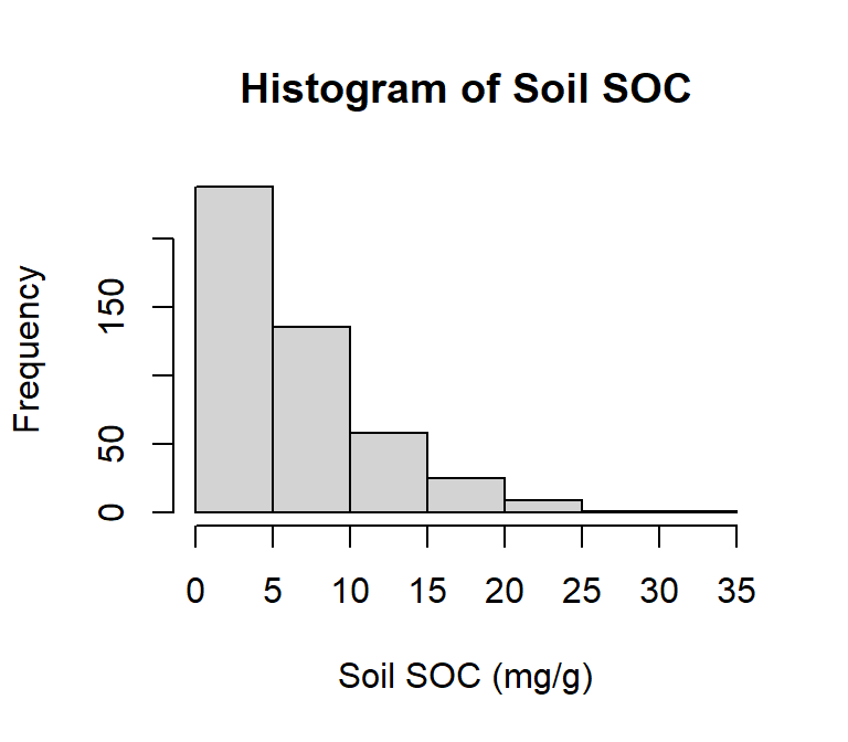
ggplot(df, aes(SOC)) +
  geom_histogram()+
  # X-axis title
  xlab("SOC (mg/g)") +
  # y-axis title
  ylab("Frequency")+
  # plot title
  ggtitle("Histogram of Soil SOC")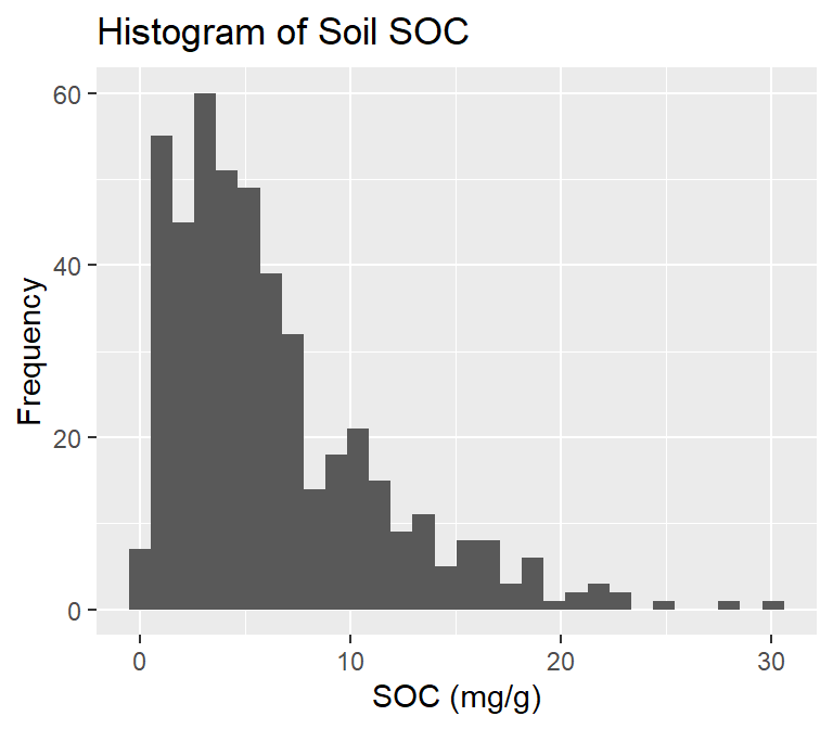
A kernel density plot (or kernel density estimation plot) is a non-parametric way of visualizing the probability density function of a variable. It represents a smoothed histogram version, where the density estimate is obtained by convolving the data with a kernel function. The kernel density plot is a helpful tool for exploring data distribution, identifying outliers, and comparing distributions.
In practice, kernel density estimation involves selecting a smoothing parameter (known as the bandwidth) that determines the width of the kernel function. The choice of bandwidth can significantly impact the resulting density estimate, and various methods have been developed to select the optimal bandwidth for a given dataset.
To create a density plot in R, you can use the density() function to estimate the density of a variable, and then plot it using the plot() function. If you want to use ggplot2, you can create a density plot with the geom_density() function, like this:
# estimate the density
p<-density(df$SOC)
# plot density
plot(p,
    # plot title
     main = "Kernel Density of Soil SOC",
     # x-axis tittle
     xlab= "Soil SOC (mg/kg)",
     # y-axis title
     ylab= "Density")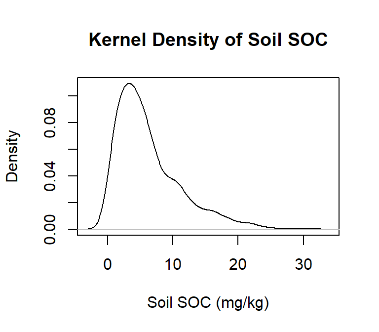
ggplot(df, aes(SOC)) +
  geom_density()+
  # x-axis title
  xlab("SOC (mg/g)") +
  # y-axis title
  ylab("Density")+
  # plot title
  ggtitle("Kernel Density of Soil SOC")+
    theme(
    # Center the plot title
    plot.title = element_text(hjust = 0.5))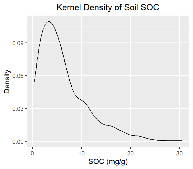
A Q-Q plot (quantile-quantile plot) is a graphical method used to compare two probability distributions by plotting their quantiles against each other. The two distributions being compared are first sorted in ascending order to create a Q-Q plot. Then, the corresponding quantile in the other distribution is calculated for each data point in one distribution. The resulting pairs of quantiles are plotted on a scatter plot, with one distribution’s quantiles on the x-axis and the other on the y-axis. If the two distributions being compared are identical, the points will fall along a straight line.
Probability distribution is a function that describes the likelihood of obtaining different outcomes in a random event. It gives a list of all possible outcomes and their corresponding probabilities. The probabilities assigned to each outcome must add up to 1, as one of the possible outcomes will always occur.
In R, you can create a Q-Q plot using the two functions:
qqnorm() is a generic function the default method of which produces a normal QQ plot of the values in y.
qqline() adds a line to a “theoretical”, by default normal, quantile-quantile plot which passes through the probs quantiles, by default the first and third quartiles.
We can create a QQ plot using the ggplot() and stat_qq() functions and then use stat_qq_line() function to add a line indicating the expected values under the assumption of a normal distribution.
# draw normal QQ plot
qqnorm(df$SOC)
# Add reference or theoretical line
qqline(df$SOC,
      main = "Q-Q plot of Soil SOC from a Normal Distribution",
     # x-axis tittle
     xlab= "Theoretical Quantiles",
     # y-axis title
     ylab= "Sample Quantiles")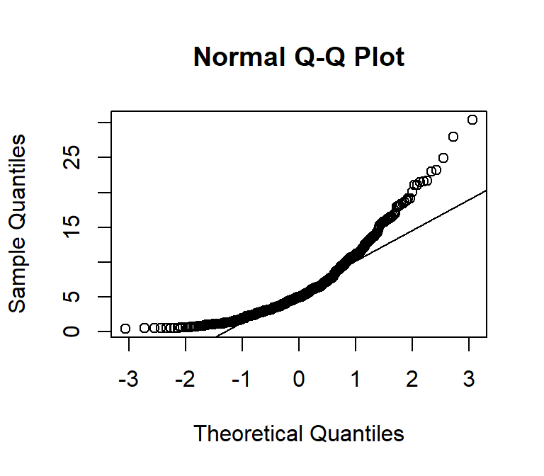
ggplot(df, aes(sample = SOC)) +
  stat_qq() +
  stat_qq_line() +
  # x-axis title
  xlab("Theoretical Quantiles)") +
  # y-axis title
  ylab("Sample Quantiles")+
  # plot title
  ggtitle("Q-Q plot of Soil SOC from a Normal Distribution")+
    theme(
    # Center the plot title
    plot.title = element_text(hjust = 0.5),
    # x-axis title font size
    axis.title.x = element_text(size = 14),
    # y-axis title font size
    axis.title.y = element_text(size = 14),)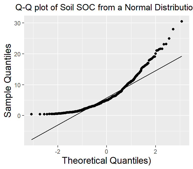
Normality test is used to determine whether a given data sample is derived from a normally distributed population. It is important to note that a normality test does not prove normality but rather provides evidence for or against it. Additionally, even if a dataset passes a normality test, it is still important to visually inspect the data and consider the context of the data before assuming normality.
Statistical tests for normality include:
Shapiro-Wilk test: The Shapiro-Wilk test is a commonly used test to check for normality. The test calculates a W statistic. If the p-value associated with the test is greater than a chosen significance level (usually 0.05), it suggests that the data is normally distributed.
Anderson-Darling test: The Anderson-Darling test is another test that can be used to check for normality. The test calculates an A2 statistic, and if the p-value associated with the test is greater than a chosen significance level, it suggests that the data is normally distributed
Kolmogorov-Smirnov test:The Kolmogorov-Smirnov (KS) test is a statistical test used to determine if two datasets have the same distribution. The test compares the empirical cumulative distribution function (ECDF) of the two datasets and calculates the maximum vertical distance between the two ECDFs. The KS test statistic is the maximum distance and the p-value is calculated based on the distribution of the test statistic.
The shapiro.test() function can be used to perform the Shapiro-Wilk test for normality. The function takes a numeric vector as input and returns a list containing the test statistic and p-value.
shapiro.test(df$SOC)
    Shapiro-Wilk normality test

data:  df$SOC
W = 0.87237, p-value < 2.2e-16
Since the p-value is lower than 0.05, we can conclude that the data is not normally distributed.
The ad.test() function from the nortest package can be used to perform the Anderson-Darling test for normality. The function takes a numeric vector as input and returns a list containing the test statistic and p-value. It is important to note that the Anderson-Darling test is also sensitive to sample size, and may not be accurate for small sample sizes. Additionally, the test may not be appropriate for non-normal distributions with heavy tails or skewness. Therefore, it is recommended to use the test in conjunction with visual inspection of the data to determine if it follows a normal distribution.
install.package(nortest)
library(nortest)
nortest::ad.test(df$SOC)
    Anderson-Darling normality test

data:  df$SOC
A = 16.22, p-value < 2.2e-16
Since the p-value is lower than 0.05, we can conclude that the data is not normally distributed.
The ks.test() function can be used to perform the Kolmogorov-Smirnov test for normality. The function takes a numeric vector as input and returns a list containing the test statistic and p-value. pnorm specifies the cumulative distribution function to use as the reference distribution for the test. I
ks.test(df$SOC, "pnorm")
    Asymptotic one-sample Kolmogorov-Smirnov test

data:  df$SOC
D = 0.81199, p-value < 2.2e-16
alternative hypothesis: two-sided
The test result shows that the maximum distance between the two ECDFs is 0.88 and the p-value is very small, which means that we can reject the null hypothesis that the two samples are from the same distribution.
Skewness is a measure of the asymmetry of a probability distribution. In other words, it measures how much a distribution deviates from symmetry or normal distribution. A positive skewness indicates that the distribution has a longer right tail, while a negative skewness indicates that the distribution has a longer left tail. A skewness of zero indicates a perfectly symmetric distribution.
Kurtosis measures how much a distribution deviates from a normal distribution in terms of the concentration of scores around the mean. A positive kurtosis indicates a more peaked distribution than a normal distribution, while a negative kurtosis indicates a flatter distribution than a normal distribution. A kurtosis of zero indicates a normal distribution.
we will use skewness() and kurtosis() functions from the moments library in R:
install.package(“moments”)
library(moments)
moments::skewness(df$SOC)
[1] 1.460019High positive value indicates that the distribution is highly skewed at right-hand sight, which means that in some sites soil are highly contaminated with SOC.
library(moments)
moments::kurtosis(df$SOC)
[1] 5.388462Again, high positive kurtosis value indicates that Soil SOC is not normal distributed
Data transformation is a technique used to modify the scale or shape of a distribution. Transforming data can help make the data distribution more normal, which is often desirable for statistical analyses. Here are some common data transformations used to achieve normality:
log10(x) for positively skewed data,
log10(max(x+1) - x) for negatively skewed data
sqrt(x) for positively skewed data,
sqrt(max(x+1) - x) for negatively skewed data
Inverse transformation: If the data are skewed to the left, taking the inverse of the data (1/x) can help to reduce the skewness and make the distribution more normal.
Box-Cox transformation: The Box-Cox transformation is a method of data transformation that is used to stabilize the variance of a dataset and make it more normally distributed. The Box-Cox transformation involves applying a power transformation to the data, which is determined by a parameter λ. The general formula for the Box-Cox transformation is:
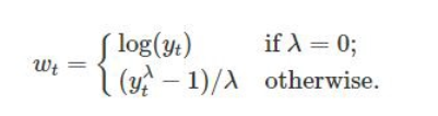
where y(λ) is the transformed data, x is the original data, and λ is the Box-Cox parameter. When λ=0, the formula becomes y=log(x), which is the logarithmic transformation. When λ=1, the formula becomes y=x, which is no transformation at all.
When choosing a data transformation method, it is important to consider the type of data, the purpose of the analysis, and the assumptions of the statistical method being used. It is also important to check the normality of the transformed data using visual inspection (histogram) and statistical tests, such as the Shapiro-Wilk test or the Anderson-Darling test.
# Log10 transformation
df$log_SOC<-log10(df$SOC)
# Histogram
hist(df$log_SOC,
          # plot title
     main = "Histogram of Log Soil SOC",
     # x-axis title
     xlab= "Log Soil SOC",
     # y-axis title
     ylab= "Frequency")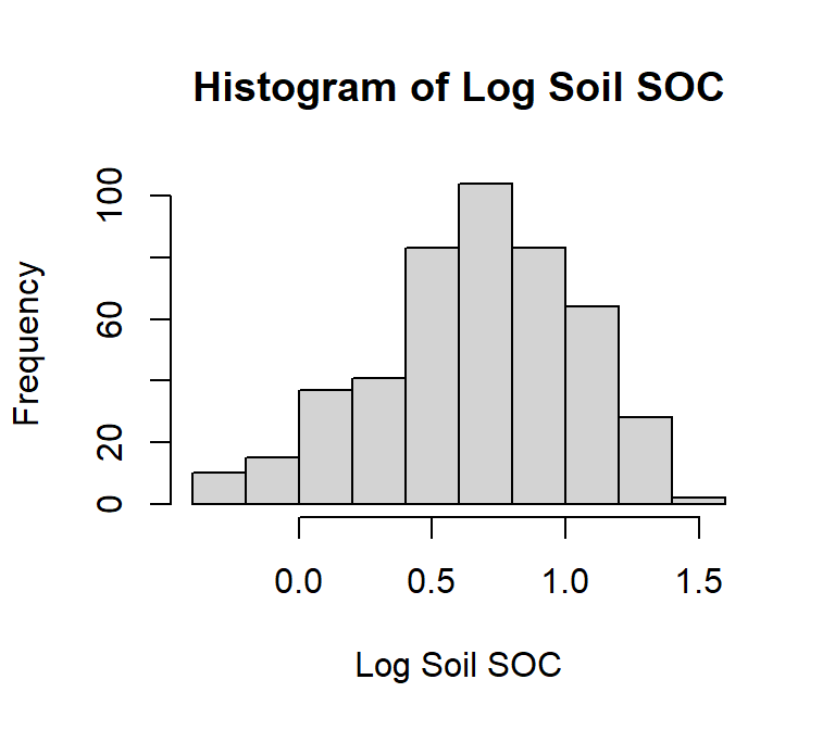
# Shapiro-Wilk test
shapiro.test(df$log_SOC)
    Shapiro-Wilk normality test

data:  df$log_SOC
W = 0.98056, p-value = 6.733e-06# Square root transformation
df$sqrt_SOC<-sqrt(df$SOC)
# histogram
hist(df$sqrt_SOC,
# plot title
main = "Histogram of Square root Soil SOC",
# x-axis title
xlab= "Sqrt. Soil SOC",
# y-axis title
ylab= "Frequency")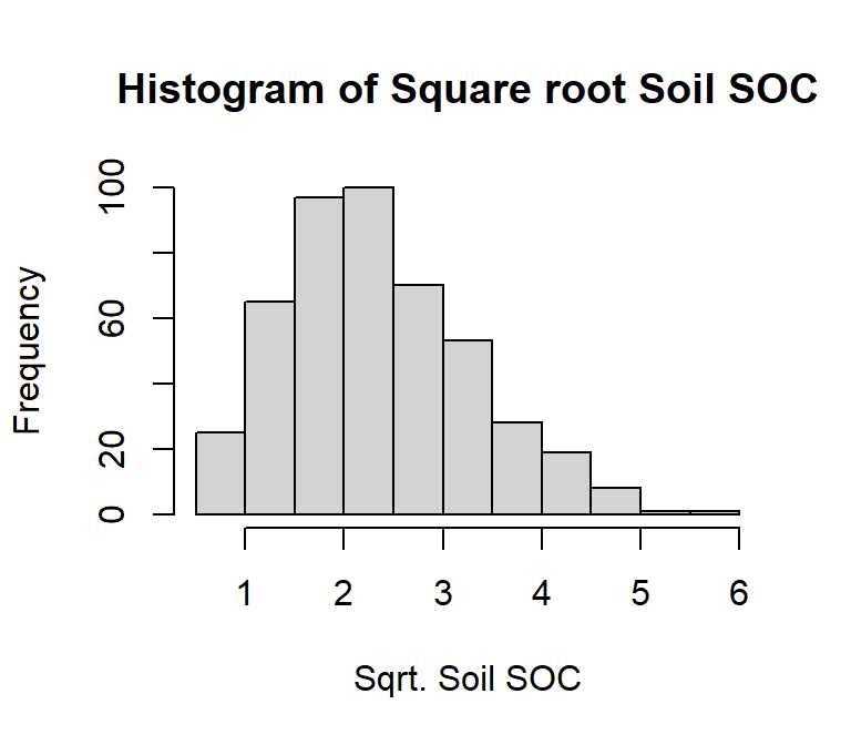
# Shapiro-Wilk test
shapiro.test(df$sqrt_SOC)
    Shapiro-Wilk normality test

data:  df$sqrt_SOC
W = 0.97494, p-value = 3.505e-07# Inverse transformation
df$inv_SOC<-(1/df$SOC)
# histogram
hist(df$inv_SOC,
# plot title
main = "Histogram of Inverse of Soil SOC",
# x-axis title
xlab= "Inverse of Soil SOC",
# y-axis title
ylab= "Frequency")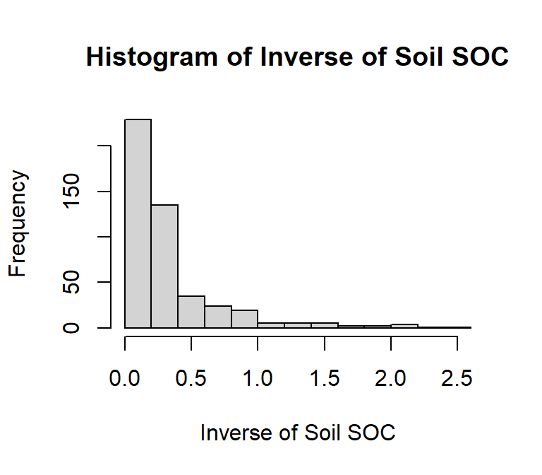
# Shapiro-Wilk test
shapiro.test(df$inv_SOC)
    Shapiro-Wilk normality test

data:  df$inv_SOC
W = 0.66851, p-value < 2.2e-16
First we have to calculate appropriate transformation parameters using powerTransform() function of car package and then use this parameter to transform the data using bcPower() function.
install.package(“car”)
library(car)
# Get appropriate power - lambda
power<-car::powerTransform(df$SOC)
power$lambda
df$SOC
0.2072527 # power transformation
df$bc_SOC<-car::bcPower(df$SOC, power$lambda)
# histogram
hist(df$bc_SOC,
# plot title
main = "Histogram of BoxCox Soil SOC",
# x-axis title
xlab= "BoxCox of Soil SOC",
# y-axis title
ylab= "Frequency")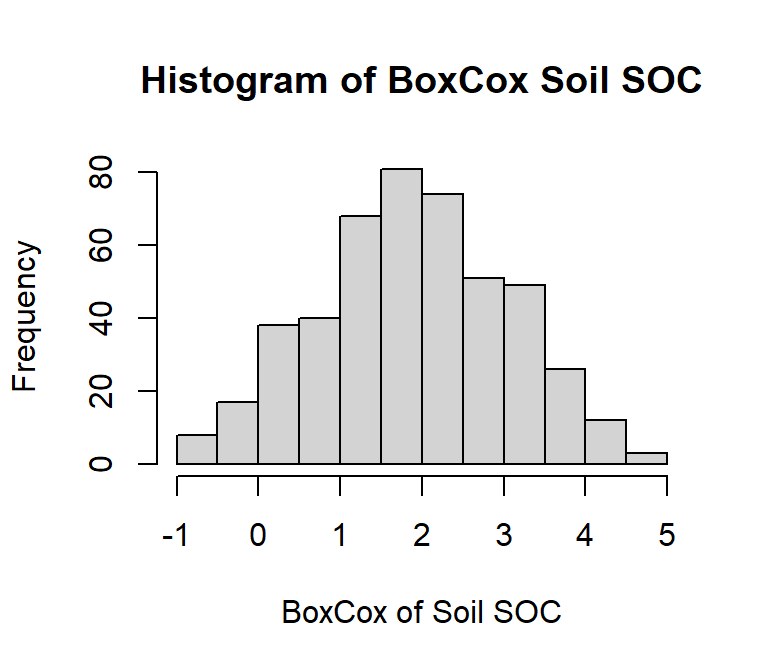
# Shapiro-Wilk test
shapiro.test(df$bc_SOC)
    Shapiro-Wilk normality test

data:  df$bc_SOC
W = 0.99393, p-value = 0.05912Outliers are data points that deviate significantly from other data points in a dataset. Measurement errors, experimental errors, or genuine extreme values (for example soil contamination) can cause them. It’s important to note that outlier detection is not an exact science, and different methods may identify different outliers. It’s important to understand the nature of your data and use your judgement to determine which method is most appropriate for your dataset.
In this exercise we will discuss some common methods of detecting outleirs, but we will not removing them. Here are some common methods for identifying outliers:
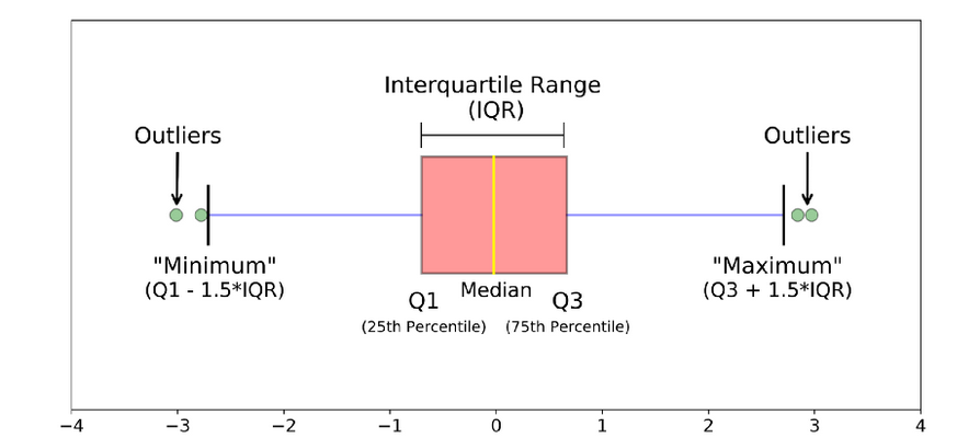
Plotting the data and visually inspecting it can often reveal outliers. Box plot, also known as a box-and-whisker plot is useful visualizations for this purpose. It is a graphical representation of a dataset that displays its median, quartiles, and any potential outliers. Here’s how to read a boxplot: Boxplots help identifies a dataset’s distribution, spread, and potential outliers. They are often used in exploratory data analysis to gain insights into the characteristics of the data.
• The box represents the interquartile range (IQR), which is the range between the 25th and 75th percentiles of the data. The length of the box represents the range of the middle 50% of the data.
• The line inside the box represents the median of the data, which is the middle value when the data is sorted.
• The whiskers extend from the box and represent the range of the data outside the IQR. They can be calculated in different ways depending on the method used to draw the boxplot. Some common methods include:
Tukey’s method: The whiskers extend to the most extreme data point within 1.5 times the IQR of the box.
Min/max whiskers: The whiskers extend to the minimum and maximum values in the data that are not considered outliers.
5-number summary: The whiskers extend to the minimum and maximum values in the data, excluding outliers.
• Outliers are data points that fall outside the whiskers of the boxplot. They are represented as individual points on the plot.
boxplot(df$SOC,
     # plot title
     main = "Boxplot of Soil SOC",
     # x-axis title
     #xlab= "Soil SOC (mg/kg)",
     # y-axis title
     ylab= "Soil SOC (mg/kg)")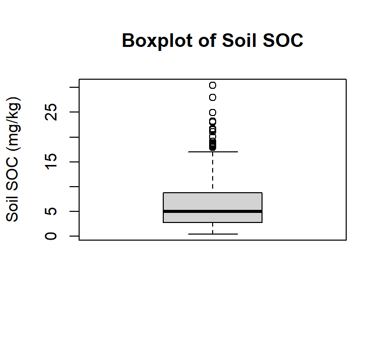
Now check how many observation considered as outlier:
length(boxplot.stats(df$SOC)$out)[1] 20ggplot(df, aes(SOC))+ geom_boxplot()+
coord_flip()+
# X-axis title
xlab("Soil SOC (mg/g)") +
# y-axis title
# ylab("Soil SOC (mg/kg)")+
# plot title
ggtitle("Boxplot of Soil SOC") +
theme(
# center the plot title
plot.title = element_text(hjust = 0.5),
# customize axis ticks
axis.text.y=element_text(size=10,
angle = 90,
vjust = 0.5,
hjust=0.5, colour='black'))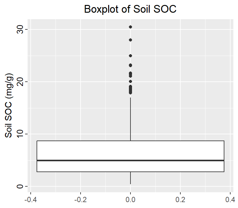
Another common method for identifying outliers is Tukey’s method, which is based on the concept of the IQR. Divide the data set into Quartiles:
Q1 (the 1st quartile): 25% of the data are less than or equal to this value
Q3 (the 3rd quartile): 25% of the data are greater than or equal to this value
IQR (the interquartile range): the distance between Q3 – Q1, it contains the middle 50% of the data.
Then outliers are then defined as any values that fall outside of:
Lower Range = Q1 – (1.5 * IQR)
and
Upper Range = Q3 + (1.5 * IQR)
Below detect_outliers function
detect_outliers <- function(x)
{
  ## Check if data is numeric in nature
  if(!(class(x) %in% c("numeric","integer")))
  {
    stop("Data provided must be of integer\numeric type")
  }
  ## Calculate lower limit
  lower.limit <- as.numeric(quantile(x)[2] - IQR(x)*1.5)
  ## Calculate upper limit
  upper.limit <- as.numeric(quantile(x)[4] + IQR(x)*1.5)
  ## Retrieve index of elements which are outliers
  lower.index <- which(x < lower.limit)
  upper.index <- which(x > upper.limit)
  ## print results
  cat(" Lower Limit ",lower.limit ,"\n", "Upper Limit", upper.limit ,"\n",
"Lower range outliers  ",x[lower.index] ,"\n", "Upper range outlers", x[upper.index])
}detect_outliers(df$SOC) Lower Limit -6.1465
Upper Limit 17.6295
Lower range outliers
Upper range outlers 18.142 24.954 21.455 21.644 19.092 21.076 30.473 18.391 20.061 21.125 18.591 19.099 17.884 21.591 18.277 27.984 18.814 23.058 23.19 18.062The Z-score method is another common statistical method for identifying outliers. It finds value with largest difference between it and sample mean, which can be considered as an outlier. In R, the outliers() function from the outliers package can be used to identify outliers using the Z-score method.
install.packages(“outliers”)
library(outliers)
# Identify outliers using the Z-score method
outlier(df$SOC, opposite=F)
[1] 30.473A box-jitter plot is a type of data visualization that combines elements of both a boxplot and a jitter plot. It is useful for displaying both the distribution and the individual data points of a dataset.
The jitter component of the plot is used to display the individual data points. Jittering refers to adding a small amount of random noise to the position of each data point along the x-axis, to prevent overlapping and to give a better sense of the density of the data.
Overall, the box-jitter plot provides a useful summary of the distribution of a dataset, while also allowing viewers to see the individual data points and any potential outliers. It is particularly useful for displaying data with a large number of observations or for comparing multiple distributions side by side.
We will ggplot package to create Box-Jitter plots to explore variability of Soil SOC among the Landcover classes. We will create a custom color palette using RColorBrewer package.
install.packages(“RColorBrewer”)
# Create a custom color
library(RColorBrewer)
rgb.palette <- colorRampPalette(c("red","yellow","green", "blue"),
space = "rgb")

# Create plot
ggplot(df, aes(y=SOC, x=NLCD)) +
  geom_point(aes(colour=MAT),size = I(1.7),
             position=position_jitter(width=0.05, height=0.05)) +
  geom_boxplot(fill=NA, outlier.colour=NA) +
  labs(title="")+
  # Change figure orientation
  coord_flip()+
  # add custom color plate and legend title
  scale_colour_gradientn(name="Soil SOC (mg/g)", colours =rgb.palette(10))+
  theme(legend.text = element_text(size = 10),legend.title = element_text(size = 12))+
  # add y-axis title and x-axis title leave blank
  labs(y="Soil SOC (mg/kg)", x = "")+
  # add plot title
  ggtitle("Variability of Soil SOC in relation to MAT in four NLCD")+
  # customize plot themes
  theme(
        axis.line = element_line(colour = "black"),
        # plot title position at center
        plot.title = element_text(hjust = 0.5),
        # axis title font size
        axis.title.x = element_text(size = 14),
        # X and  axis font size
        axis.text.y=element_text(size=12,vjust = 0.5, hjust=0.5, colour='black'),
        axis.text.x = element_text(size=12))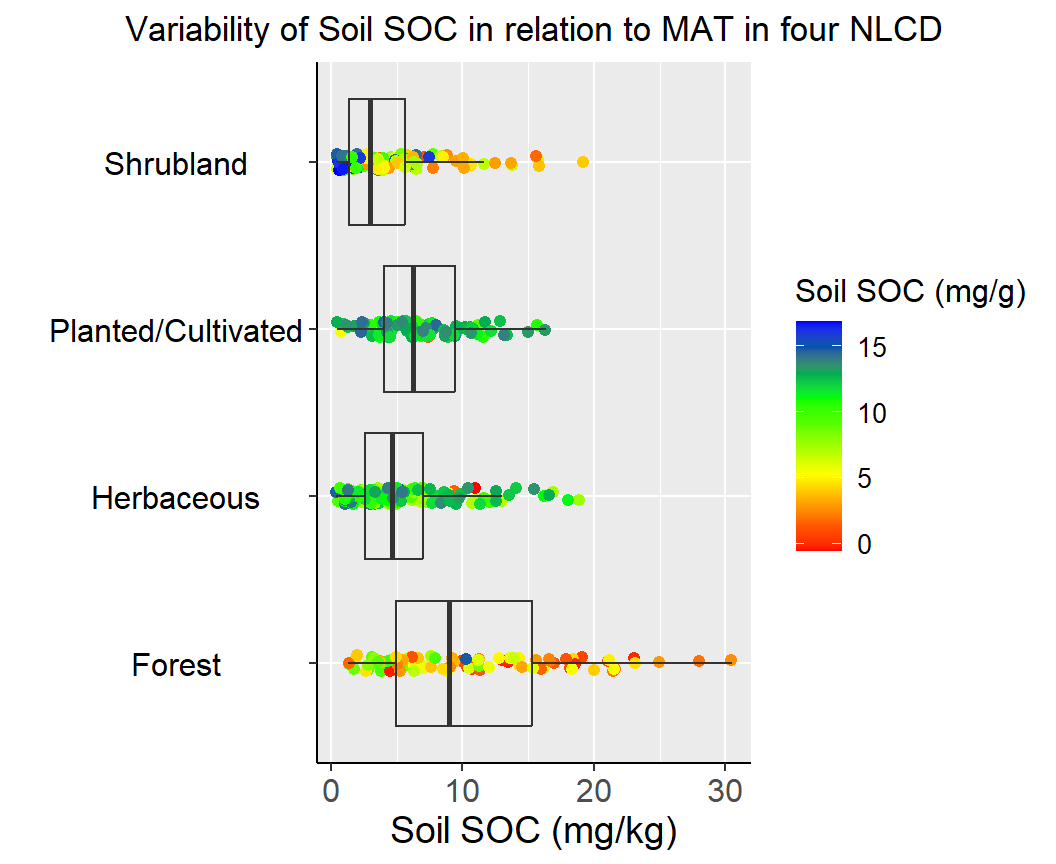
Before creating bar plots, we are going to calculate summary statistics of soil SOC grouped by Landcover. We will ddply() function from plyr package. We will Soil Carbon data in this exercises
install.packages(“plyr”)
For standard error of mean, we will use following function:
# Standard error
SE <- function(x){
  sd(x)/sqrt(length(x))
}# Load library
library(plyr)
# Get summary statistics
summarise_soc<-ddply(df,~NLCD, summarise,
Mean= round(mean(SOC), 3),
Median=round (median(SOC), 3),
Min= round (min(SOC),3),
Max= round (max(SOC),3),
SD= round(sd(SOC), 3),
SE= round (SE(SOC), 3))
# Load library
library(flextable)
# Create a table
flextable::flextable(summarise_soc, theme_fun = theme_booktabs)NLCD | Mean | Median | Min | Max | SD | SE |
|---|---|---|---|---|---|---|
Forest | 10.431 | 8.974 | 1.333 | 30.473 | 6.802 | 0.705 |
Herbaceous | 5.477 | 4.609 | 0.408 | 18.814 | 3.925 | 0.320 |
Planted/Cultivated | 6.697 | 6.230 | 0.462 | 16.336 | 3.598 | 0.365 |
Shrubland | 4.131 | 2.996 | 0.446 | 19.099 | 3.745 | 0.332 |
#| warning: false
#| error: false
#| fig.width: 5
#| fig.height: 4.5
#|
ggplot(summarise_soc, aes(x=NLCD, y=Mean)) +
  geom_bar(stat="identity", position=position_dodge(),width=0.5, fill="gray") +
  geom_errorbar(aes(ymin=Mean-SE, ymax=Mean+SE), width=.2,
   position=position_dodge(.9))+
  # add y-axis title and x-axis title leave blank
  labs(y="Soil SOC (mg/g)", x = "")+
  # add plot title
  ggtitle("Mean ± SE of Soil SOC")+
  coord_flip()+
  # customize plot themes
  theme(
        axis.line = element_line(colour = "gray"),
        # plot title position at center
        plot.title = element_text(hjust = 0.5),
        # axis title font size
        axis.title.x = element_text(size = 14),
        # X and  axis font size
        axis.text.y=element_text(size=12,vjust = 0.5, hjust=0.5, colour='black'),
        axis.text.x = element_text(size=12))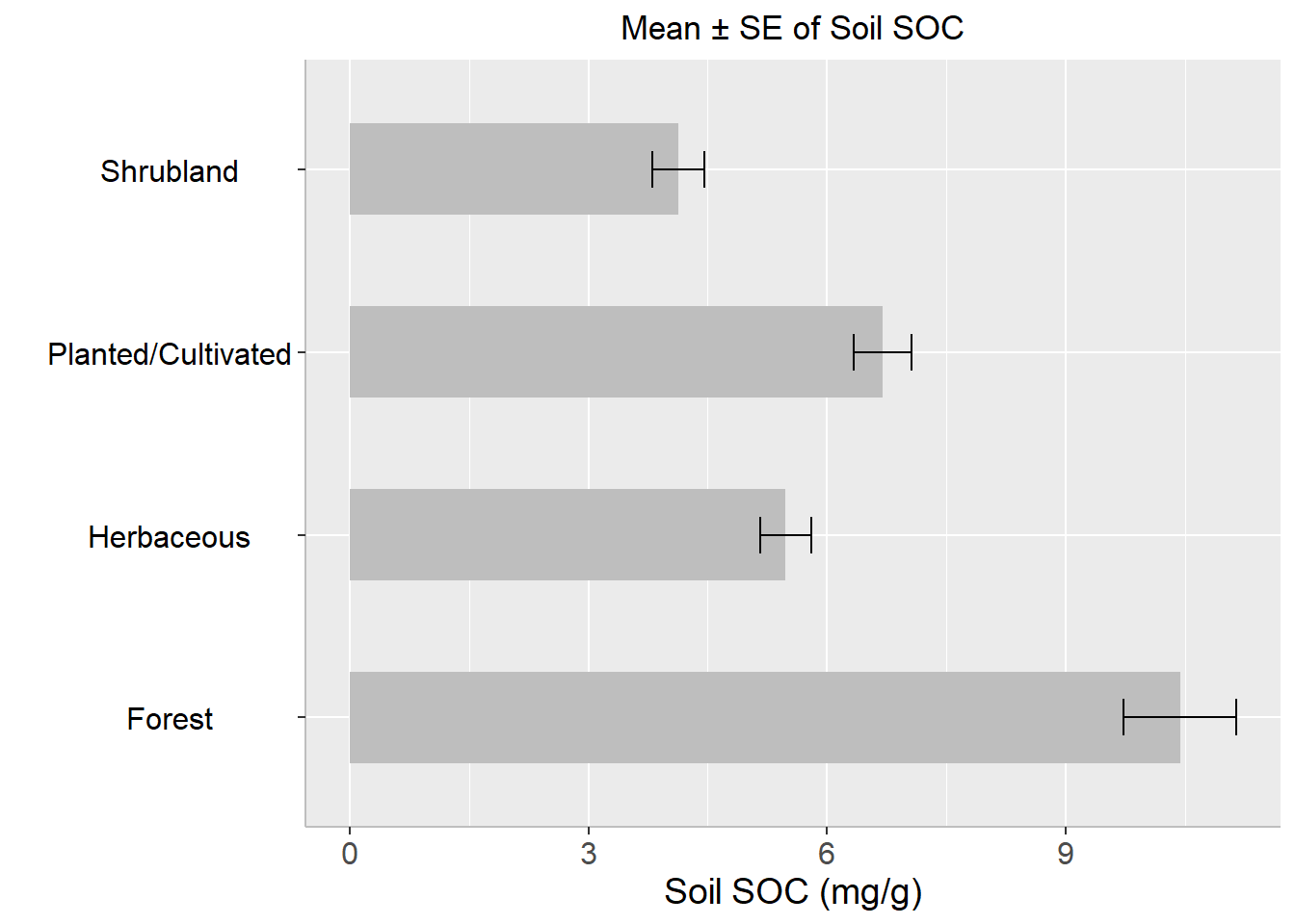
A t-test is a statistical hypothesis test that is used to determine if there is a significant difference between the means of two groups or samples. It is a commonly used parametric test assuming the data follows a normal distribution.
There are several types of t-tests, including:
Independent samples t-test: This test is used when the two groups being compared are independent and have different participants in each group. For example, comparing the mean test scores of two different classes of students.
Paired samples t-test: This test is used when the two groups being compared are dependent or related, such as when comparing the mean scores of the same group of students before and after an intervention.
One-sample t-test: This test is used to determine if a sample mean is significantly different from a known population mean.
A two-sample t-test is a statistical test used to determine if two sets of data are significantly different from each other. It is typically used when comparing the means of two groups of data to determine if they come from populations with different means.
The two-sample t-test is based on the assumption that the two populations are normally distributed and have equal variances. The test compares the means of the two samples and calculates a t-value based on the difference between the means and the standard error of the means.
The null hypothesis of the test is that the means of the two populations are equal, while the alternative hypothesis is that the means are not equal. If the calculated t-value is large enough and the associated p-value is below a chosen significance level (e.g. 0.05), then the null hypothesis is rejected in favor of the alternative hypothesis, indicating that there is a significant difference between the means of the two populations.
There are several variations of the two-sample t-test, including the independent samples t-test and the paired samples t-test, which are used in different situations depending on the nature of the data being compared.
In this exercise, we will create a data frame randomly, four treatments, six varieties, and four replications (Total 96 observation) .
# Set the number of observations, treatments, replications, and varieties
n <- 1
treatments <- 4
replications <- 4
varieties <- 6
# Create an empty data frame with columns for treatment, replication, variety, and observation
exp.df <- data.frame(
  Treatment = character(),
  Replication = integer(),
  Variety = character(),
  Yield = numeric(),
  stringsAsFactors = FALSE
)
# Generate random data for each treatment, replication, and variety combination
for (t in 1:treatments) {
  for (r in 1:replications) {
    for (v in 1:varieties) {
      # Generate n random observations for the current combination of treatment, replication, and variety
      obs <- rnorm(n, mean = 3*t + 0.95*r + 0.90*v, sd = 0.25)

      # Add the observations to the data frame
      set.seeds= 1256
      exp.df <- rbind(exp.df, data.frame(
        Treatment = paste0("T", t),
        Replication = r,
        Variety = paste0("V", v),
        Yield = obs
      ))
    }
  }
}

# Print the first 10 rows of the data frame
glimpse(exp.df)
Rows: 96
Columns: 4
$ Treatment <chr> "T1", "T1", "T1", "T1", "T1", "T1", "T1", "T1", "T1", "T1"…
$ Replication <int> 1, 1, 1, 1, 1, 1, 2, 2, 2, 2, 2, 2, 3, 3, 3, 3, 3, 3, 4, 4…
$ Variety <chr> "V1", "V2", "V3", "V4", "V5", "V6", "V1", "V2", "V3", "V4"…
$ Yield <dbl> 4.902387, 5.794793, 7.074300, 7.744916, 8.276292, 9.345586…ggplot(exp.df,
aes(x = Treatment,
y = Yield,
fill = Variety)) +
geom_bar(stat = "identity",
position = "dodge")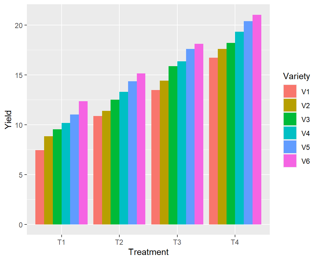
Now we will the means of T1 and T2 treatments to determine if they come from populations with different means.
# Create two dataframes
T1 <- exp.df %>% dplyr::select(Treatment, Yield) %>%
         filter(Treatment == "T1")

T2 <- exp.df %>% dplyr::select(Treatment, Yield) %>%
         filter(Treatment == "T3")

# Two-Sample T-test
t.test(x=T1$Yield,
       y=T2$Yield,
       paired = TRUE,
       alternative = "greater")
    Paired t-test

data:  T1$Yield and T2$Yield
t = -83.522, df = 23, p-value = 1
alternative hypothesis: true mean difference is greater than 0
95 percent confidence interval:
 -6.078855       Inf
sample estimates:
mean difference
      -5.956625
Since the p-value is greater than the level of significance (α) = 0.05, we may to accept the null hypothesis and means yields in T1 and T2 are equal
Analysis of Variance (ANOVA) is a statistical technique used to analyze the variance in a dataset. It is used to determine if there are any significant differences between the means of two or more groups. It compare the variance within each group to the variance between the groups. If the variance between the groups is significantly larger than the variance within the groups, then it can be concluded that there is a significant difference between the means of the groups.
There are several types of ANOVA, including one-way ANOVA, two-way ANOVA, and repeated measures ANOVA. One-way ANOVA is used when there is one independent variable, while two-way ANOVA is used when there are two independent variables. Repeated measures ANOVA is used when the same group of participants is tested multiple times.
The one-way analysis of variance (ANOVA) is used to determine whether there are any statistically significant differences between the means of two or more independent (unrelated) groups.
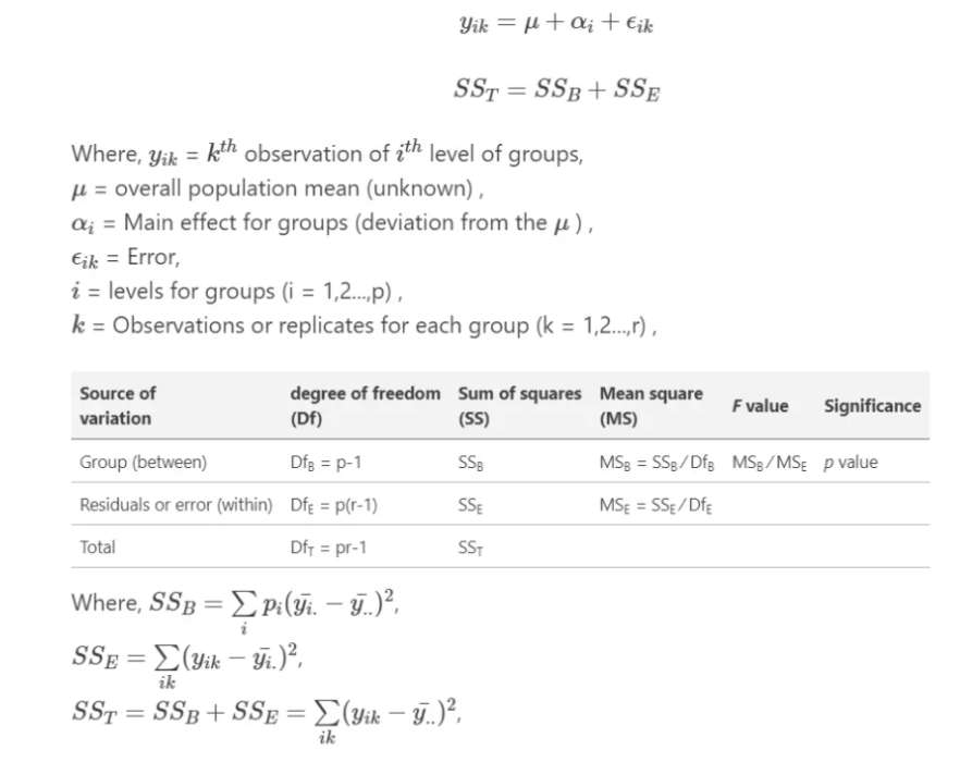
The output of an ANOVA test includes an F-statistic, which is a measure of the difference between the groups, and a p-value, which indicates the probability of obtaining the observed difference by chance. If the p-value is less than a chosen significance level (typically 0.05), then the null hypothesis, which states that there is no significant difference between the means of the groups, can be rejected.
ANOVA in R can be performed using the built-in aov() function. This function takes a formula as an argument, where the dependent variable is on the left side of the tilde (~), and the independent variables are on the right side, separated by +. We will use dataset we have created before to see the main effect of treatment on yield.
anova.one=aov (Yield ~Treatment, data = exp.df) # analysis variance
anova (anova.one)
Analysis of Variance Table
Response: Yield
Df Sum Sq Mean Sq F value Pr(>F)
Treatment 3 1073.8 357.92 100.21 < 2.2e-16 ***
Residuals 92 328.6 3.57
---
Signif. codes: 0 '***' 0.001 '**' 0.01 '*' 0.05 '.' 0.1 ' ' 1A nice and easy way to report results of an ANOVA in R is with the report() function from the report package
The primary goal of package **report* is to bridge the gap between R’s output and the formatted results contained in your manuscript. It automatically produces reports of models and data frames according to best practices guidelines, ensuring standardization and quality in results reporting.

install.packages(“report)
# Load library
library(report)
report(anova.one)
The ANOVA (formula: Yield ~ Treatment) suggests that:
- The main effect of Treatment is statistically significant and large (F(3, 92)
= 100.21, p < .001; Eta2 = 0.77, 95% CI [0.70, 1.00])
Effect sizes were labelled following Field's (2013) recommendations.Two-way ANOVA (analysis of variance) or factorial ANOVA is a statistical method used to analyze the effects of two categorical independent variables, or factors, on a continuous dependent variable. It tests for the main effects of each factor and their interaction effect.
The two-way ANOVA model can be expressed as:
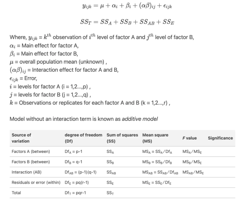
Here is an example code for a two-way ANOVA with one dependent variable (Yield), and two independent variables (Treatment and Variety) with interaction effect:
anova.two =aov (Yield ~Treatment + Variety+ Treatment:Variety, data = exp.df)
anova (anova.two)
Analysis of Variance Table
Response: Yield
Df Sum Sq Mean Sq F value Pr(>F)
Treatment 3 1073.76 357.92 232.9549 < 2.2e-16 ***
Variety 5 217.33 43.47 28.2900 9.621e-16 ***
Treatment:Variety 15 0.65 0.04 0.0281 1
Residuals 72 110.62 1.54
---
Signif. codes: 0 '***' 0.001 '**' 0.01 '*' 0.05 '.' 0.1 ' ' 1From the ANOVA table we can conclude that both Treatment and Variety statistically significant.
# Load library
library(report)
report(anova.two)
The ANOVA (formula: Yield ~ Treatment + Variety + Treatment:Variety) suggests
that:
- The main effect of Treatment is statistically significant and large (F(3, 72)
= 232.95, p < .001; Eta2 (partial) = 0.91, 95% CI [0.87, 1.00])
- The main effect of Variety is statistically significant and large (F(5, 72) =
28.29, p < .001; Eta2 (partial) = 0.66, 95% CI [0.55, 1.00])
- The interaction between Treatment and Variety is statistically not
significant and very small (F(15, 72) = 0.03, p > .999; Eta2 (partial) =
5.81e-03, 95% CI [0.00, 1.00])
Effect sizes were labelled following Field's (2013) recommendations.After performing an ANOVA, if the overall F-test is significant, we may want to determine which groups differ significantly from each other in terms of the dependent variable. This can be done using post-hoc tests or multiple comparison tests.
From ANOVA analysis, main effect of landcover on Soil Pb is statistically significant, but ANOVA does not tell us where soil SOC is significantly higher than others. After performing an ANOVA, if the overall F-test is significant, we may want to determine which groups differ significantly from each other in terms of the dependent variable. This can be done using post-hoc tests or multiple comparison tests.
Post-hoc tests are designed to compare all possible pairs of groups and determine which pairs are significantly different from each other. The most common post-hoc tests are Tukey’s Honestly Significant Difference (HSD) test, Bonferroni correction, and Scheffe’s test. These tests control the overall Type I error rate for multiple comparisons.
In R, the TukeyHSD() function can be used to perform Tukey’s HSD test, which returns a table of pairwise comparisons between the groups, along with the adjusted p-values:
tukey <- TukeyHSD(anova.one)
tukey
Tukey multiple comparisons of means
95% family-wise confidence level
Fit: aov(formula = Yield ~ Treatment, data = exp.df)
$Treatment
diff lwr upr p adj
T2-T1 3.006233 1.578690 4.433775 1.9e-06
T3-T1 5.956625 4.529083 7.384168 0.0e+00
T4-T1 8.987502 7.559959 10.415044 0.0e+00
T3-T2 2.950393 1.522851 4.377935 3.0e-06
T4-T2 5.981269 4.553727 7.408811 0.0e+00
T4-T3 3.030876 1.603334 4.458418 1.6e-06The table shows the differences between the groups and the 95% confidence intervals for each difference. If the confidence interval does not include zero, the difference between the groups is significant at the specified level.
The pairwise.t.test() function can be used to perform Bonferroni correction or other multiple comparison tests. For example, to perform pairwise comparisons using Bonferroni correction, we can use:
pairwise.t.test(exp.df$Yield, exp.df$Treatment,
                 p.adjust.method = "bonferroni",
                 paired=FALSE)
    Pairwise comparisons using t tests with pooled SD

data:  exp.df$Yield and exp.df$Treatment

   T1      T2      T3
T2 1.9e-06 -       -
T3 < 2e-16 3.0e-06 -
T4 < 2e-16 < 2e-16 1.6e-06

P value adjustment method: bonferroni We can create a nice looking plots with results of ANOVA and post-hoc tests on the same plot (directly on the boxplots). We will use gbetweenstats() function of ggstatsplot package:
install.packages(“ggstatsplot”)
# Load library
library(ggstatsplot)

p1<-ggbetweenstats(
  data = exp.df,
  x = Treatment,
  y = Yield,
  ylab = "Yield (t/ha)",
  type = "parametric", # ANOVA or Kruskal-Wallis
  var.equal = TRUE, # ANOVA or Welch ANOVA
  plot.type = "box",
  pairwise.comparisons = TRUE,
  pairwise.display = "significant",
  centrality.plotting = FALSE,
  bf.message = FALSE
)+
# add plot title
ggtitle("Mian Effect of Treatment") +
   theme(
    # center the plot title
    plot.title = element_text(hjust = 0.5),
    axis.line = element_line(colour = "gray"),
    # axis title font size
    axis.title.x = element_text(size = 14),
    # X and  axis font size
    axis.text.y=element_text(size=12,vjust = 0.5, hjust=0.5),
    axis.text.x = element_text(size=12))
print(p1)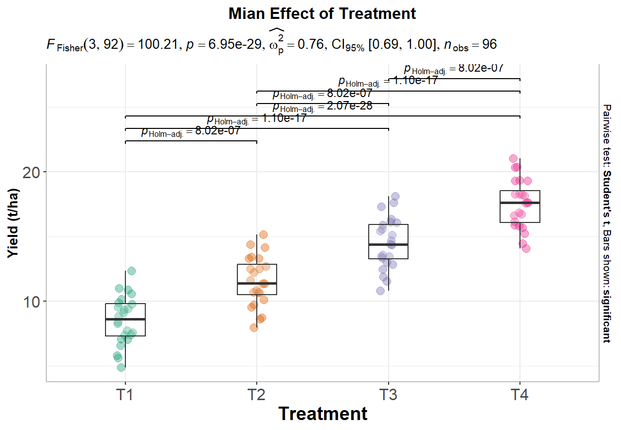
# Load library
library(ggstatsplot)

p2<-ggbetweenstats(
  data = exp.df,
  x = Variety,
  y = Yield,
  ylab = "Yield (t/ha)",
  type = "parametric", # ANOVA or Kruskal-Wallis
  var.equal = TRUE, # ANOVA or Welch ANOVA
  plot.type = "box",
  pairwise.comparisons = TRUE,
  pairwise.display = "significant",
  centrality.plotting = FALSE,
  bf.message = FALSE
)+
# add plot title
ggtitle("Mian Effect of Variety") +
   theme(
    # center the plot title
    plot.title = element_text(hjust = 0.5),
    axis.line = element_line(colour = "gray"),
    # axis title font size
    axis.title.x = element_text(size = 14),
    # X and  axis font size
    axis.text.y=element_text(size=12,vjust = 0.5, hjust=0.5),
    axis.text.x = element_text(size=12))
print(p2)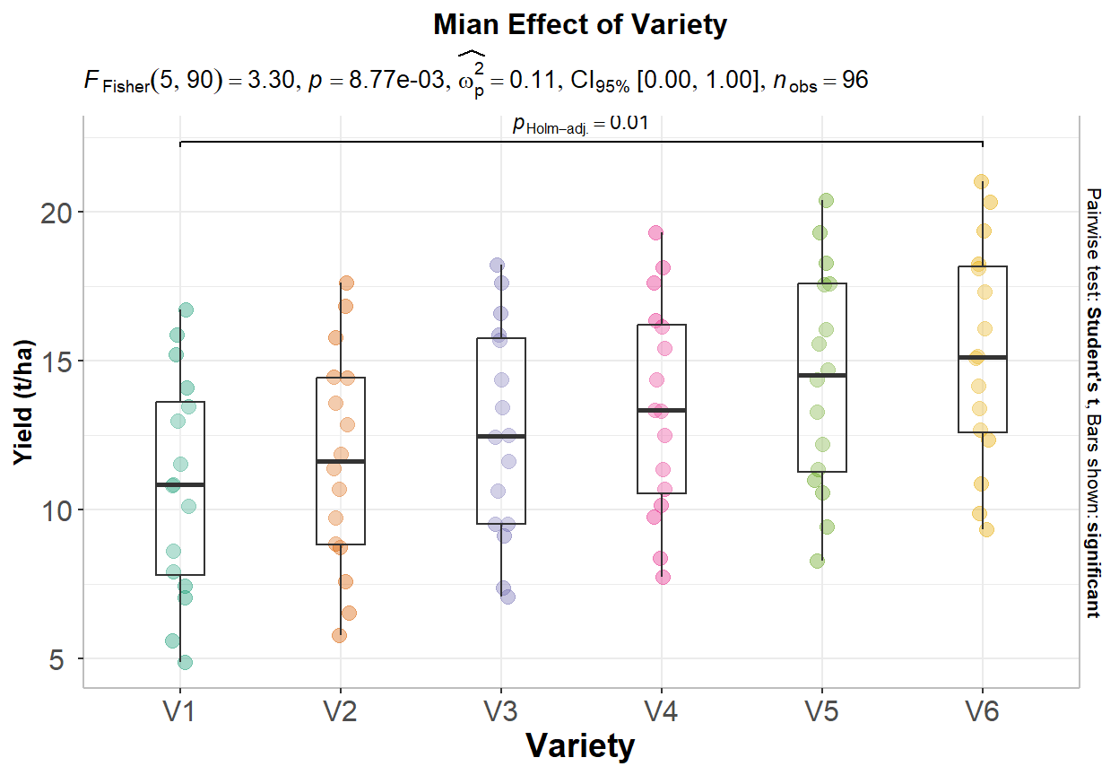
We plot these plots side by side using patchwork package:
install.packages(“patchwork”)
library(patchwork)
p1+p2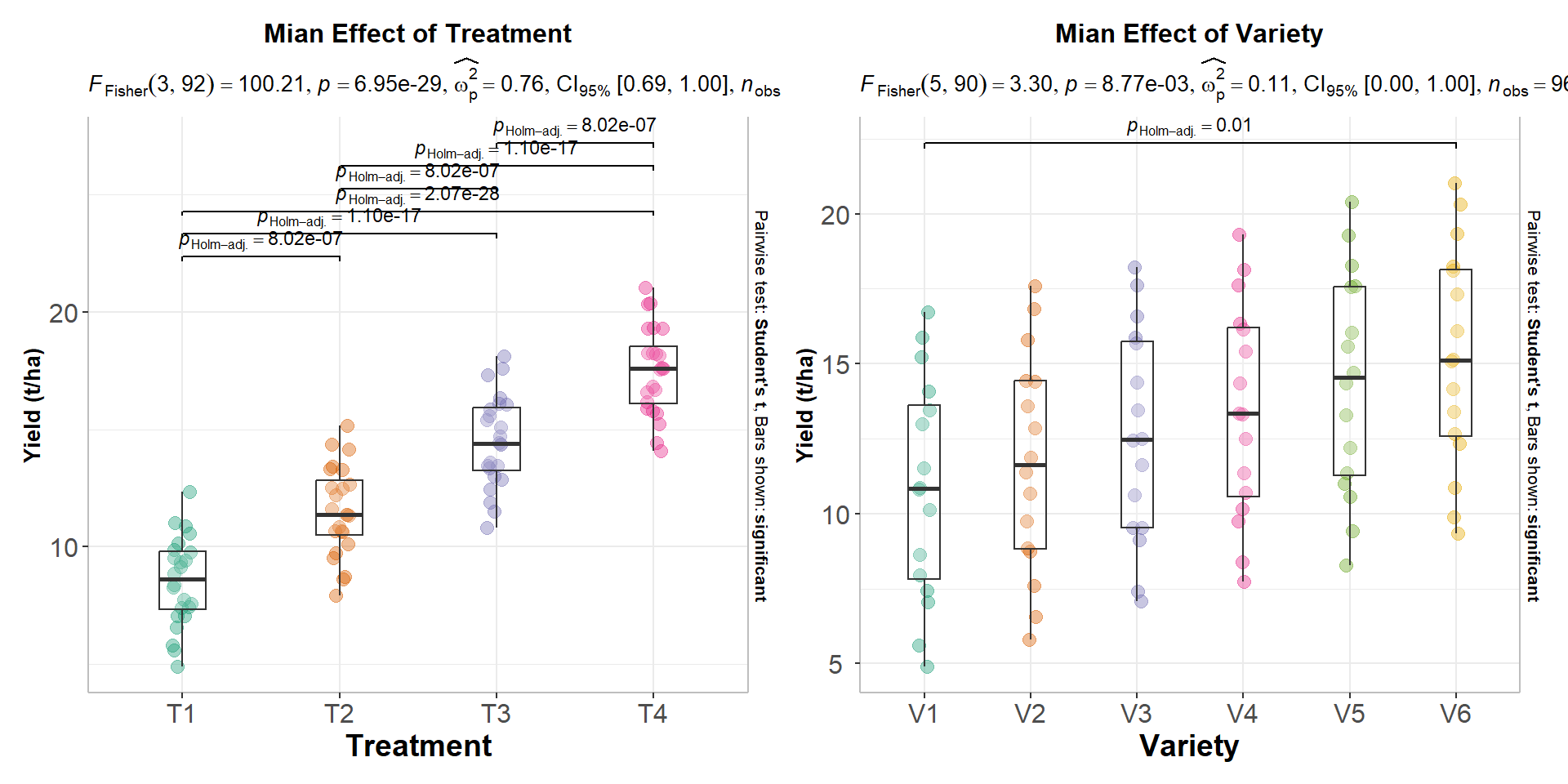
Correlation refers to the degree of association between two or more variables. It is a statistical measure that describes the strength and direction of the relationship between two or more quantitative variables. The correlation coefficient is a value between -1 and +1, where a value of -1 indicates a perfect negative correlation, +1 indicates a perfect positive correlation, and 0 indicates no correlation.
Correlation does not necessarily imply causation. Just because two variables are correlated does not mean one causes the other. However, correlation can help identify relationships between variables and make predictions based on those relationships.
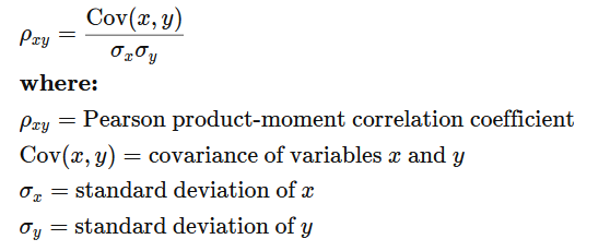
Pearson correlation is a statistical measure that assesses the linear relationship between two continuous variables. It is also known as Pearson’s r or the Pearson product-moment correlation coefficient. The Pearson correlation coefficient is calculated by dividing the covariance of the two variables by the product of their standard deviations:
We can calculate the Pearson correlation coefficient using the cor() function. method is a character string indicating which correlation coefficient (or covariance) is to be computed. One of pearson (default),kendall, or spearman can be abbreviated. Here’s an example:
df %>% dplyr::select(SOC, NDVI) %>%
      cor(method = "pearson")
SOC NDVI
SOC 1.0000000 0.5870452
NDVI 0.5870452 1.0000000Nonparametric correlations are statistical measures of association between two variables that do not make assumptions about the form of the relationship between the variables. Nonparametric correlations are helpful when the variables are not normally distributed or when the relationship between the variables is not linear.
Two commonly used nonparametric correlation measures are Spearman’s rank correlation coefficient and Kendall’s tau correlation coefficient.
Spearman’s rank correlation coefficient is used to measure the strength and direction of the relationship between two variables when both variables are measured on an ordinal scale. It is calculated by ranking the values of each variable and then calculating the correlation coefficient between the ranks. The coefficient ranges from -1 to 1, with values of -1 indicating a perfect negative correlation, 0 indicating no correlation, and 1 indicating a perfect positive correlation.
df %>% dplyr::select(SOC, NDVI) %>%
      cor(method = "spearman")
SOC NDVI
SOC 1.000000 0.648452
NDVI 0.648452 1.000000Kendall’s tau correlation coefficient is also used to measure the strength and direction of the relationship between two variables, but it is more appropriate when the variables are measured on a nominal or ordinal scale. Kendall’s tau is based on the number of concordant and discordant pairs of observations, and ranges from -1 to 1, with values of -1 indicating a perfect negative correlation, 0 indicating no correlation, and 1 indicating a perfect positive correlation.
df %>% dplyr::select(SOC, NDVI) %>%
      cor(method = "kendall")
SOC NDVI
SOC 1.0000000 0.4616806
NDVI 0.4616806 1.0000000The cor.test() function is used to test the significance of the correlation coefficient between two variables (both r-and p-values):
cor.test(df$SOC, df$NDVI)
    Pearson's product-moment correlation

data:  df$SOC and df$NDVI
t = 15.637, df = 465, p-value < 2.2e-16
alternative hypothesis: true correlation is not equal to 0
95 percent confidence interval:
 0.5242311 0.6435059
sample estimates:
      cor
0.5870452
The correlation coefficient between SOC and Fe is 0.3149, and that the p-value of the test is < 2.2e-16, indicating that there is a significant correlation between SOC and Fe at the alpha level of 0.05.
We can also calculate spearman correlation coefficients between SOC and Fe in different landcovers. will We will use ddply() function of plyr package which split data frame, apply function, (here cor()), and return r-values in a data frame using summarise argument
library(plyr)
plyr::ddply(df, "NLCD",
            summarise,
            corr=cor(SOC, NDVI, method = "spearman"))
NLCD corr
1 Forest 0.4053550
2 Herbaceous 0.5353354
3 Planted/Cultivated 0.4803166
4 Shrubland 0.5773881A scatter plot is a type of graph used to display the relationship between two continuous variables. This plot is commonly used in data analysis to explore and visualize the relationship between two variables. They are particularly useful in identifying patterns or trends in data, as well as in identifying outliers or unusual observations.
plot(df$NDVI, df$SOC,
    # x-axis label
    xlab="NDVI",
    # y-axis label
    ylab=" Soil OC (mg/g)",
    # Plot title
main="Scatterplot of Soil SOC vs NDVI") 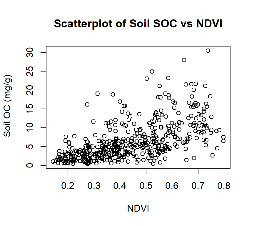
ggplot(df, aes(x=NDVI, y=SOC)) +
  geom_point(size=2) +
  # add plot title
  ggtitle("Scatterplot of Soil SOC vs NDVI") +
   theme(
    # center the plot title
    plot.title = element_text(hjust = 0.5),
    axis.line = element_line(colour = "gray"),
    # axis title font size
    axis.title.x = element_text(size = 14),
    # X and  axis font size
    axis.text.y=element_text(size=12,vjust = 0.5, hjust=0.5),
    axis.text.x = element_text(size=12))+
     xlab("NDVI") +
ylab("Soil OC (mg/g)") 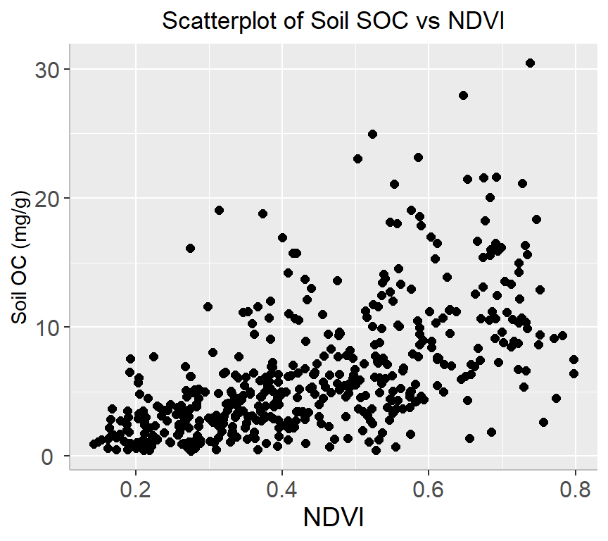
ggplot(df, aes(x=NDVI, y=SOC, color=NLCD)) +
  geom_point(size=2) +
# add plot title
  ggtitle("Scatterplot of Soil SOC vs NDVI") +
   theme(
    # center the plot title
    plot.title = element_text(hjust = 0.5),
    axis.line = element_line(colour = "gray"),
    # axis title font size
    axis.title.x = element_text(size = 14),
    # X and  axis font size
    axis.text.y=element_text(size=12,vjust = 0.5, hjust=0.5),
    axis.text.x = element_text(size=12))+
      # add legend tittle
  guides(color = guide_legend(title = "NLCD"))+
  xlab("NDVI") +
ylab("Soil OC (mg/g))") 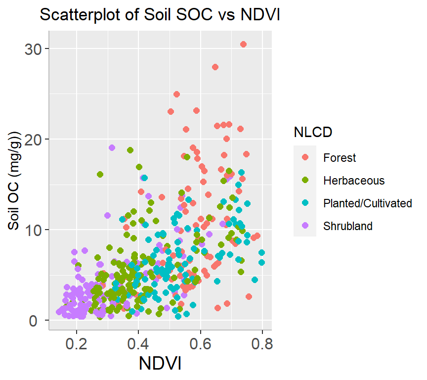
A bubble plot is a type of chart that displays data points in a 3-dimensional space using bubbles or spheres. The chart is similar to a scatter plot, but each data point is represented by a bubble with a size proportional to a third variable. Bubble plots are useful for displaying relationships between three variables and can be particularly effective when used to visualize large datasets.
df %>%
  arrange(desc(SOC)) %>%
  mutate(NLCD = factor(NLCD)) %>%
  ggplot(aes(x=NDVI, y=SOC, size = MAT, color=NLCD)) +
    geom_point(alpha=0.5) +
    scale_size(range = c(.2, 4), name="MAT")+
     guides(color = guide_legend(title = "NLCD"))+
  ggtitle("Bubble Plot of Soil SOC vs NDVI") +
   theme(
    # center the plot title
    plot.title = element_text(hjust = 0.5),
    axis.line = element_line(colour = "gray"),
    # axis title font size
    axis.title.x = element_text(size = 14),
    # X and  axis font size
    axis.text.y=element_text(size=12,vjust = 0.5, hjust=0.5),
    axis.text.x = element_text(size=12))+
      # add legend tittle
  guides(color = guide_legend(title = "NLCD")) +
  xlab("NDVI") +
ylab("Soil OC (mg/g)") 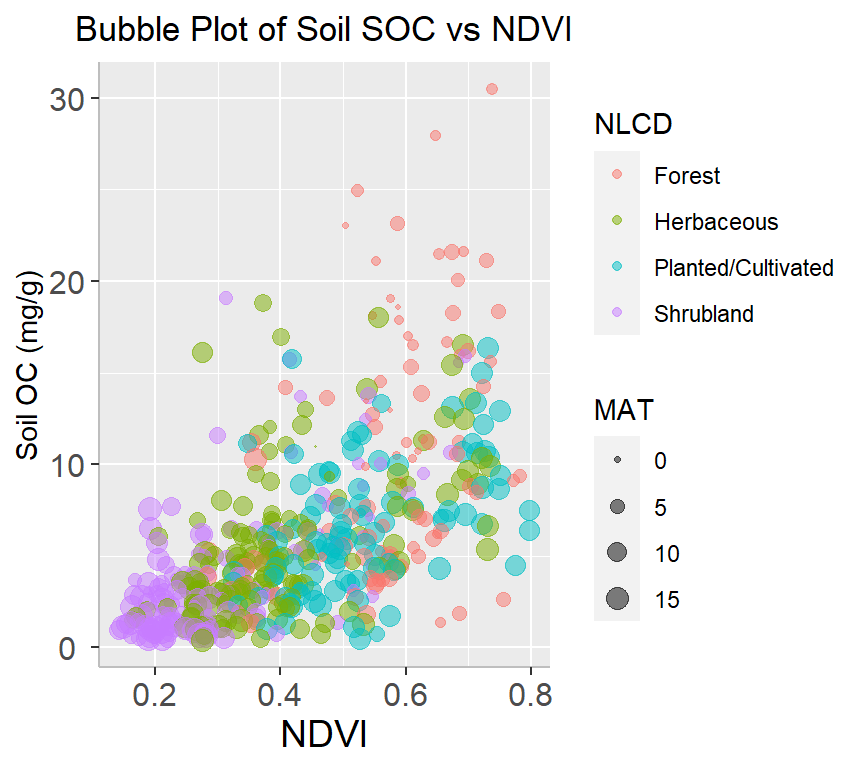
A marginal plot is a type of visualization that displays the distribution of a single variable along the margins of a scatterplot. It is a useful tool for exploring the relationship between two variables and can provide additional insights into the data. We will use ggMarginal() function from ggExtra library makes it create marginal plots
install.packages(“ggExtra”)
install.packages(“gridExtra”)
library(ggExtra)
# classic plot :
p<-ggplot(df, aes(x=SOC, y=NDVI, color=NLCD, size=MAT)) +
      geom_point() +
      theme(legend.position="none") +
      xlab("NDVI") + ylab("Soil SOC (mg/g)")
p_hist <- ggMarginal(p, type="histogram", size=10)
# marginal density
p_dens <- ggMarginal(p, type="density")
# marginal boxplot
p_box <- ggMarginal(p, type="boxplot")library(gridExtra)
grid.arrange(p_hist, p_dens, p_box, ncol=3)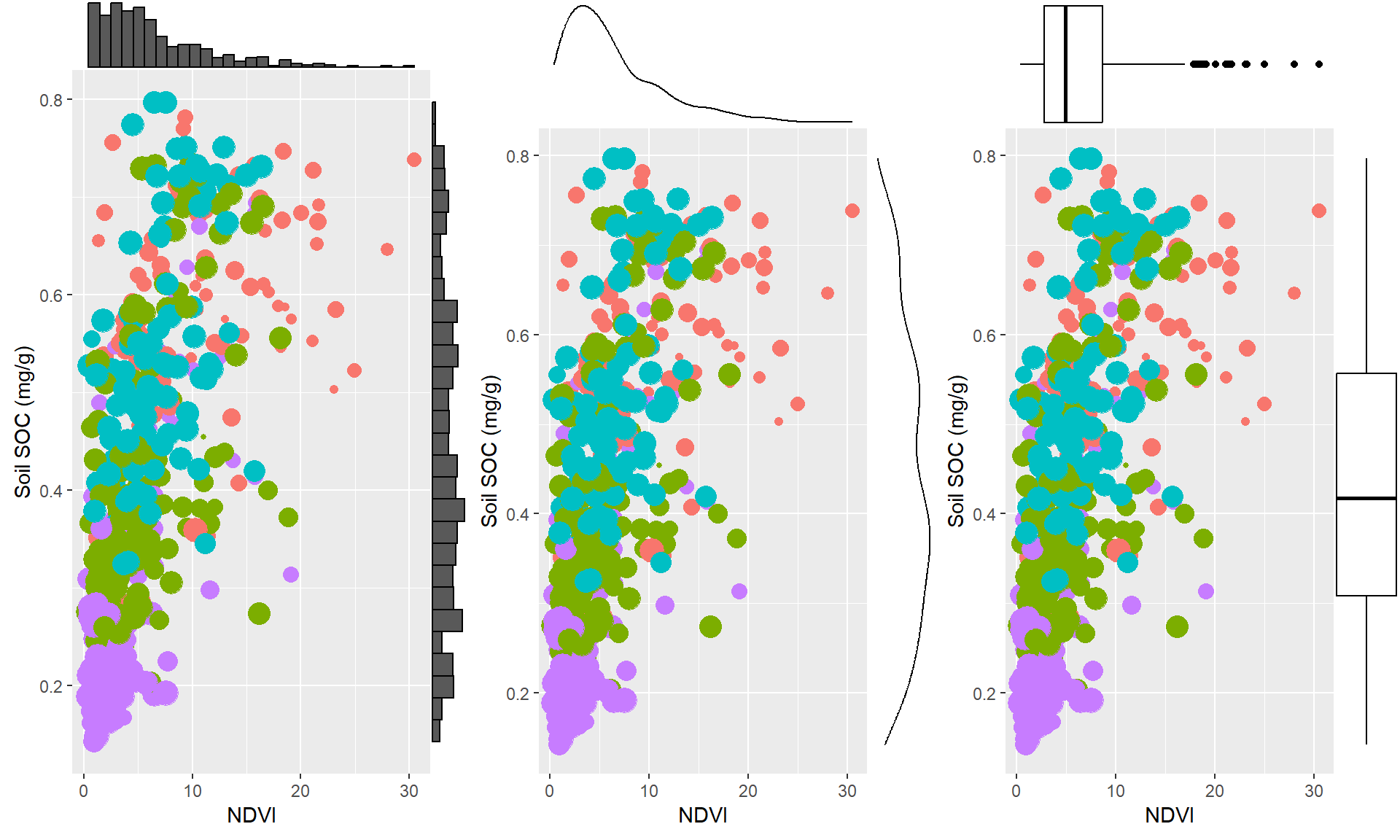
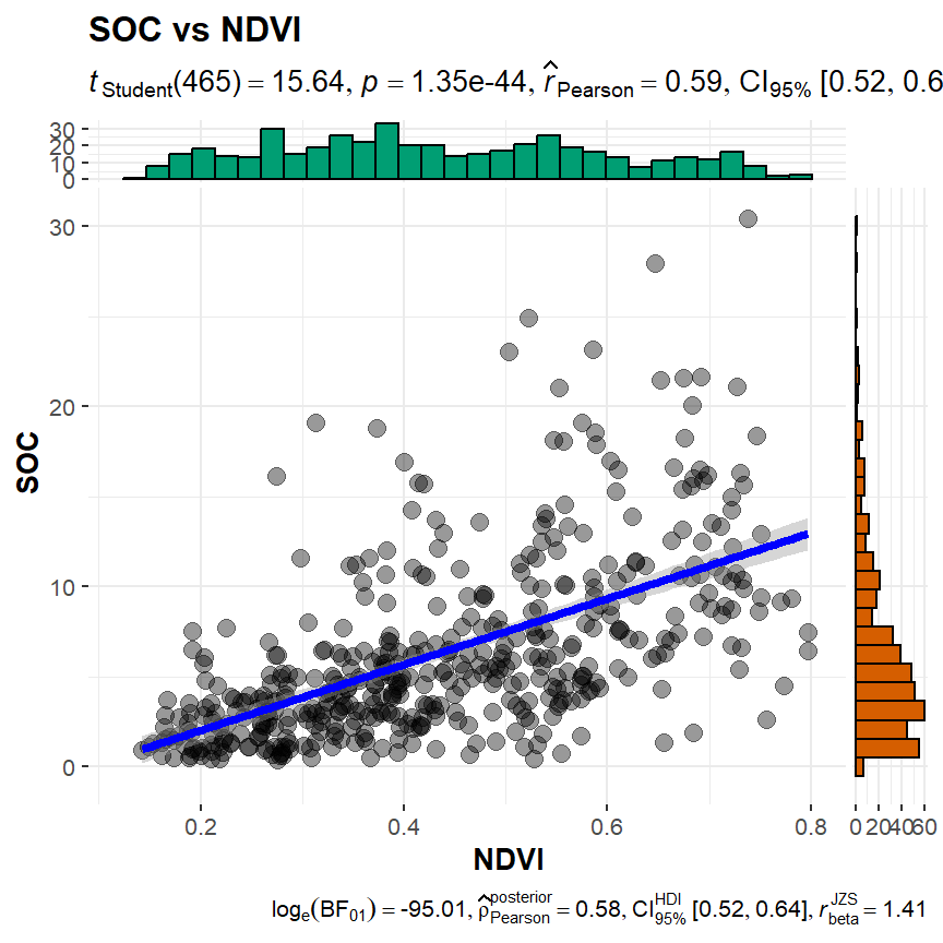
ggscatterstats() function from ggstatsplot will create scatterplots from ggplot2 combined with marginal densigram (density + histogram) plots with statistical details.
install.package(ggstatsplot)
install.package(ggside)
library(ggstatsplot )
ggstatsplot::ggscatterstats(
  data = df,
  x = NDVI,
  y = SOC,
  title = "SOC vs NDVI",
  messages = FALSE
)
A correlation matrix is a table that displays the correlation coefficients between different variables.
The rcorr() function of Hmisc computes a matrix of Pearson’s r or Spearman’s rho rank correlation coefficients for all possible pairs of columns of a matrix.
install.packages(“Hmisc”)
library(Hmisc)
# create a data frame for correlation analysis
df.cor<-df %>% dplyr::select(SOC, DEM, Slope, TPI, NDVI, MAP, MAT)
# correlation matrix
cor.mat<-Hmisc::rcorr(as.matrix(df.cor, type="pearson"))
cor.mat
SOC DEM Slope TPI NDVI MAP MAT
SOC 1.00 0.17 0.40 0.04 0.59 0.50 -0.36
DEM 0.17 1.00 0.70 0.00 -0.07 -0.31 -0.81
Slope 0.40 0.70 1.00 -0.01 0.31 0.15 -0.64
TPI 0.04 0.00 -0.01 1.00 0.07 0.14 0.00
NDVI 0.59 -0.07 0.31 0.07 1.00 0.80 -0.21
MAP 0.50 -0.31 0.15 0.14 0.80 1.00 0.06
MAT -0.36 -0.81 -0.64 0.00 -0.21 0.06 1.00
n= 467
P
SOC DEM Slope TPI NDVI MAP MAT
SOC 0.0003 0.0000 0.3745 0.0000 0.0000 0.0000
DEM 0.0003 0.0000 0.9559 0.1404 0.0000 0.0000
Slope 0.0000 0.0000 0.7940 0.0000 0.0016 0.0000
TPI 0.3745 0.9559 0.7940 0.1201 0.0017 0.9187
NDVI 0.0000 0.1404 0.0000 0.1201 0.0000 0.0000
MAP 0.0000 0.0000 0.0016 0.0017 0.0000 0.1922
MAT 0.0000 0.0000 0.0000 0.9187 0.0000 0.1922 We can create a correlation matrix table with correlation coefficients (r) and with significat P-values using following function”
# install.packages("xtable")
library(xtable)

cor_table <- function(x){
  require(Hmisc)
  x <- as.matrix(x)
  R <- rcorr(x)$r
  p <- rcorr(x)$P

  ## define notions for significance levels; spacing is important.
  mystars <- ifelse(p < .001, "***", ifelse(p < .01, "** ", ifelse(p < .05, "* ", " ")))

  ## trunctuate the matrix that holds the correlations to three decimal
  R <- format(round(cbind(rep(-1.11, ncol(x)), R), 3))[,-1]

  ## build a new matrix that includes the correlations with their apropriate stars
  Rnew <- matrix(paste(R, mystars, sep=""), ncol=ncol(x))
  diag(Rnew) <- paste(diag(R), " ", sep="")
  rownames(Rnew) <- colnames(x)
  colnames(Rnew) <- paste(colnames(x), "", sep="")

  ## remove upper triangle
  Rnew <- as.matrix(Rnew)
  Rnew[upper.tri(Rnew, diag = TRUE)] <- ""
  Rnew <- as.data.frame(Rnew)

  ## remove last column and return the matrix (which is now a data frame)
  Rnew <- cbind(Rnew[1:length(Rnew)-1])
  return(Rnew)
}cor_table(df.cor) SOC DEM Slope TPI NDVI MAP
SOC
DEM 0.167***
Slope 0.405*** 0.703***
TPI 0.041 -0.003 -0.012
NDVI 0.587*** -0.068 0.311*** 0.072
MAP 0.499*** -0.308*** 0.146** 0.145** 0.804***
MAT -0.358*** -0.808*** -0.638*** 0.005 -0.210*** 0.060 The function ggpairs() from GGally leverages a modular design of pairwise comparisons of multivariate data and displays either the density or count of the respective variable along the diagonal.
install.packages(GGally)
# Load GGally library
library(GGally)
GGally::ggpairs(df.cor)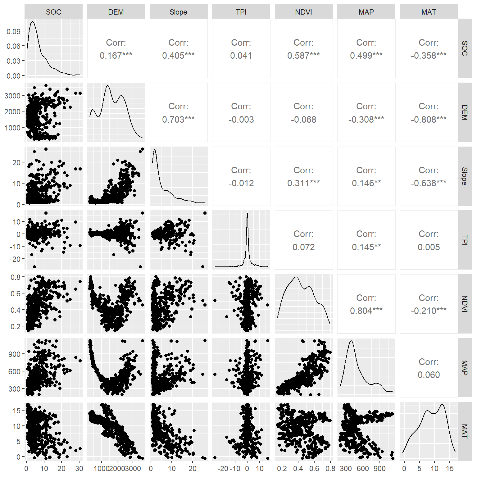
You can create a graphical display of a correlation matrix using the function corrplot() of corrplot package. The function corrplot() takes the correlation matrix as the first argument. The second argument (type=“upper”) is used to display only the upper triangular of the correlation matrix. The correlation matrix is reordered according to the correlation coefficient using “hclust” method
install.pacakges(“corrplot”)
# Load corrplot library
library(corrplot)
# Create plot
corrplot(cor.mat$r,
         type="upper",
         order="hclust",
         cex.lab = 0.5,
         tl.col = "black",
         p.mat = cor.mat$p,
         sig.level = 0.05, insig = "blank")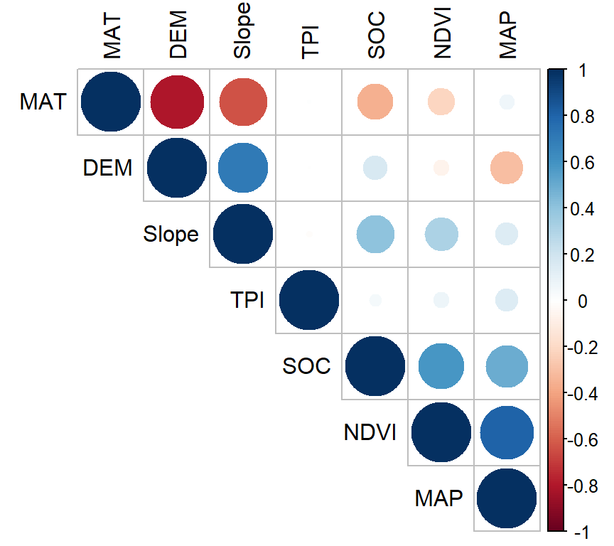
In above plot, correlation coefficients are colored according to the value. Correlation matrix can be also reordered according to the degree of association between variables. Positive correlations are displayed in blue and negative correlations in red color. Color intensity and the size of the circle are proportional to the correlation coefficients. In the right side of the correlogram, the legend color shows the correlation coefficients and the corresponding colors. The correlations with p-value > 0.05 are considered as insignificant. In this case the correlation coefficient values are leaved blank.
Create a R-Markdown documents (name homework_03.rmd) in this project and do all Tasks ( using the data shown below.
Submit all codes and output as a HTML document (homework_03.html) before class of next week.
tidyverse, car, nortest, outliers, plyr, report, RColorBrewer, ggstatsplot, gtsummary, ggExtra, gridExtra, xtable, and flextable.
Download the data and save in your project directory. Use read_csv to load the data in your R-session. For example:
df<-read_csv(“bd_arsenic_data.csv”))
df.gh<-read_csv(“bd_green_house.csv”))
Use bd_arsenic.csv data for tasks 1-10 and bd_green_house.csv for the tasks 10-14
Check the data structure with str() function
Check missing values if any.
Create a summary statistics table with these variables: GAs, WAs, SAs, SPAs, SAoAs, SAoFe from arsenic data.
Create a summary statistics by group (Landtype) using above mention variables.
Create a histogram, density plot QQ-plot of Soil As (SAs) with ggplot2 package.
Do normality test of WAs, SAs, GAs and measure the Skewness and Kurtosis of these variables.
Create two scatter plots with ggplot2: i) WAs vs GAs and ii) SAs vs GAs, and show them side by side (p1+p2)
Create a 3D bubble plot
Create a correlation matrix table showing significant levels. Use GAs, StAs, WAs, SAs, SPAs, SAoAs, ans SAoFe variables.
Create a Correlation matrix plot of above correlation analysis.
Use ggplot2 to create tow barplots with error bar: i) GAs and Treatment II) GAs varieties. And show them side by side. Use bd_green_house data
Do t-test show is there any significant difference in As concentration in rice (GAs) between low and high As soil treatments.
Do one-way and two-way ANOVA show main effect of treatment and rice variety and their interaction on rice grain As and explain the results.
Do multiple comparison of two main effect.