Code
# Packages List
packages <- c(
  "tidyverse",   # Includes readr, dplyr, ggplot2, etc.
  'fitdistrplus', # Fit distributions
  'minpack.lm'   # Levenberg-Marquardt algorithm
)![]()

Humped curves, also known as unimodal curves, are characterized by a single peak or “hump” and are commonly used to describe phenomena where a variable increases to a maximum point and then decreases. These types of curves are often found in various fields such as biology, economics, and environmental science.
Some common types of humped curves include:
Gaussian (Normal) Distribution: A symmetric bell-shaped curve that is widely used in statistics to represent the distribution of a set of data.
Log-Normal Distribution: A distribution of a random variable whose logarithm is normally distributed, often used in finance and environmental studies.
Beta Distribution: A family of continuous probability distributions defined on the interval [0, 1], often used to model random variables that are constrained within a fixed range.
Ricker Curve: A population growth model used in ecology to describe the growth of populations, characterized by rapid growth followed by a decline as the population approaches a carrying capacity.
First-order Compartment: A model in pharmacokinetics where the rate of change of drug concentration is proportional to the concentration of the drug.
Biexponential Humped Curves: A curve with two exponential terms that describe a rapid initial decline followed by a slower decline.
We will fit different humped curves to a sample dataset in R using the fitdistrplus package. The fitdistrplus package provides functions to fit various probability distributions to data and estimate the parameters of the distributions.
# Packages List
packages <- c(
"tidyverse", # Includes readr, dplyr, ggplot2, etc.
'fitdistrplus', # Fit distributions
'minpack.lm' # Levenberg-Marquardt algorithm
)#| warning: false
#| error: false
# Install missing packages
new_packages <- packages[!(packages %in% installed.packages()[,"Package"])]
if(length(new_packages)) install.packages(new_packages)
# Verify installation
cat("Installed packages:\n")
print(sapply(packages, requireNamespace, quietly = TRUE))# Load packages with suppressed messages
invisible(lapply(packages, function(pkg) {
suppressPackageStartupMessages(library(pkg, character.only = TRUE))
}))# Check loaded packages
cat("Successfully loaded packages:\n")Successfully loaded packages:print(search()[grepl("package:", search())]) [1] "package:minpack.lm" "package:fitdistrplus" "package:survival"
[4] "package:MASS" "package:lubridate" "package:forcats"
[7] "package:stringr" "package:dplyr" "package:purrr"
[10] "package:readr" "package:tidyr" "package:tibble"
[13] "package:ggplot2" "package:tidyverse" "package:stats"
[16] "package:graphics" "package:grDevices" "package:utils"
[19] "package:datasets" "package:methods" "package:base" The Gaussian or Normal distribution is one of the most commonly used probability distributions in statistics. It is characterized by its symmetric bell-shaped curve and is defined by two parameters: the mean (\(\mu\)) and the standard deviation (\(\sigma\)). The probability density function (PDF) of the Gaussian distribution is given by:
\[ f(x) = \frac{1}{\sqrt{2 \pi \sigma^2}} \exp\left(-\frac{(x - \mu)^2}{2 \sigma^2}\right) \]
Where:
*Properties of the Gaussian Distribution:
Applications of the Gaussian Distribution
# Generate synthetic data from a normal distribution
set.seed(123)
mu <- 0    # mean
sigma <- 1 # standard deviation
data <- rnorm(1000, mean = mu, sd = sigma)

# Create a data frame
df <- data.frame(x = data)

# Fit the Gaussian model to the data
fit <- fitdistrplus::fitdist(data, "norm")

# Get the summary of the fit
summary(fit)
Fitting of the distribution ' norm ' by maximum likelihood
Parameters :
estimate Std. Error
mean 0.01612787 0.03134446
sd 0.99119900 0.02216378
Loglikelihood: -1410.099 AIC: 2824.197 BIC: 2834.013
Correlation matrix:
mean sd
mean 1 0
sd 0 1# Plot the original data and the fitted Gaussian distribution
ggplot(df, aes(x = x)) +
geom_histogram(aes(y = ..density..), bins = 30, color = "black", fill = "white") +
stat_function(fun = dnorm, args = list(mean = fit$estimate[1], sd = fit$estimate[2]),
color = "red", size = 1.2) +
ggtitle("Gaussian (Normal) Distribution Fit") +
xlab("x") + ylab("Density") +
theme_minimal()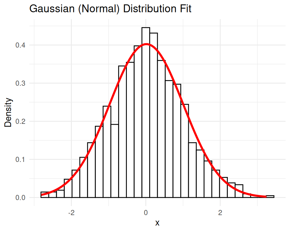
The log-normal distribution is a continuous probability distribution of a random variable whose logarithm is normally distributed. In other words, if \(X\) is a random variable that is log-normally distributed, then \(\log(X)\) follows a normal distribution.
Probability Density Function (PDF)
The probability density function (PDF) of a log-normal distribution is given by:
\[ f(x; \mu, \sigma) = \frac{1}{x \sigma \sqrt{2\pi}} \exp\left(-\frac{(\log(x) - \mu)^2}{2\sigma^2}\right) \]
Where: - \(x > 0\) - \(\mu\) is the mean of the logarithm of the variable. - \(\sigma\) is the standard deviation of the logarithm of the variable. - \(\exp\) denotes the exponential function.
Properties of the Log-Normal Distribution
Applications of the Log-Normal Distribution
Below is an example of how to fit a log-normal distribution to synthetic data using R:
# Generate synthetic data from a log-normal distribution
set.seed(123)
meanlog <- 0    # mean of the logarithm
sdlog <- 1      # standard deviation of the logarithm
data <- rlnorm(1000, meanlog = meanlog, sdlog = sdlog)

# Create a data frame
df <- data.frame(x = data)

# Fit the log-normal model to the data
fit <- fitdistrplus::fitdist(data, "lnorm")

# Get the summary of the fit
summary(fit)
Fitting of the distribution ' lnorm ' by maximum likelihood
Parameters :
estimate Std. Error
meanlog 0.01612787 0.03134446
sdlog 0.99119900 0.02216378
Loglikelihood: -1426.226 AIC: 2856.453 BIC: 2866.268
Correlation matrix:
meanlog sdlog
meanlog 1 0
sdlog 0 1# Plot the original data and the fitted log-normal distribution
ggplot(df, aes(x = x)) +
geom_histogram(aes(y = ..density..), bins = 30, color = "black", fill = "white") +
stat_function(fun = dlnorm, args = list(meanlog = fit$estimate[1], sdlog = fit$estimate[2]),
color = "red", size = 1.2) +
ggtitle("Log-Normal Distribution Fit") +
xlab("x") + ylab("Density") +
theme_minimal()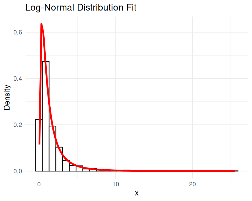
The Beta distribution is a continuous probability distribution defined on the interval \([0, 1]\). It is parameterized by two positive shape parameters, \(\alpha\) (alpha) and \(\beta\) (beta), which determine the shape of the distribution.
Probability Density Function (PDF)
The probability density function (PDF) of the Beta distribution is given by:
\[ f(x; \alpha, \beta) = \frac{x^{\alpha - 1} (1 - x)^{\beta - 1}}{B(\alpha, \beta)} \]
Where:
\(x\) is the variable, and \(0 \leq x \leq 1\).
$> 0 is the first shape parameter.
3- \(\beta > 0\) is the second shape parameter.
\[ B(\alpha, \beta) = \int_0^1 t^{\alpha - 1} (1 - t)^{\beta - 1} \, dt \]
Properties of the Beta Distribution
Applications of the Beta Distribution
# Generate synthetic data from a beta distribution
set.seed(123)
shape1 <- 2    # alpha
shape2 <- 5    # beta
data <- rbeta(1000, shape1 = shape1, shape2 = shape2)

# Create a data frame
df <- data.frame(x = data)

# Fit the beta model to the data
fit <- fitdistrplus::fitdist(data, "beta", start = list(shape1 = 1, shape2 = 1))

# Get the summary of the fit
summary(fit)
Fitting of the distribution ' beta ' by maximum likelihood
Parameters :
estimate Std. Error
shape1 1.998378 0.08340903
shape2 4.895698 0.21986020
Loglikelihood: 472.4089 AIC: -940.8177 BIC: -931.0022
Correlation matrix:
shape1 shape2
shape1 1.0000000 0.8404541
shape2 0.8404541 1.0000000# Plot the original data and the fitted beta distribution
ggplot(df, aes(x = x)) +
geom_histogram(aes(y = ..density..), bins = 30, color = "black", fill = "white") +
stat_function(fun = dbeta, args = list(shape1 = fit$estimate[1], shape2 = fit$estimate[2]),
color = "red", size = 1.2) +
ggtitle("Beta Distribution Fit") +
xlab("x") + ylab("Density") +
theme_minimal()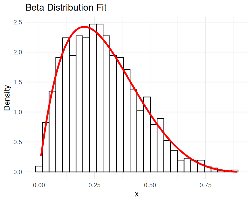
The Ricker curve is used in population dynamics and is named after the Canadian biologist William Ricker. The Ricker curve describes how a population grows rapidly when it is small and slows as it approaches the carrying capacity. It is represented by the equation:
\[ N_{t+1} = N_t e^{r(1 - \frac{N_t}{K})} \]
Where:
\(N_t\) is the population size at time \(t\).
\(r\) is the intrinsic growth rate.
\(K\) is the carrying capacity of the environment.
The Ricker model is a classic example of a discrete-time population model used in ecology to describe the growth of populations. It captures the idea that populations grow rapidly when they are small and slow down as they approach a carrying capacity. The mathematical formulation of the Ricker model is as follows:
Interpretation
Let’s implement the Ricker model in R and visualize the population growth over time. We will simulate the population dynamics using the Ricker curve and plot the population size over time.
##Ricker Curve
ricker_curve <- function(t, r = 1.5, K = 100, N0 = 10) {
  N <- numeric(length(t))
  N[1] <- N0
  for (i in 2:length(t)) {
    N[i] <- N[i-1] * exp(r * (1 - N[i-1] / K))
  }
  return(N)
}

t_seq <- seq(0, 20, by = 1)
N_values <- ricker_curve(t_seq)
N_values
[1] 10.00000 38.57426 96.92827 101.49882 99.24235 100.37665 99.81115
[8] 100.09429 99.95282 100.02358 99.98821 100.00590 99.99705 100.00147
[15] 99.99926 100.00037 99.99982 100.00009 99.99995 100.00002 99.99999# plot the Ricker curve
df_ricker <- data.frame(t = t_seq, N = N_values)
ggplot(df_ricker, aes(x = t, y = N)) +
geom_line(color = "blue") +
labs(title = "Ricker Curve", x = "Time", y = "Population Size")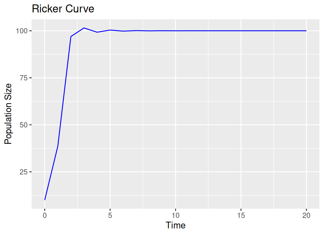
In pharmacokinetics, a first-order compartment refers to a model where the rate of change of the drug concentration in the compartment is proportional to the concentration of the drug. This is described by the equation:
\[ \frac{dC}{dt} = -kC \]
Where: - \(C\) is the concentration of the drug - \(k\) is the first-order rate constant
This model assumes that the drug is uniformly distributed within the compartment and that the rate of elimination or absorption follows first-order kinetics.
Lest fit the first-order compartment model to a sample dataset in R:
# 2. First-Order Compartment Model
first_order_comp <- function(t, C0 = 100, k = 0.2) {
  return(C0 * exp(-k * t))
}

t_seq <- seq(0, 50, by = 1)
C_values <- first_order_comp(t_seq)

df_first_order <- data.frame(t = t_seq, C = C_values)
ggplot(df_first_order, aes(x = t, y = C)) +
  geom_line(color = "red") +
  labs(title = "First-Order Compartment Model", x = "Time", y = "Concentration")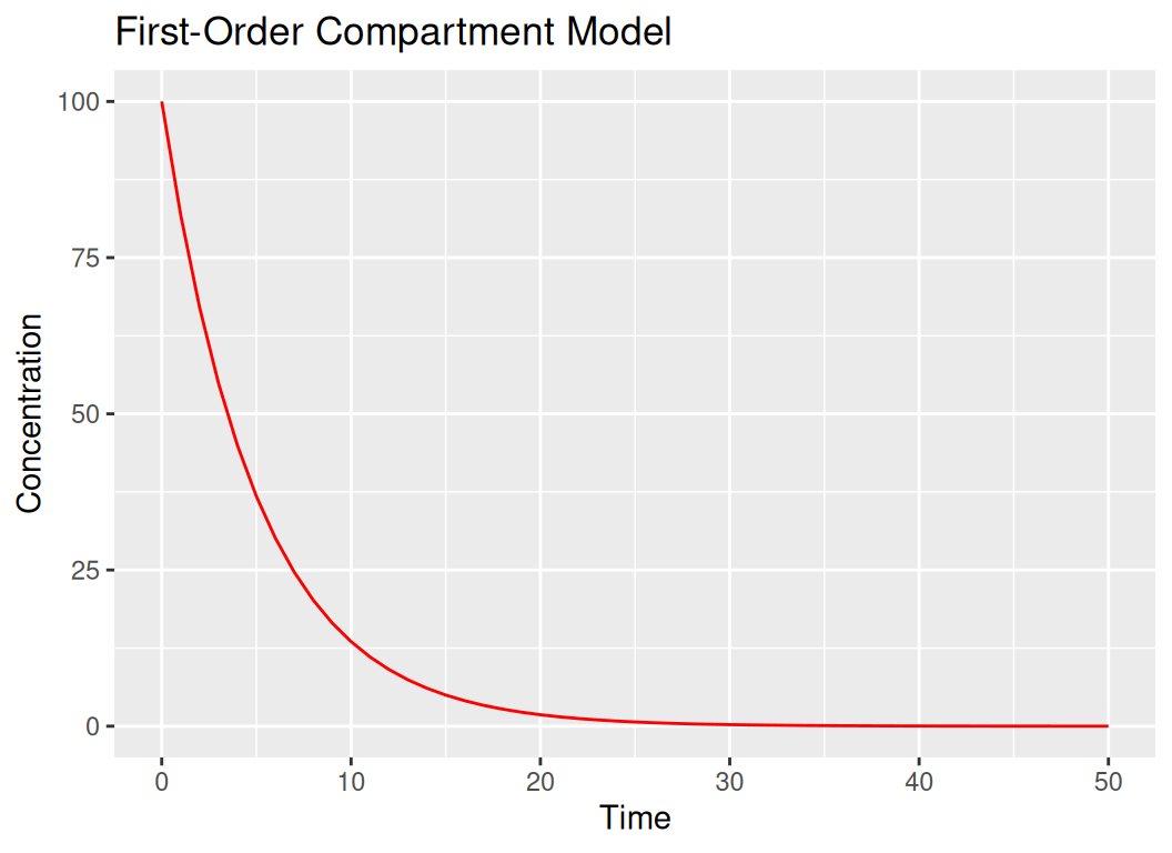
Biexponential humped curves are used to describe pharmacokinetic profiles where the concentration-time data show two phases: a rapid initial decline followed by a slower decline. This can be modeled using a biexponential equation:
\[ C(t) = Ae^{-\alpha t} + Be^{-\beta t} \]
Where:
The “hump” in the curve indicates a period where the concentration decreases more slowly after the initial rapid decline. These concepts are fundamental in fields such as ecology, pharmacokinetics, and mathematical biology, providing insights into population dynamics, drug distribution, and elimination processes.
Let’s fit a biexponential humped curve to a sample dataset in R:
# 3. Biexponential Humped Curve
biexponential_curve <- function(t, A = 100, B = 50, alpha = 0.1, beta = 0.05) {
  return(A * exp(-alpha * t) - B * exp(-beta * t))
}

t_seq <- seq(0, 100, by = 1)
C_values <- biexponential_curve(t_seq)

df_biexp <- data.frame(t = t_seq, C = C_values)
ggplot(df_biexp, aes(x = t, y = C)) +
  geom_line(color = "green") +
  labs(title = "Biexponential Humped Curve", x = "Time", y = "Concentration")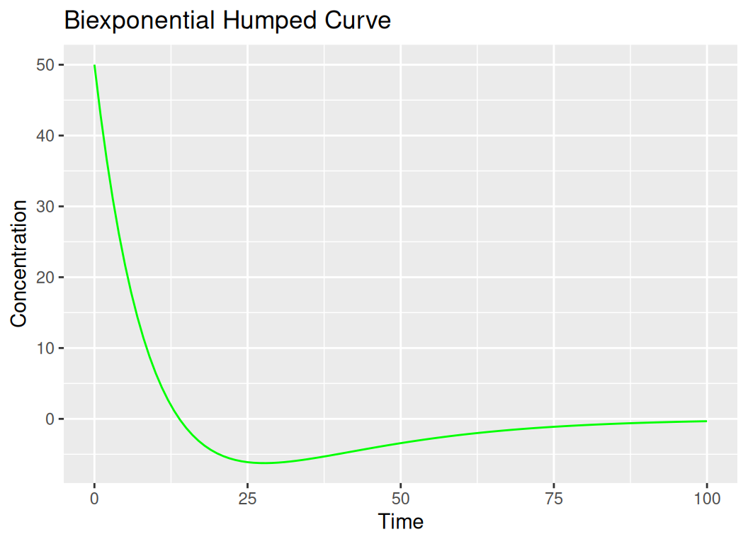
In this notebook, we explored different types of humped curves and how to fit them to data in R using the fitdistrplus package. We covered the Gaussian (Normal) distribution, Log-Normal distribution, and Beta distribution, along with their properties and applications. Fitting probability distributions to data is a common task in statistics and data analysis, and it allows us to model and understand the underlying patterns in the data. We also discussed the Ricker curve, a population growth model used in ecology, and the first-order compartment model in pharmacokinetics. By fitting humped curves to data, we can gain insights into the shape and characteristics of the data distribution, which can be useful for various analytical tasks.
Here are some references on humped curves (specifically in the context of yield curves):